Pages

Showing posts with label National Geographic. Show all posts

Tiled Basemaps Survey 2013 - Results!

Tuesday, August 6, 2013
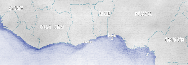
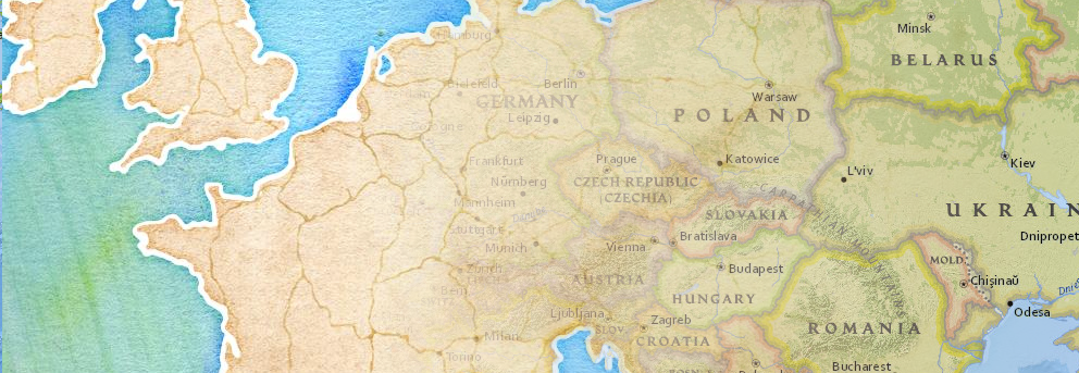
From Stamen, OSM Contributors and National Geographic

The results are in!

123 helpful participants submitted their thoughts on their favorite basemap services, and without further ado I present some of the results:

Which tiled basemap is most cartographically appealing to you?


Google, National Geographic (served via ESRI), and Mapbox are the winners here, with support for Stamen's options as well. "Other" in this case included OSU's Crinkled Watercolor and OpenCycleMap. Between the Stamen, OSM-Mapnik and Mapbox selections here, tiles based on OpenStreetmap data were ahead of the others. But this is a popularity contest based on looks. Moving on to substance . . .

Which tiled basemap do you use most frequently in your projects?

Google wins on ubiquity. Almost half of the respondent pool uses Google's tiles first; though given the widespread adoption of the API this is not a great surprise. More interesting is that about half of these Google users find a different basemap to be more attractive. Which brings us to . . .

What factors drive the choice of basemap for your projects?


Respondents could choose more than one here, but it's clear that not many balked at the technical challenge or vendor lock-in concerns. Mostly it seems like choices were driven by a balance between aesthetics and quality/detail, with cost and licensing hovering in the back of respondents' minds.

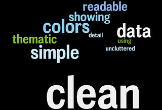
What do you like best about your "cartographic favorite"?

Unpacking these results is best done with a series of [gasp!] word clouds for the top three choices. You might call it a word storm . . .

National Geographic: 

Mapbox: 

Google: 

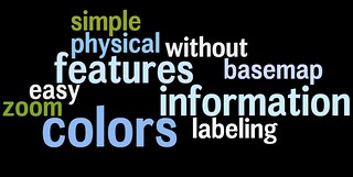
Interpret these as you will - subjective assessments have a way of bleeding from one choice to another. For instance, it looks like everyone likes the "colors".

Whoa there . . .

This is not a scientific survey. And despite my best efforts to reach out to all the communities involved, it's probably not even terribly representative. But it's interesting to inspect the choices made by this particular group of mappers, and fantastic that so many were willing to share their thoughts. Check out the unvarnished results here - mostly interesting to see the full explanations of what folks like about their preferred aesthetic.

As always, drop me a line if you have any questions or concerns about these results. Thanks to all who participated!


Read more ...

Tiled Basemaps: the Survey

Monday, July 8, 2013


The time has come once again for a taking of the geopulse! In years past I've asked broad questions about platform-level technology use, but this year I'm getting more specific:


Yes, I realize that the very concept of tiles is about to go the way of the Avenue script, but the present moment is still flush with amazing cartography served up in square chunks. For this survey I've chosen a selection of "Streetmap" styles from the major players, since imagery is another can of worms entirely.

I've built a comparison app here (with thanks to Dair Grant for the idea). Check it out and vote for your favorite.

Note: It's not possible to get a perfect comparison, since some maps tiles are locked to a particular API (what up, Apple), and others were too hard to parse into a single web map (Was a quadkey scheme really necessary, Bing?). Feel free to add these in if they serve as your go-to basemaps anyway.

Thanks for participating, and check back here for results in a few weeks!
Read more ...

The Buffalo in the Room Part 2: Fade Out

Sunday, September 16, 2012
In the last post we looked at the many difficult paths that can take us to the summit of cartographic nirvana known as the "Buffalo Tint", as rocked by National Geographic Maps and others

As I noted, this effect has traditionally been impossible to pull off in a GIS platform like ArcMap or QGIS. Tilemill initially got us a little bit closer by giving us full control over styling possibilities with CartoCSS code.

But now, as of Tilemill 0.10.0, compositing functions make this kind of effect a snap. Let's look at making a full Buffalo Fade, still using South Sudan as an example. Specifically, we're going to make a fade mask in Tilemill that can be laid over some Mapbox base layers in a web map.


Step 1: Preprocessing a Mask

This step - preprocessing in a GIS platform - is optional, it just depends on where you want the fade to begin. The purpose of preprocessing is to create a fixed feature mask;

  • QGIS: Run a buffer on your focal feature, larger than the convex hull of the feature for good measure. Then run a difference process between the buffer and the focal feature. 


Either way you're aiming for a feature mask that looks like this:


Step 2: Into Tilemill


Then import that feature mask into Tilemill and style it with what might be the most efficient piece of code I've ever cobbled together, compositing the feature mask to fade inward from its border:


[Alternately, in this case you can do it by just compositing every country that isn't South Sudan and eliminate the buffer processing above. Here's the CartoCSS to do that]

That's it. Export to MBTiles format and drop it on top of a base map of your choice. You're off to the races:


There are still a few bugs when using this for dynamic tiles, notably some tile-edge artifacts that break up the smoothness. But overall I'm looking forward to messing around with these new compositing capabilities


Read more ...

The Buffalo in the Room Part 1: Fade In

Wednesday, September 12, 2012
Since the ancient days - well, since late 1993 or so - production cartographers have been been stuck in an awkward technical limbo between GIS and art. Two platforms were required to get a map from vector geoprocessing to publication-quality graphics: Mostly ESRI's ArcGIS for the former and mostly Adobe's Creative Suite for the latter. Sure the two tried to overlap each other as time went on ("Seven hours to export a 900dpi TIFF and I can still see the pixels? Thanks ArcMap!"), but the basic math was tough to overcome: with finite memory on a workstation, ArcGIS focuses its resources on geoprocessing at the expense of the graphic outputs, and vice-versa.

This was the way of it when I started mapping. And the classic example of "You can't do that in GIS" is the buffalo tint popularized and used to wicked effect by National Geographic Maps. Basically it's a targeted feature fade, meant to draw attention to a focal point or to one side of a divide. And pretty hot too.

And it's not really possible in ArcMap. Here, let's try doing the inverse of a fade, which is easier to envision. This is more of a halo, and it's theoretically possible to do this by adding line layer after line layer, each offset and transparent-ed a bit more than the last:

Buffalo Halo a la ArcMap
Not too shabby, I suppose. A fade out from a clear focal feature. Maybe a bit heavy-handed, but it gets the message across. Too bad it took 30 minutes of clicking into five successive sub-menus on each of ten layers to get it done. And since ArcMap isn't a graphic engine, there's no anti-aliasing, and pixels are visible in every feature. This is not a production-quality graphic.

Let's try that again with Tilemill. I know I know, it's not a GIS engine, but it's a lot closer to one than Adobe Illustrator is, try as they might. Tilemill has full support for operations like selecting and styling by attributes as well as basic geoprocessing if the data is tied to a source like PostGIS, Google's data API or CartoDB's SQL API. Also it's free and open-source (I love that such news is ancillary to my point here. Woot!). As I've mentioned before, Tilemill brings the efficiency of CSS code to the map styling process, and it pushes everything through the sophisticated Mapnik graphic driver to look damn pretty for web or print.

Code will save us, right? Here, check it out:

Buffalo Halo a la Tilemill
This is a more subtle effect, with no striping artifacts, and all the linework is anti-aliased for smoothness. Bonus points for also providing an interactive output where the halo scales dynamically.

So what kind of Carto CSS went into that? Oh, just more than three hundred lines of recursively offset style code. Oy. It's true that it's portable (feel free to plug the code into your own project), but it's not ideal. Definitely not for fast projects under a deadline.

This is where compositing comes in. Last month, the indefatigable Mapnik team added support for the graphical magic that underpins programs like illustrator. This is part of a long-running effort by cartographic designers at Stamen and Development Seed to get out from under the Iron Adobe boot. (or the supple GIMP moccasin, I suppose). With compositing, all sorts of things become a lot easier to do in Tilemill, for instance what we've been trying above is now about 30 lines of CartoCSS, and much richer:

Buffalo Halo with Mapnik Compositing Mojo in Tilemill
The possibilities are sort of mind-boggling, and I invite all the actual graphic designers of the world to figure them out (The composite parameter alone in CartoCSS has 35 options). In the meantime I'll continue to look for ways to enhance my mapping toolkit; the next post will focus on reversing the direction of this effect, like in the NatGeo example linked above.

Free-Range Buffalo Halo, Thriving in its Natural Environment.
Thanks to Dane Springmeyer for pointing out the time-saving parameters on this one.

Read more ...