|
| Find me, small screen. |
I've spent a lot of time thinking about the incredibly rich experiences we're getting these days from a digital map paradigm basically invented by Google in 2005.
A rich experience everywhere but on mobile devices, that is.
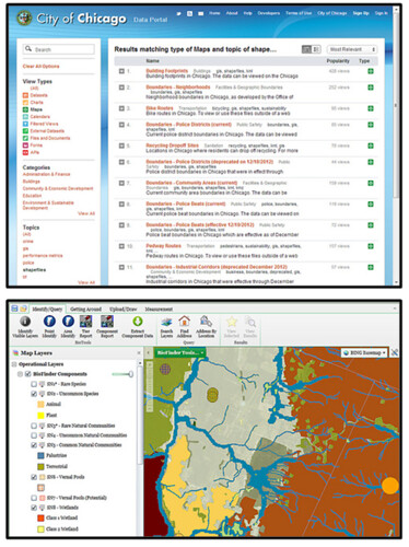
The dichotomy is pretty intense - on our larger screens, we have data visualizations of artful grandeur. We have amazing cartography in tiles and vectors, and we have smooth analytical tools. We're even approaching "GIS on the Web" that doesn't suck.
But then you turn on your phone and the best applications use oblique-angle maps the same way they did in Car SatNavs a decade ago.
I don't have an answer to this problem, I just mean to say I've been thinking about it. And it turns out that a bunch of the technologies I use regularly can be pretty easily combined to offer some possible fixes for how a user experiences maps on mobile. I'll walk you through them while trying to tackle a basic application: a location-based survey.
1.) Bootstrap
I get it. I overuse Bootstrap for the architecture of my sites. But in the latest release (3.0) they went "Mobile First", so it makes many of my other tasks easy by providing the responsive classes out of the box:2.) Google Forms
I still think of Google Forms as an underutilized gem for easy data collection: pipe data from a form to a spreadsheet with an API; one barely needs to try anymore :) However, tying a custom Bootstrap page to a specific google form requires a few things available in the source code of the input form's page:- Form identifiers:
- Field-specific IDs:
- A Redirection iframe:
3.) Mapbox.js
Most of the necessary functions here are actually native to Leaflet, but I like the look of the Mapbox implementation, and they provide "Retina Tiles" that scale better for mobile. The basic tasks for the map in this application are:- Figure out user location without asking
- Let the user fix the inevitably-incorrect positioning
This works with a quick call to a free IP registry, centering the map on the result:
Then the user can drag the map around under the crosshair to where they actually are - this is a tactic I borrowed from OpenPlans after I got a reminder:
@mourner @vtcraghead an alternative would be to just let people drag the map and have the center be the target
— tschaub (@tschaub) November 7, 2013
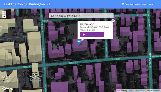
4.) CartoDB
Using a new tool they've made available to sync tables, there's almost no code involved in this step. All I needed to do was go to "File-->Publish" in the form target spreadsheet, then copy the .csv URL into the "New Table" creation dialog in CartoDB. Then a bit of easy styling created a custom-mapped results page:
The page itself is pretty simple, and you can grab it as a gist here. It'd be pretty easy to fork it and replace the form parameters with one of your own. As always, please share if you use it; I'd love to see where others take this.
The Caveats and Alternatives:
- Geolocation by IP is pretty awful, unless you happen to be Google (but in that case you're currently being sued for the method by which you collected your registry). The service I used put me in the correct city on my laptop, the correct state on my tablet, but according to my phone I'm in Buffalo. There are better ways to get location, but they require user permission, which is a UX hurdle I didn't want to jump for this.
- I subscribe to the gospel of responsive design because I'm lazy. It would probably be smoother to build this as a native Android/iOS app, but no way would it be this easy.
- Since location is being passed to the table from the initial map, there's no geocoding and you could theoretically just tap the Google Drive API to put points on a results map. But again: EASY. CartoDB is that :)
#Facepalm
In the first run I forgot the mobile-specific meta tag. I was reminded :) Thanks, Vladimir!
@vtcraghead yeah, it's not marker's fault, fix the page scale with a correct meta tag :)
— Vladimir Agafonkin (@mourner) November 7, 2013