I'm going to come right out and say this:
You should probably just use Mapbox.
How I came to that conclusion is a bit of a longer story.
The Scene
As a cartographer, I am an unabashed fan of
Mapbox. I've been using
Tilemill for years, and I love the fully-realized design of the
Mapbox Streets basemaps. Even before Google Maps brought the paywall hammer down I was already migrating my clients' projects to the open-source ecosystem based out of a D.C. garage. Controlling so much of the stack in an open-source environment meant less risk to my clients, and in most cases it came out a lot cheaper. The choice was pretty easy, actually.
Looking around this section of the market I don't believe that Mapbox and Google Maps have anyone to compete with but each other (mobile is another story). They are the only two companies currently offering a rigorous javascript API tightly integrated with attractive map services built for the web. (Debate this in the comments, ESRI, Nokia, and Bing users) There are plenty of a la carte options out there - Stamen's wonderful map tiles, the sheer power of the OpenLayers API - but as a lazy developer I've come to really like working with an integrated, open stack. Mapbox is my current choice, though many use cases
all but require Google's services.
The Challenge
An open-source stack doesn't mean a free stack, and Mapbox's map tile charges can rack up quickly if you're not paying attention. Exhibit A: I offered
Brandon Martin-Anderson one of my Mapbox tilesets to use as a reference for his
Census Dotmap. Several viral weeks later I was looking at overages the size of my annual budget.
An open-source stack may not always be free, but in theory it can be copied and hosted by others. I've done this quite a bit on the javascript API side,
mixing and matching tile providers with various client libraries. However, the costs that had begun to concern me were on the basemap end. So I set out to do what Mapbox flat-out encourages you to do with its wide-open codebase:
I would make and serve my own damn basemap. How hard could it be?
The Tools
I started with the open-source Tilemill template OSM-Bright, noting that there are
some good examples of it in use out there. I grabbed the current OSM data, piped it into my local PostGIS database (note
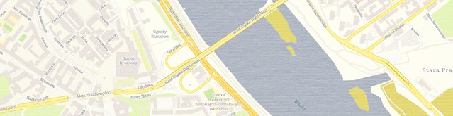
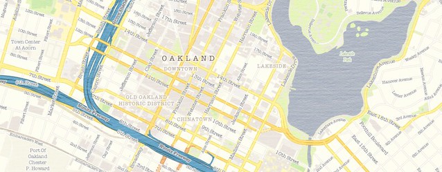
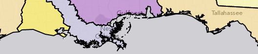
the hazards of adding many extracts) and spent some time turning it into "Geosprocket-Bright" in Tilemill:
Next came the heavy lifting. I exported a slew of regions to .mbtiles format; I would have loved to build a map of the entire world down to street zoom level, but I thought I'd start more realistically with a global map down to zoom level 9, then a handful of cities down to zoom level 17. I planned to put them on an Amazon S3 instance and tap them directly from the client library, doing an end-run around Mapbox hosting. Sounds pretty smooth, right?
Let's keep track of the time investment, shall we?
- 4 hours to export everything from Tilemill
- 6 hours to chop the .mbtiles into 1.6 million PNGs
- 3 hours to consolidate them all into a single directory structure (because I was too dumb to do that in the last step)
- 56 hours to push the tiles to an S3 bucket on a 20mbps connection
Obviously these are CPU hours, not billable hours - but it was still more than two days between when my map style was ready and when I could actually hook the map up to a browser.
The Verdict
This is a narrow case where I needed to roll my own tiles and serve them. My map included texture and custom fonts, which is beyond the reach of Mapbox Streets. The total filesize of my exports - even as .mbtiles - was 15GB; that translates to the Premium Mapbox hosting plan, and a whopping $6,000 flat fee per year. That's for
five cities - the tiniest fraction of a world of tiles. It's not quite
Google Maps Enterprise money, but damn. By contrast, it cost me nine bucks to get all of my map tiles into an S3 bucket, where I'll get billed something like half a cent per 1,000 map views.
But this process will be moot pretty soon anyway; the promise of
Tilemill 2 is that you only need to bring your cartography to the table - Mapbox will do the rest of the work to get your style to the browser with
vector tiles. They've only done this for
a few testers while they're hashing out the details, but odds are there will be a public version in the first half of 2014.
In keeping with other examples of open-source underpinning software-as-a-service, Mapbox has a sound business model. Despite the huge amount of intellectual capital they've open-sourced, it is still easier and - when time spent is considered - VASTLY cheaper to just use their hosted map services. I suspect they've been totally aware of this even as they release service-liberating tools like Tilemill, OSM-Bright and mbutil. The scale and efficiency of Mapbox make their hosted maps too good to avoid.
I hope my experience here has been instructive to others.
The Product
I did get
a map out of my experiment, and it's free to use. If you happen to be mapping in Warsaw, Sochi, Santo Domingo, LA or the Bay Area, I hope it proves useful. Just use this XYZ tile scheme in your client implementation:
http://s3.amazonaws.com/geosprocket/tiles/{z}/{x}/{y}.png
As per the usual OSM license, be sure to include "© OpenStreetMap contributors". Happy Mapping!