Pages

HTML5 and the Limits of Imagination

Tuesday, December 11, 2012
I just (days later than everyone else) came across this awesome Google Maps application built by Darren Wiens using the buckled-on graphics capabilities of paper.js. It strikes me as a perfect example of good imagination at work on complex geographic problems. Specifically, this is a mixture of pure javascript, HTML5 browser-boosting and advanced trip routing, all to make a cool visualization of where traffic bottlenecks will arise.

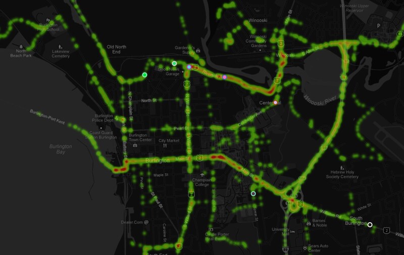
The application calls on paper.js to generate an endless series of random point-to-point trips within the map view, then passes them to Google's routing API and renders the result visually as a trip on the local road network. Over a short time, the traces of the trips build up into a density map of highest traffic:


So as is my wont, I grabbed the code (Thanks again to Mr. Wiens) and adapted it to my home territory of Burlington, VT, with a bit of map styling for contrast (modern browser required):


I intend to spend a lot more time figuring out the ways that new graphics modules can interact with the maps I build, but as always I'm limited by my own imagination. It seems like the technology is increasingly unlimited in capability.

Read more ...

Hashtags and Hurricanes

Wednesday, December 5, 2012
I was scoffing at Twitter a few years ago. Actually, I was openly mocking it, jeering that perhaps 140 characters was too verbose for the new world order.

Then came Hurricane Irene.

Vermont got slammed to a degree we hadn't experienced in a century. Flooding cut off whole towns and wrecked hundreds of miles of roads. Communications were a thicket of half information and delays as the news media tried to step in for a crippled emergency management system. But while working with the Ushahidi platform in support of VTResponse, I discovered that Twitter was ablaze with actionable info. 14,000 tweets used the #vtirene or #vtresponse hashtags during the storm, and Ushahidi vacuumed them all in for automated and manual analysis, then channeled them off to state and local officials. I saw the power of Twitter.

These capabilities were recently tested again when Hurricane Sandy showed up, and with a bit more experience I observed that Twitter by no means removes all the noise and confusion. Two incidents raised my hackles:

  •  Burlington, VT - and indeed the broader Vermont community - have long used the #BTV hashtag to organize news that runs from mundane to crisis-critical. I had configured a new instance of Ushahidi to note #BTV tweets as Sandy got closer, so it caught me off-guard when Bloomberg TV started soliciting photos of storm damage using #BTV. With visions of flood-isolated Vermonters unable to get their message through a deluge of Manhattanite instagrams, I politely asked that they use a different channel. I heard nothing back from the TV station, but it was a moot point; they got very little traffic on #BTV despite the fact that NYC got walloped and VT mostly escaped unharmed.

  • Encouraged by the successful use of Ushahidi and Google's Stratomap plaforms for crisis mapping during Irene, the world's largest producer of mapping software - ESRI - decided to go full-court press during Sandy with their own crisis response web maps. The problem is they're not that good at it. Taking more of a marketing approach, ESRI blanketed Twitter and the #sandy hashtag with links to "Map galleries" full of redundant chartjunk, mostly pulling data from FEMA and local response agencies.

"How do I get to a Red Cross station? Yellow dots, blue crosses? I have to install Silverlight to view this?"
On Twitter, this diverted thousands of clicks worth of traffic away from information Rally points like Google and FEMA (who was actually using ESRI web tools, just with some forethought). Ironically, almost every emergency response agency was using ESRI's desktop software to coordinate infrastructure and personnel; ground-level geocrunching is ESRI's great strength. But their half-baked web tools only served to dilute any sense of authoritative information on Twitter as Sandy raged into the coast. Afterward I had a productive conversation with ESRI's Public Safety Marketer, but it's not clear that their approach will change in the future. Hopefully their tools will.

These complaints each deserve a post of their own, but I prefer to minimize my ranting about the negative side of technology. However, I'll be bearing all of this them in mind when the next emergency hits and we look to Twitter for rapid distribution of news. For better or worse, Twitter and Facebook are tools of public information during crisis situations, and it is incumbent on us to amplify the signals of highest priority and applicability.

Read more ...

Secession & Racism: a Spatial Analysis

Thursday, November 15, 2012

Can a state's tendency toward racism determine it's willingness to secede from Barack Obama's America?

Maybe.

There's the short answer. The longer one follows, and please note the many qualifiers before you fire up the Troll-o-Matic 9000.

Post-Election Racism

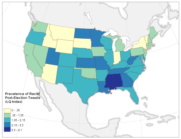
It turns out that there was a lot of racist language being bandied about on twitter after the election. And a small group of brilliant individuals elected to post their hate speech with geolocation attached. The good folks at Floating Sheep were there to catch it all and they boiled it down to a normalized index of the prevalence of racist tweets about the election by state:


A very small number of people in Alabama and Mississippi don't come out of this analysis looking very good. But the point here is that among social media users, Alabamans and Mississippians are slightly more likely than others to vent about the election using hate speech.

Post-Election Support for Secession

At the same time, citizens of some (initially Southern) states initiated online petitions calling for peaceful separation from the United States, AKA secession. These petitions have quickly spread to every state in the union, but the number of signatures varies wildly. As of this writing, Texas has over 100,000 signatures on its petition, while Vermont has 869 [and some colorful arguments have been made about keeping these specific two in separate countries].

Obviously you can't compare these two numbers on the same plane. To get a picture of the real support for secession in each state, I normalized the number of signatures by the state population in 2011 per census estimates:


Balanced by 25 million people, Texas is actually not quite as hot for a second republic as the petition might suggest. The northern rockies on the the other hand are desperate to escape, with a much as ONE AND A HALF PERCENT of the states' populations showing up on a secession petition (yes, this is a tiny percentage). The only states with no stomach for independence are pretty close to the map that John Kerry won in 2004 (with the odd inclusion of Virginia). This is fascinating on its own, but let's dig deeper . . .


Why do you really want to secede? I mean, really why?

All well and good, I thought, but what sort of motivations drive someone to sign onto an idea that half a million Americans died over not so long ago? There are as many explanations as pundits to make them up: culture, climate, economics, and one that comes up every now and then: racism.

So much coded language was thrown around during the election cycle that "Welfare" translated as "Greedy Black People" and "States' Rights" translated to "White Power" to some who were inclined to hear it. In such an environment it's not inconceivable that some citizens would rather leave the U.S.A. than dwell another four years under a president whose legitimacy was so exhaustively questioned.

Relationships like that are extremely difficult to tease out. There are potentially hundreds of factors driving an individual's decision to sign a petition like this, and the president's ethnicity may be only the smallest one - if it's present in the calculation at all. Colinearity is the term the statisticians like to throw around: you think you've got a significant relationship between two variables, but it's really a parallel factor that you forgot to measure.

Therefore, a non-exhaustive list of caveats before I get to any results:
  • Fewer than 400 geolocated tweets included both racist language and a reference to the election. This is a tiny number compared to the overall election-related traffic, and Floating Sheep has made this clear in their analysis. The author of that post judiciously used the term "Thin nail to hang on" in reference to my use of his dataset. That said, there was also a significant amount of non-geolocated twitter traffic using hate speech in the days after the election, so these are representative of a larger tone if not of a geographic location.
  • Signatories to these secession petitions are not all residents of the state in question. About 3/4 of the Texas petition participants appear to be Texans, while only about 1/4 of Oklahoma signatories are locals. Without a good way to sort out locals-only, I just included the total number on each petition and in doing so introduced more error. 
  • The analysis method I use below doesn't eliminate colinearity. It just suggests where it might be strong and where it might be weak. It's possible that racists in Georgia really love pandas, and it's actually the broader panda-loving population there that wants to secede so that the federal government can't seize any Georgian pandas.
  • Similarly, this analysis helps with - but does not eliminate - the modifiable areal unit problem.
  • Alaska and Hawaii have secession petitions too, but their non-contiguity with the lower 50 skews the results.
  • This is only scratching the surface. If there's a grad student out there with funding and no project, I invite them to burn time improving the input data.
  • More as they occur to me . . .
With these qualifiers in mind, let's look at the straight-up linear relationship between racist tweeting and secession-petition-signing. The big question I'm asking here is "Can a state's tendency toward racism determine it's willingness to secede from Barack Obama's America?" And I'm not answering that question; I'm answering a highly-qualified version of it based on the data I have available. Plus it's kind of a nutty question.

And at the national level, the answer to the question is no:
This "relationship" at the national level is not significant at any useful confidence interval, and it sports only the tiniest of trends (P = 0.36, R-squared = 0.017).

Before I lose the rest of you, let me say this: The answer to the above question could still be "maybe".

There's a statistical tactic available called Geographically-weighted regression (GWR); it's best described as a diagnostic tool to figure out how relationships like this can vary over distance. Instead of measuring the relationship between racism and secession at the national scale, we can look at it regionally to tease out places where it might be valid:

This map shows where it's possible that the prevalence of racist post-election tweets can predict the local support for secession. 
Cutting through the fog of colinearity, we're left with four states that exhibit the signs of correlation between racism and secession: Kentucky, Tennessee, Georgia and Florida. Anecdotally this isn't nuts; the very real secessionist movements in Northern New England express an odd motivating mix of social liberalism and Rand-ian libertarianism. On the other hand the Southern states actually did secede once, and whether you give it a Marxist reading or not, the resulting war was about the intertwining of race and governance. The banner-bearers of southern secession before this petition fracas included not a few white supremacist groups.

Many on the political left are trigger-happy with the use of racism as an explanation for any opposition to the president. The above analysis shows that this may be the case in some places. However, it must be pointed out that it also shows there is no strong link between racism and secession (using proxy terms here) in many "red states", including Texas and Mississippi. Other factors not analyzed here are most likely driving the petitions in those states. This is not to say there's no racist twitter activity in Texas, just that it's not really correlated with support for secession.

Here's the qualified conclusion born of all this flying data:

In a few southern states it is possible that the drive to secede from the United States is being informed by racism on some level. 

This is surely news to no one, but I thought it would be useful to look at the statistical underpinnings of it. Make of this what you will.


    Read more ...

    Maximalist Mapping

    Monday, November 12, 2012
    I am a journeyman cartographer, and I often find that my training didn't prepare me for the possibilities available today. It's all well and good to know the right ratios and color schemes, but how am I supposed to learn the right way to incorporate the nuttery that is Mapnik? How do I use compositing operations and CartoCSS in my maps without making them look like the worst visual excesses of web design?

    By spitballing.

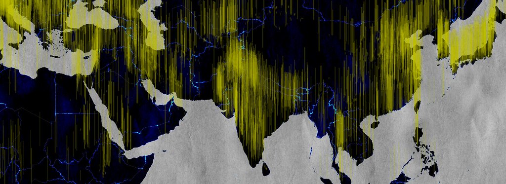
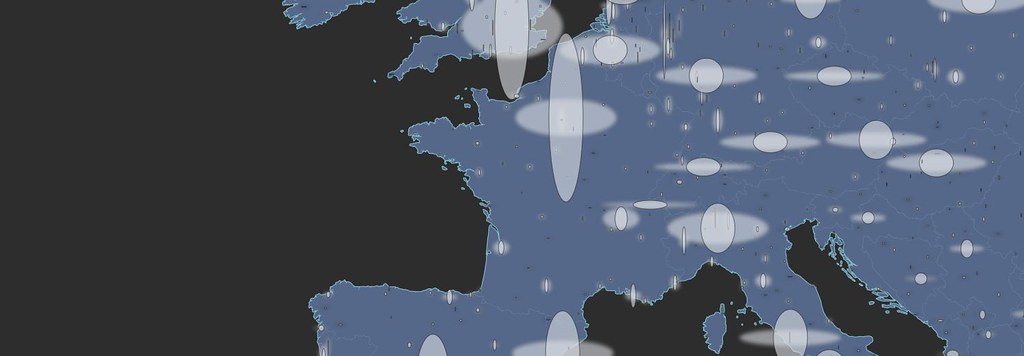
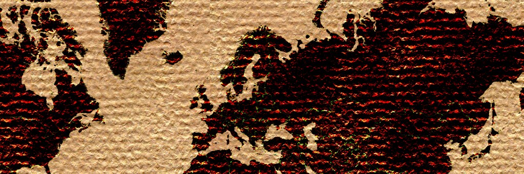
    I'm throwing data, textures and cartographic conventions at the wall and seeing what sticks. Some combinations work better than others, and I'm finding that maximalism isn't all bad. There are elegant ways of arranging a thousand features in a map, and hopefully I'll stumble on them someday. In the meantime, here are some studies.


    More of these fiddlings can be found here, with CartoCSS parameters attached in most cases. It's also worth noting that I used Tilemill for these, employing datasets from Natural Earth 1.4 and patterns from ForHumanUse. Most are open-source, all are free.

    These are static images, and the test I'm now finding most difficult is how to make arresting visuals meaningful when dynamism is required. Many have failed, including me.


    Read more ...

    VoteMapping

    Tuesday, November 6, 2012
    The big day is upon us again, and since my vote in the people's republic of Vermont (The GOP's term, not mine) doesn't really matter, I've turned my attention to the national level. First, to the many controversial things appearing on Twitter:


    Well, turns out when you cast a broad net people are actually saying some pretty hideous things on Twitter. This app I knocked together a few months ago from a Mapbox template reveals the tweeting public in all its grammar-deficient, race-baiting, socialism-misdefining glory. I stopped watching it after the last debate, since it was damaging my faith in humanity:


    It'll be more interesting to see if any of the many "Election Crowdsourcing" apps produce robust datasets about the differences in voting experience around the country. Twitter is too hard to mine for precinct-specific context about wait times at polling places (Don't believe me? Give it a try.), so I'm hoping to see some useful information from MyFairElection and Mother Jones.

    If you note others who are collecting such info, please drop me a line in the comments or on Twitter (@vtcraghead). Because this is my mapping project for the today if I can get enough data:

    Read more ...

    Results of the Burlington Neighborhoods Project

    Friday, October 26, 2012
    Thanks again to everyone who submitted neighborhood boundaries to the BTVHoods project. Results are now crunched!

    This map was compiled from over 400 sketches submitted by 104 participants in an online survey of the neighborhoods of Burlington VT, conducted between August and October 2012. The areas shown here reflect where participant agreement was greater than 50%.


    These are available - cleaned for admin use - in geojson format here.

    I pulled out block group boundaries from the latest US census (2010) and assigned them to neighborhoods to get a picture of how many people lived in each. Bear in mind that the numbers look exact, but the boundary lines are vague so these "neighborhood populations" should be taken with a grain of salt:


    And a look at some of the smaller neighborhoods, contained by larger ones on the map:
    Read more ...

    The Buffalo in the Room Part 2: Fade Out

    Sunday, September 16, 2012
    In the last post we looked at the many difficult paths that can take us to the summit of cartographic nirvana known as the "Buffalo Tint", as rocked by National Geographic Maps and others

    As I noted, this effect has traditionally been impossible to pull off in a GIS platform like ArcMap or QGIS. Tilemill initially got us a little bit closer by giving us full control over styling possibilities with CartoCSS code.

    But now, as of Tilemill 0.10.0, compositing functions make this kind of effect a snap. Let's look at making a full Buffalo Fade, still using South Sudan as an example. Specifically, we're going to make a fade mask in Tilemill that can be laid over some Mapbox base layers in a web map.


    Step 1: Preprocessing a Mask

    This step - preprocessing in a GIS platform - is optional, it just depends on where you want the fade to begin. The purpose of preprocessing is to create a fixed feature mask;

    • QGIS: Run a buffer on your focal feature, larger than the convex hull of the feature for good measure. Then run a difference process between the buffer and the focal feature. 


    Either way you're aiming for a feature mask that looks like this:


    Step 2: Into Tilemill


    Then import that feature mask into Tilemill and style it with what might be the most efficient piece of code I've ever cobbled together, compositing the feature mask to fade inward from its border:


    [Alternately, in this case you can do it by just compositing every country that isn't South Sudan and eliminate the buffer processing above. Here's the CartoCSS to do that]

    That's it. Export to MBTiles format and drop it on top of a base map of your choice. You're off to the races:


    There are still a few bugs when using this for dynamic tiles, notably some tile-edge artifacts that break up the smoothness. But overall I'm looking forward to messing around with these new compositing capabilities


    Read more ...

    The Buffalo in the Room Part 1: Fade In

    Wednesday, September 12, 2012
    Since the ancient days - well, since late 1993 or so - production cartographers have been been stuck in an awkward technical limbo between GIS and art. Two platforms were required to get a map from vector geoprocessing to publication-quality graphics: Mostly ESRI's ArcGIS for the former and mostly Adobe's Creative Suite for the latter. Sure the two tried to overlap each other as time went on ("Seven hours to export a 900dpi TIFF and I can still see the pixels? Thanks ArcMap!"), but the basic math was tough to overcome: with finite memory on a workstation, ArcGIS focuses its resources on geoprocessing at the expense of the graphic outputs, and vice-versa.

    This was the way of it when I started mapping. And the classic example of "You can't do that in GIS" is the buffalo tint popularized and used to wicked effect by National Geographic Maps. Basically it's a targeted feature fade, meant to draw attention to a focal point or to one side of a divide. And pretty hot too.

    And it's not really possible in ArcMap. Here, let's try doing the inverse of a fade, which is easier to envision. This is more of a halo, and it's theoretically possible to do this by adding line layer after line layer, each offset and transparent-ed a bit more than the last:

    Buffalo Halo a la ArcMap
    Not too shabby, I suppose. A fade out from a clear focal feature. Maybe a bit heavy-handed, but it gets the message across. Too bad it took 30 minutes of clicking into five successive sub-menus on each of ten layers to get it done. And since ArcMap isn't a graphic engine, there's no anti-aliasing, and pixels are visible in every feature. This is not a production-quality graphic.

    Let's try that again with Tilemill. I know I know, it's not a GIS engine, but it's a lot closer to one than Adobe Illustrator is, try as they might. Tilemill has full support for operations like selecting and styling by attributes as well as basic geoprocessing if the data is tied to a source like PostGIS, Google's data API or CartoDB's SQL API. Also it's free and open-source (I love that such news is ancillary to my point here. Woot!). As I've mentioned before, Tilemill brings the efficiency of CSS code to the map styling process, and it pushes everything through the sophisticated Mapnik graphic driver to look damn pretty for web or print.

    Code will save us, right? Here, check it out:

    Buffalo Halo a la Tilemill
    This is a more subtle effect, with no striping artifacts, and all the linework is anti-aliased for smoothness. Bonus points for also providing an interactive output where the halo scales dynamically.

    So what kind of Carto CSS went into that? Oh, just more than three hundred lines of recursively offset style code. Oy. It's true that it's portable (feel free to plug the code into your own project), but it's not ideal. Definitely not for fast projects under a deadline.

    This is where compositing comes in. Last month, the indefatigable Mapnik team added support for the graphical magic that underpins programs like illustrator. This is part of a long-running effort by cartographic designers at Stamen and Development Seed to get out from under the Iron Adobe boot. (or the supple GIMP moccasin, I suppose). With compositing, all sorts of things become a lot easier to do in Tilemill, for instance what we've been trying above is now about 30 lines of CartoCSS, and much richer:

    Buffalo Halo with Mapnik Compositing Mojo in Tilemill
    The possibilities are sort of mind-boggling, and I invite all the actual graphic designers of the world to figure them out (The composite parameter alone in CartoCSS has 35 options). In the meantime I'll continue to look for ways to enhance my mapping toolkit; the next post will focus on reversing the direction of this effect, like in the NatGeo example linked above.

    Free-Range Buffalo Halo, Thriving in its Natural Environment.
    Thanks to Dane Springmeyer for pointing out the time-saving parameters on this one.

    Read more ...