Pages

Results of the Burlington Neighborhoods Project

Friday, October 26, 2012
Thanks again to everyone who submitted neighborhood boundaries to the BTVHoods project. Results are now crunched!

This map was compiled from over 400 sketches submitted by 104 participants in an online survey of the neighborhoods of Burlington VT, conducted between August and October 2012. The areas shown here reflect where participant agreement was greater than 50%.


These are available - cleaned for admin use - in geojson format here.

I pulled out block group boundaries from the latest US census (2010) and assigned them to neighborhoods to get a picture of how many people lived in each. Bear in mind that the numbers look exact, but the boundary lines are vague so these "neighborhood populations" should be taken with a grain of salt:


And a look at some of the smaller neighborhoods, contained by larger ones on the map:
Read more ...

The Buffalo in the Room Part 2: Fade Out

Sunday, September 16, 2012
In the last post we looked at the many difficult paths that can take us to the summit of cartographic nirvana known as the "Buffalo Tint", as rocked by National Geographic Maps and others

As I noted, this effect has traditionally been impossible to pull off in a GIS platform like ArcMap or QGIS. Tilemill initially got us a little bit closer by giving us full control over styling possibilities with CartoCSS code.

But now, as of Tilemill 0.10.0, compositing functions make this kind of effect a snap. Let's look at making a full Buffalo Fade, still using South Sudan as an example. Specifically, we're going to make a fade mask in Tilemill that can be laid over some Mapbox base layers in a web map.


Step 1: Preprocessing a Mask

This step - preprocessing in a GIS platform - is optional, it just depends on where you want the fade to begin. The purpose of preprocessing is to create a fixed feature mask;

  • QGIS: Run a buffer on your focal feature, larger than the convex hull of the feature for good measure. Then run a difference process between the buffer and the focal feature. 


Either way you're aiming for a feature mask that looks like this:


Step 2: Into Tilemill


Then import that feature mask into Tilemill and style it with what might be the most efficient piece of code I've ever cobbled together, compositing the feature mask to fade inward from its border:


[Alternately, in this case you can do it by just compositing every country that isn't South Sudan and eliminate the buffer processing above. Here's the CartoCSS to do that]

That's it. Export to MBTiles format and drop it on top of a base map of your choice. You're off to the races:


There are still a few bugs when using this for dynamic tiles, notably some tile-edge artifacts that break up the smoothness. But overall I'm looking forward to messing around with these new compositing capabilities


Read more ...

The Buffalo in the Room Part 1: Fade In

Wednesday, September 12, 2012
Since the ancient days - well, since late 1993 or so - production cartographers have been been stuck in an awkward technical limbo between GIS and art. Two platforms were required to get a map from vector geoprocessing to publication-quality graphics: Mostly ESRI's ArcGIS for the former and mostly Adobe's Creative Suite for the latter. Sure the two tried to overlap each other as time went on ("Seven hours to export a 900dpi TIFF and I can still see the pixels? Thanks ArcMap!"), but the basic math was tough to overcome: with finite memory on a workstation, ArcGIS focuses its resources on geoprocessing at the expense of the graphic outputs, and vice-versa.

This was the way of it when I started mapping. And the classic example of "You can't do that in GIS" is the buffalo tint popularized and used to wicked effect by National Geographic Maps. Basically it's a targeted feature fade, meant to draw attention to a focal point or to one side of a divide. And pretty hot too.

And it's not really possible in ArcMap. Here, let's try doing the inverse of a fade, which is easier to envision. This is more of a halo, and it's theoretically possible to do this by adding line layer after line layer, each offset and transparent-ed a bit more than the last:

Buffalo Halo a la ArcMap
Not too shabby, I suppose. A fade out from a clear focal feature. Maybe a bit heavy-handed, but it gets the message across. Too bad it took 30 minutes of clicking into five successive sub-menus on each of ten layers to get it done. And since ArcMap isn't a graphic engine, there's no anti-aliasing, and pixels are visible in every feature. This is not a production-quality graphic.

Let's try that again with Tilemill. I know I know, it's not a GIS engine, but it's a lot closer to one than Adobe Illustrator is, try as they might. Tilemill has full support for operations like selecting and styling by attributes as well as basic geoprocessing if the data is tied to a source like PostGIS, Google's data API or CartoDB's SQL API. Also it's free and open-source (I love that such news is ancillary to my point here. Woot!). As I've mentioned before, Tilemill brings the efficiency of CSS code to the map styling process, and it pushes everything through the sophisticated Mapnik graphic driver to look damn pretty for web or print.

Code will save us, right? Here, check it out:

Buffalo Halo a la Tilemill
This is a more subtle effect, with no striping artifacts, and all the linework is anti-aliased for smoothness. Bonus points for also providing an interactive output where the halo scales dynamically.

So what kind of Carto CSS went into that? Oh, just more than three hundred lines of recursively offset style code. Oy. It's true that it's portable (feel free to plug the code into your own project), but it's not ideal. Definitely not for fast projects under a deadline.

This is where compositing comes in. Last month, the indefatigable Mapnik team added support for the graphical magic that underpins programs like illustrator. This is part of a long-running effort by cartographic designers at Stamen and Development Seed to get out from under the Iron Adobe boot. (or the supple GIMP moccasin, I suppose). With compositing, all sorts of things become a lot easier to do in Tilemill, for instance what we've been trying above is now about 30 lines of CartoCSS, and much richer:

Buffalo Halo with Mapnik Compositing Mojo in Tilemill
The possibilities are sort of mind-boggling, and I invite all the actual graphic designers of the world to figure them out (The composite parameter alone in CartoCSS has 35 options). In the meantime I'll continue to look for ways to enhance my mapping toolkit; the next post will focus on reversing the direction of this effect, like in the NatGeo example linked above.

Free-Range Buffalo Halo, Thriving in its Natural Environment.
Thanks to Dane Springmeyer for pointing out the time-saving parameters on this one.

Read more ...

Map Texture Studies

Tuesday, September 11, 2012
Given enough time to play with them, I'm coming to adore the new Mapnik image compositing features available in Tilemill. I'll cover some methods in more detail in the next few days, but for now here's a look at a series of map background textures, composited through geographic features. The vignettes below are displayed with their attendant carto parameters for your re-creative enjoyment. Click here to see the full set.


Many thanks to AJ Ashton for fiddling assistance and to Dane Springmeyer (+Artem & the Mapnik crew) for hacking the new features. [Mostly] seamless texture tiles generously provided by Dave McNally and Patrick Hoesly.

More compositing to follow . . .

Read more ...

The Official Takeover

Wednesday, August 29, 2012
High Seas by AJ Ashton. Pirate by Lego, clearly.
ESRI has made some interesting moves in the web mapping space in the past year. I don't blame them for being desperate to get a grappling hook up on a ship dominated by a combination of Google Maps and an open-source polyglot, but at this point the attitude is starting to border on dickish:

  • Step 1: ESRI rumbles toward a unified way of getting licenseholders' data online, while pulling a group of early innovators - GeoIQ - onboard to help. Admirable.
  • Step 2: ESRI adopts the term "Web Map" along with "Story Map" and a few other items that they clearly stole. No worries; a bit of rebranding and we're all one big-happy-web-mappy family, ESRI, Google, FOSS4G and your grandmother with her Bing API side project.
  • Step 3: ESRI kicks everyone else off the boat they just boarded. Now only ESRI makes "official" web maps, and clients should be wary of cut-rate imitators. Specifically a "Web Service" is only an ESRI REST service, and a "Web Map" is "[Like an] .mxd file, but for the web." 
Okay, this is an oversimplification - particularly that step 3 doesn't come from ESRI directly, but from a well-intentioned partner. Well-intentioned because the author clearly wants the "Average GIS professional" to have access to the brave new world of the cartointerwebs and that path is not currently an easy one. But this attitude doesn't arrive in a vacuum; ESRI has cultivated it in the hope that no one will notice they didn't innovate the web mapping space. Web developers did and still do. Folks from tiny open-source shops all the way up to search giants.

Fair play to the big guy with the marketing budget, you say. But here's why I want the developers that built this ship to retain control of it: THEY'RE BETTER AT IT. The user experience is uniformly superior in non-ESRI web maps, the implementation costs are lower and the data is faster. Though this will change and ESRI will catch up if new hires like Sean Gorman have anything to say about it.

But for now I would love to see a bit of humility and willingness to listen on the part of the GIS giant, instead of taking the ship by storm and kicking off everyone who knows how to steer it.
Read more ...

Data-Driven Symbology in Carto

Tuesday, August 7, 2012

The term "disruption" makes me want to stick a hot poker in my eyes, and then post a tilt-shifted instagram pic of that poker laying on a table next to a lychee mojito.

However, "disruption" is an accurate description of the state of cartography over the past two years or so. The traditional realm of the GIS analyst has been invaded and turned upside-down by an army of new cartographers who come from a software development background. These visigoths have brought odd notions like efficiency, economy and - heaven help us - design to the mapping field, but wow do they have a different process for making maps.

This dichotomy between GIS-er and carto-developer is visible in the 
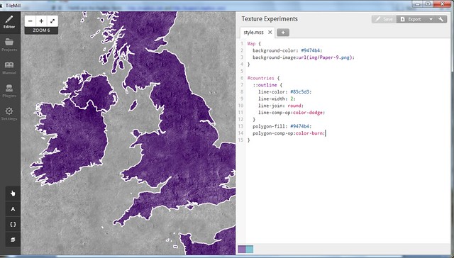
CartoCSS language. Stemming from a project called Cascadenik, CartoCSS is a collection of stylesheet code that allows a mapper to assign symbology to geodata and render it with Mapnik - by far the best image rendering engine available for cartography. This code distinctly resembles the assemblage of rule sets, blocks and properties that any web developer would use to style a web page (hint: the target user base):

 #wind {    marker-width:5;    marker-fill:#DADDE2;    marker-line-color:#fff;    marker-fill-opacity: 0.6;   }  

The highest-profile deployment of CartoCSS is in the excellent Tilemill mapping platform from the folks at Development Seed. The code drives every style choice you make in Tilemill, then it compiles everything to Mapnik and delivers you exceptional graphics, both static and web-ready. This is great news for developers, who are already comfortable with code in their workflows. Not so much for the GIS analysts (like me) who have been Arc-trained for years on how to push buttons and move sliders in the quest for a good map. Also, CartoCSS has had limited functionality for thematic mapping - a common complaint is that you can't do multivariate symbology (graduated colors and symbols, say) without awkwardly-nested code cascades.

Until now, that is. A key development has been taking place behind the scenes, one style parameter at a time -- data-driven symbology has arrived in CartoCSS as of Tilemill version 0.10.0. Let's take a look at what this means:

Figure 1 - Marker Size
Previously, you needed to specify a hard number as a value for almost every style parameter. Translated, that means the point data (representing weather stations) in figure 1A was coded like this:

 #wind { marker-width:10; }  

To make graduated symbol sizes, you previously had to put in a plague of conditional statements over many lines, each pointing to a different value for marker width. Now you can just pull those numbers from attribute data; in figure 1B, the points are graduated based on average wind speed, with the values coming from the attribute field labeled "mph":

 #wind { marker-width:[mph]; }  

You can even manipulate the attribute-derived values directly in CartoCSS with basic math. In figure 1B, I've multiplied everything by 2 for an exaggerated effect. Things get interesting when you try styling on multiple variables - one on symbol width (wind speed) and one on symbol height (station elevation) in figure 2B:

Figure 2 - Multivariate Symbology

Label placement has long been the lone data-driven feature in CartoCSS. This code renders the weather station labels in figure 3A:

 #wind { text-name:"[STATION NAME]"; }  

Now you can orient labels directly from a column, for instance to make them point in the average wind direction in figure 3B below (fun but cartographically criminal). Makers of typographic maps should pop a celebratory beer over this one; a little bit of geoprocessing and your work is automated now. [Update: I'm told the real purpose of this is to orient interesting text characters like Arrows (-->). It's all fair game.]

 #wind { text-orientation:[direction]; }  

Figure 3 - Label Rotation

Building heights for "Pseudo-3D" effects can also now be pulled from attribute data. Figure 4A shows building outlines, 4B shows all buildings rendered with a height of 8pts, and 4C shows them rendered at actual height in meters with a vertical exaggeration of 2. Woot.
Figure 4 - Dynamic Building Heights

The possibilities are not limitless here. It takes a fair amount of chopping away at the Mapnik source code to enable each of these data-driven parameters, so the list of available ones is still pretty short. Nor does this make CartoCSS the absolutely-ideal entry platform for a GIS analyst looking to get into "Map Development". However, this represents a forward leap in ease of use for mappers of all stripes, and I look forward to seeing what the community can do with this functionality.


Read more ...

Results of the Geo Toolkit Poll 2012

Monday, July 23, 2012
Many thanks to everyone who participated in this survey of the geospatial industry. I tried to get a platform-agnostic look at the tools that are most-frequently used in our community, and after 250 responses I think we have a useful glimpse of the scene.

My reason for running this survey: I'm tired of speculating. As a multi-platform user I don't know where I stand with my clients and competitors, let alone in this sprawling industry, and I've heard lots of similar curiosity from colleagues. I call this an independent survey in that no vendor funded it (nobody funded it, actually) and it isn't for marketing use. This is a community poll, nothing more. Onward . . .

Methods

This is worth a cursory glance, since the results are inevitably colored by the collection routine. I relied almost entirely on social media to get the word out, specifically:
  • Numerous twitter solicitations to my ~500 followers, retweeted to a combined audience of over 11,000 utilizing hashtags for both the ESRI User Conference and OSCon - probably annoying the crap out of everyone in the process
  • Google+ and Facebook posts
  • Listserv posts to ESRI, OSGeo, OSM and Google user groups
  • Posts on the three largest geospatial groups on LinkedIn
Given the warren-like distribution network, I do not know how many people saw this poll. Thus the sample size is 250 out of an unknown population, and no big-picture conclusions should be drawn. Also let it be known that the balance - even if measured properly - changes from month-to-month.

Results


Question 1: Which of the following geospatial technologies have you used on at least one project in the past year? [Note - I Included pre-purchase GeoCommons on its own out of morbid curiosity; I otherwise would have included it with FOSS4G Web Tools]

Some of the technologies that went into the "Other" column include FME, MicroStation, ENVI/IDL, GIS Cloud, AutoDesk, Maptitude, Idrisi, ERDAS, MapProxy, R-Spatial, Garmin Basecamp, Oracle XE, Ushahidi and Geocortex. Sorry to have ignored those, but it's a big ecosystem out there.


Question 2: Which of the above technologies did you use most frequently in the past year?


Platform Gregariousness: Do you cross over from your primary platform? e.g. ESRI is your main platform but you've also used Google Maps/Earth at least once in the past year. [A venn diagram would be cooler but the chart API was inscrutable]


Use by Business Sector:


Use by Country: (Click here for fullscreen glory - we're all cartographers here)


There's a lot to see in these distributions - an ESRI lean among U.S. respondents, a FOSS4G lean among Europeans. Also interesting to see how the sectors use these tools. See anything of note? Anything obviously-spurious? Do tell - I think there's a good discussion to be had here.

I'll say it again: this was not a scientific, controlled survey. It's a snapshot or an anectodal collection; take your pick. But it is nonetheless interesting to see what this group of mappers uses to get the job done. Thanks again to you all for pitching in, and maybe we'll try an expanded version next year.

If you're interested in the raw, messy results (stripped of unique identifiers of course), hit this link for an XLS download, and happy parsing!


Read more ...

GeoTools 2012 Poll - Round 2

Monday, July 23, 2012
Expanding the search around the Geo Community:

Read more ...