They went too far, clearly.
In publishing the precise locations and names of all the permitted handgun owners in two New York Counties, the New York Journal-News has done a serious disservice to data journalists in particular. More broadly, they may have made things more difficult for the "Open Data" community at large.
But a lot of ink and rage has already been leveled at the J-N for this; in the New York Times, David Carr pointed out that even in an era of minimized privacy this was a step too far, lacking in due diligence. Jeff Sonderman in Poynter noted that the context matters kind of a lot - that the timing and lack of justification seemed to associate the mapped gun owners with the Sandy Hook massacre. Sonderman also had sage words for those sitting on piles of prospective open-data boodle:
"If you can’t come up with a better reason than 'because we can' or 'because we think it would look cool,' stop here, you’re about to data dump."
So the smarter folks have weighed in on the implications for journalism and data management, but this awkward business leaves me with two HUMUNGO-GONZO TAKE-HOME MESSAGES for the geographic opendata community:
In publishing the precise locations and names of all the permitted handgun owners in two New York Counties, the New York Journal-News has done a serious disservice to data journalists in particular. More broadly, they may have made things more difficult for the "Open Data" community at large.
 |
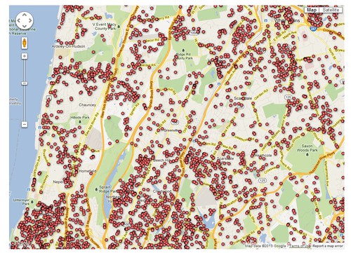
| Got guns? |
"If you can’t come up with a better reason than 'because we can' or 'because we think it would look cool,' stop here, you’re about to data dump."
So the smarter folks have weighed in on the implications for journalism and data management, but this awkward business leaves me with two HUMUNGO-GONZO TAKE-HOME MESSAGES for the geographic opendata community:
1. Aggregate to Support the Story.
We - as a society - are flat-out not comfortable with publishing the name and location of individuals. At the very least strip the identifiers out of your points; better still, aggregate the points to coarser-scale geographic units. Census blocks work fantastically well for detailed data like this, and I hear that hexagonal bins are all the rage these days. More importantly, the coarser scale brings context and emphasizes patterns; that's where the story is at.
2. QA/QC, Punks.
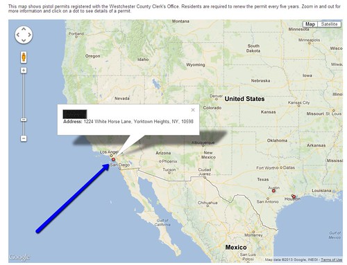
Google Fusion Tables - for all its awesomeness - is an extremely blunt instrument for data journalism. Styles, filters and deployment are all very limited for getting your message out. But fusion tables also make it a little too easy to presume accuracy. The handgun ownership maps were piped through the Google geocoding engine (by all accounts the most accurate one out there today) and deposited in their supposed locations on the map. The Journal-News may have tried to clean up the output before publishing, but they didn't catch a few that missed their targets and landed in Burbank and Houston. If you're going to publish something like this, sloppiness is profoundly unhelpful.
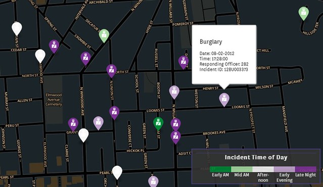
Geosprocket built an application for the Burlington Free Press (coincidentally a sister publication of the Journal-News; don't run out of free article views now!) in late 2012, in which we tried to show the month-to-month patterns of burglaries in the city of Burlington. The data was provided by the BPD in response to a FOIA request by the Free Press, and it was extremely specific - down to the address of the incident. The context and story were clear - there's a February bump in Nighttime Burglaries - and we tailored the visualization to focus on that pattern.
At the time I thought we were being conscientious by stripping out the address text and using only the badge number of the responding officer, but in retrospect I would have aggregated these to the census block level. With the cool tools available today, it's a relative snap to make a polygon flash every time an incident occurs, and let the incidents stack up in accumulated color (though not so much of a snap that I'll do it for a blog post).
Basically, the Journal-News handgun owners' map has caused me to rethink a few of my own methods, and I hope provided us all with a sense of the threshold between responsible data journalism and data dumping.
 |
| Yeah, that guy doesn't live there. |
Geosprocket built an application for the Burlington Free Press (coincidentally a sister publication of the Journal-News; don't run out of free article views now!) in late 2012, in which we tried to show the month-to-month patterns of burglaries in the city of Burlington. The data was provided by the BPD in response to a FOIA request by the Free Press, and it was extremely specific - down to the address of the incident. The context and story were clear - there's a February bump in Nighttime Burglaries - and we tailored the visualization to focus on that pattern.
 |
| BTVCrime - via the Burlington Free Press |
Basically, the Journal-News handgun owners' map has caused me to rethink a few of my own methods, and I hope provided us all with a sense of the threshold between responsible data journalism and data dumping.
No comments:
Post a Comment