I'll be wrapping up a series of existing projects, but then Geosprocket will be on hold. Thanks to all of you who have been such great clients, collaborators, mentors and friends. I look forward to keeping the conversation going!
Moving to a New Gig
Monday, February 10, 2014
I'll be wrapping up a series of existing projects, but then Geosprocket will be on hold. Thanks to all of you who have been such great clients, collaborators, mentors and friends. I look forward to keeping the conversation going!
Redistricting: A Question and a Query
Wednesday, January 15, 2014
Alert: Both policy AND technology will be discussed below. Bring both your brains. You've been warned.
I was unrealistic early on about how much of a role technology could play in the process. A survey of neighborhood geographic identity and a do-it-yourself redistricting app were helpful but not game-changing. After years of wrangling, the parties mostly just hashed it out in committee (though the final plan is derived from one made with our DistrictBuilder app), and now in about 6 weeks the voters will approve or reject it.
Which brings me to the question: What would the proposed plan change things for the average BTV citizen? It's a pretty easy one to answer in the aggregate - all the information is out there: new boundaries, old boundaries, population distribution, polling locations. But these bits are spread out across various sites and articles. What if there was a way to just ask the question: How will this change things for me?
Under the umbrella of CodeForBTV - the local CodeforAmerica brigade - I put together the basic answering tool. Built for phones (via Bootstrap), the app lets the user plug in their address and get back a list of redistricting plan implications:
It's a simple app, relying on some robust APIs. I hope it's useful in getting my neighbors oriented to the landscape of the proposed redistricting. At the very least it'll save people some time peering at a large paper map in city hall, and at best it'll head off 40,000 individual "how will this affect me" emails directed at the city councilors and GIS manager.
I also hope it'll be of use to anyone else who wants to present geographic change over time at a user-selected location. Get the code on github.
![]() |
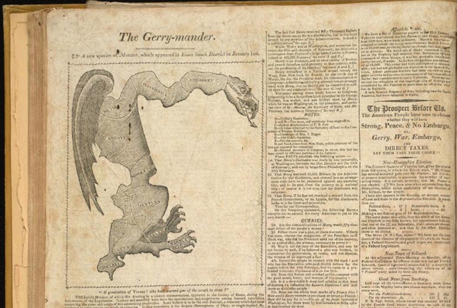
| Gotta love the classics |
The Question
My city is on the tail end of the country's redistricting cycle. Somehow while Texas was marginalizing Latinos and Dennis Kucinich was getting scribbled out of his constituency, we here in Burlington were waffling over how to deal with triparty politics and the implications of our changing neighborhoods.I was unrealistic early on about how much of a role technology could play in the process. A survey of neighborhood geographic identity and a do-it-yourself redistricting app were helpful but not game-changing. After years of wrangling, the parties mostly just hashed it out in committee (though the final plan is derived from one made with our DistrictBuilder app), and now in about 6 weeks the voters will approve or reject it.
Which brings me to the question: What would the proposed plan change things for the average BTV citizen? It's a pretty easy one to answer in the aggregate - all the information is out there: new boundaries, old boundaries, population distribution, polling locations. But these bits are spread out across various sites and articles. What if there was a way to just ask the question: How will this change things for me?
Under the umbrella of CodeForBTV - the local CodeforAmerica brigade - I put together the basic answering tool. Built for phones (via Bootstrap), the app lets the user plug in their address and get back a list of redistricting plan implications:
The Query
The question of individual impact can be answered with a simple spatial query: return some pieces of information based on the polygons that intersect the user's location. This pointed to some basic building blocks:- The city redistricting plan - both the old wards and the new ones lumped into one geojson file
- A robust search engine - I went with the Google Maps API because of the amazing viewport-biased geocoding and the built-in typeahead, but given more time I would use Leaflet and a state-hosted geocoder plus typeahead.js
- Spatial query capability - fortunately CartoDB offers all the magic of PostGIS at a URL endpoint, with great styling available as well.
It's a simple app, relying on some robust APIs. I hope it's useful in getting my neighbors oriented to the landscape of the proposed redistricting. At the very least it'll save people some time peering at a large paper map in city hall, and at best it'll head off 40,000 individual "how will this affect me" emails directed at the city councilors and GIS manager.
I also hope it'll be of use to anyone else who wants to present geographic change over time at a user-selected location. Get the code on github.
Labels:
cartodb,
census,
google maps,
Maps,
mobile,
Open Data,
Open Source,
Politics,
population,
PostGIS,
redistricting,
responsive design,
vote
On Reverse-Engineering a Map Stack
Saturday, January 11, 2014
I'm going to come right out and say this:
You should probably just use Mapbox.
How I came to that conclusion is a bit of a longer story.
The Scene
As a cartographer, I am an unabashed fan of Mapbox. I've been using Tilemill for years, and I love the fully-realized design of the Mapbox Streets basemaps. Even before Google Maps brought the paywall hammer down I was already migrating my clients' projects to the open-source ecosystem based out of a D.C. garage. Controlling so much of the stack in an open-source environment meant less risk to my clients, and in most cases it came out a lot cheaper. The choice was pretty easy, actually.
Looking around this section of the market I don't believe that Mapbox and Google Maps have anyone to compete with but each other (mobile is another story). They are the only two companies currently offering a rigorous javascript API tightly integrated with attractive map services built for the web. (Debate this in the comments, ESRI, Nokia, and Bing users) There are plenty of a la carte options out there - Stamen's wonderful map tiles, the sheer power of the OpenLayers API - but as a lazy developer I've come to really like working with an integrated, open stack. Mapbox is my current choice, though many use cases all but require Google's services.
The Challenge
An open-source stack doesn't mean a free stack, and Mapbox's map tile charges can rack up quickly if you're not paying attention. Exhibit A: I offered Brandon Martin-Anderson one of my Mapbox tilesets to use as a reference for his Census Dotmap. Several viral weeks later I was looking at overages the size of my annual budget.
An open-source stack may not always be free, but in theory it can be copied and hosted by others. I've done this quite a bit on the javascript API side, mixing and matching tile providers with various client libraries. However, the costs that had begun to concern me were on the basemap end. So I set out to do what Mapbox flat-out encourages you to do with its wide-open codebase:
I would make and serve my own damn basemap. How hard could it be?
An open-source stack may not always be free, but in theory it can be copied and hosted by others. I've done this quite a bit on the javascript API side, mixing and matching tile providers with various client libraries. However, the costs that had begun to concern me were on the basemap end. So I set out to do what Mapbox flat-out encourages you to do with its wide-open codebase:
I would make and serve my own damn basemap. How hard could it be?
The Tools
- Openstreetmap Data
- QGIS
- osm2pgsql
- PostGIS
- Tilemill
- OSM-Bright Template
- mbutil
- s3cmd
- A big ol' S3 bucket on Amazon Web Services
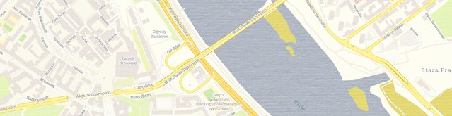
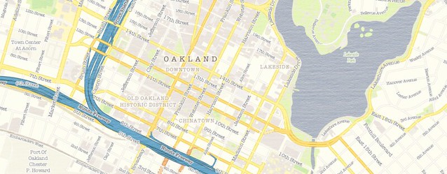
I started with the open-source Tilemill template OSM-Bright, noting that there are some good examples of it in use out there. I grabbed the current OSM data, piped it into my local PostGIS database (note the hazards of adding many extracts) and spent some time turning it into "Geosprocket-Bright" in Tilemill:
Let's keep track of the time investment, shall we?
- 4 hours to export everything from Tilemill
- 6 hours to chop the .mbtiles into 1.6 million PNGs
- 3 hours to consolidate them all into a single directory structure (because I was too dumb to do that in the last step)
- 56 hours to push the tiles to an S3 bucket on a 20mbps connection
Obviously these are CPU hours, not billable hours - but it was still more than two days between when my map style was ready and when I could actually hook the map up to a browser.
The Verdict
This is a narrow case where I needed to roll my own tiles and serve them. My map included texture and custom fonts, which is beyond the reach of Mapbox Streets. The total filesize of my exports - even as .mbtiles - was 15GB; that translates to the Premium Mapbox hosting plan, and a whopping $6,000 flat fee per year. That's for five cities - the tiniest fraction of a world of tiles. It's not quite Google Maps Enterprise money, but damn. By contrast, it cost me nine bucks to get all of my map tiles into an S3 bucket, where I'll get billed something like half a cent per 1,000 map views.
But this process will be moot pretty soon anyway; the promise of Tilemill 2 is that you only need to bring your cartography to the table - Mapbox will do the rest of the work to get your style to the browser with vector tiles. They've only done this for a few testers while they're hashing out the details, but odds are there will be a public version in the first half of 2014.
In keeping with other examples of open-source underpinning software-as-a-service, Mapbox has a sound business model. Despite the huge amount of intellectual capital they've open-sourced, it is still easier and - when time spent is considered - VASTLY cheaper to just use their hosted map services. I suspect they've been totally aware of this even as they release service-liberating tools like Tilemill, OSM-Bright and mbutil. The scale and efficiency of Mapbox make their hosted maps too good to avoid.
I hope my experience here has been instructive to others.
The Product
I did get a map out of my experiment, and it's free to use. If you happen to be mapping in Warsaw, Sochi, Santo Domingo, LA or the Bay Area, I hope it proves useful. Just use this XYZ tile scheme in your client implementation:
http://s3.amazonaws.com/geosprocket/tiles/{z}/{x}/{y}.png
As per the usual OSM license, be sure to include "© OpenStreetMap contributors". Happy Mapping!
Labels:
CartoCSS,
cartography,
design,
google,
google maps,
MapBox,
Mapnik,
OpenStreetmap,
PostGIS,
QGIS,
stamen,
symbology,
texture,
tilemill,
vector tiles
The District Plows Tonight
Thursday, January 2, 2014
It will surprise no one in Vermont if I say it's cold tonight.
On the fun side, during the last storm in D.C. Jeremy Bowers of NPR wrote a handy script ("Mister Plow") to scrape location data for the city's plow fleet and offer it up as a live feed. Since this sort of screamed for a map, I built one, and now it can serve for this storm:
It's lacking a good temporal symbology, but it'll do to see if the plow has been by your street recently. The mechanism is Leaflet, Mapbox Satellite, and a dose of PHP to parse the feed. Grab it here if you dare.
I FOUND THEIR NEST! DEAR GOD, THE PLOWS ARE SWARMING!
We've got Barrow, Alaska beat at 10pm. It's been that way most of the day and should continue tomorrow. #btv pic.twitter.com/EiVDjEbGwt
— Channel 3 Weather (@wcaxweather) January 3, 2014
So I'm indoors, and bemused to note that it's also snowing down in the nation's capital, where such things tend to bring out the crazy in the more troglodyte-like elected representatives.On the fun side, during the last storm in D.C. Jeremy Bowers of NPR wrote a handy script ("Mister Plow") to scrape location data for the city's plow fleet and offer it up as a live feed. Since this sort of screamed for a map, I built one, and now it can serve for this storm:
It's lacking a good temporal symbology, but it'll do to see if the plow has been by your street recently. The mechanism is Leaflet, Mapbox Satellite, and a dose of PHP to parse the feed. Grab it here if you dare.
I FOUND THEIR NEST! DEAR GOD, THE PLOWS ARE SWARMING!
What a difference a decade makes in satellite imaging
Tuesday, November 26, 2013
It seems like there's an armada of new earth-imaging satellites headed for orbit every day. As we consider the changes afoot in an industry where entry costs have traditionally been measured as a percent of GDP, it's worth a look at the tools of today's remote sensors.
Something has sure as hell been disrupted here. We're about to find out what.
This is a commercial, high-resolution earth imaging satellite before launch in 2001:
![]() |
| QuickBird 1 being prepped in 2001. Image courtesy of DigitalGlobe |
And this is a roomful of them in 2013:
![]() |
| The PlanetLabs crew and their fleet of Doves, 2013. |
Something has sure as hell been disrupted here. We're about to find out what.
Labels:
digitalglobe,
google earth,
MapBox,
Open Data,
planetlabs,
remote sensing,
satellite
How to build a Mobile-First Map Form
Friday, November 8, 2013
![]() |
| Find me, small screen. |
I've spent a lot of time thinking about the incredibly rich experiences we're getting these days from a digital map paradigm basically invented by Google in 2005.
A rich experience everywhere but on mobile devices, that is.
The dichotomy is pretty intense - on our larger screens, we have data visualizations of artful grandeur. We have amazing cartography in tiles and vectors, and we have smooth analytical tools. We're even approaching "GIS on the Web" that doesn't suck.
But then you turn on your phone and the best applications use oblique-angle maps the same way they did in Car SatNavs a decade ago.
I don't have an answer to this problem, I just mean to say I've been thinking about it. And it turns out that a bunch of the technologies I use regularly can be pretty easily combined to offer some possible fixes for how a user experiences maps on mobile. I'll walk you through them while trying to tackle a basic application: a location-based survey.
1.) Bootstrap
I get it. I overuse Bootstrap for the architecture of my sites. But in the latest release (3.0) they went "Mobile First", so it makes many of my other tasks easy by providing the responsive classes out of the box:2.) Google Forms
I still think of Google Forms as an underutilized gem for easy data collection: pipe data from a form to a spreadsheet with an API; one barely needs to try anymore :) However, tying a custom Bootstrap page to a specific google form requires a few things available in the source code of the input form's page:- Form identifiers:
- Field-specific IDs:
- A Redirection iframe:
3.) Mapbox.js
Most of the necessary functions here are actually native to Leaflet, but I like the look of the Mapbox implementation, and they provide "Retina Tiles" that scale better for mobile. The basic tasks for the map in this application are:- Figure out user location without asking
- Let the user fix the inevitably-incorrect positioning
This works with a quick call to a free IP registry, centering the map on the result:
Then the user can drag the map around under the crosshair to where they actually are - this is a tactic I borrowed from OpenPlans after I got a reminder:
@mourner @vtcraghead an alternative would be to just let people drag the map and have the center be the target
— tschaub (@tschaub) November 7, 2013
4.) CartoDB
Using a new tool they've made available to sync tables, there's almost no code involved in this step. All I needed to do was go to "File-->Publish" in the form target spreadsheet, then copy the .csv URL into the "New Table" creation dialog in CartoDB. Then a bit of easy styling created a custom-mapped results page:
The page itself is pretty simple, and you can grab it as a gist here. It'd be pretty easy to fork it and replace the form parameters with one of your own. As always, please share if you use it; I'd love to see where others take this.
The Caveats and Alternatives:
- Geolocation by IP is pretty awful, unless you happen to be Google (but in that case you're currently being sued for the method by which you collected your registry). The service I used put me in the correct city on my laptop, the correct state on my tablet, but according to my phone I'm in Buffalo. There are better ways to get location, but they require user permission, which is a UX hurdle I didn't want to jump for this.
- I subscribe to the gospel of responsive design because I'm lazy. It would probably be smoother to build this as a native Android/iOS app, but no way would it be this easy.
- Since location is being passed to the table from the initial map, there's no geocoding and you could theoretically just tap the Google Drive API to put points on a results map. But again: EASY. CartoDB is that :)
#Facepalm
In the first run I forgot the mobile-specific meta tag. I was reminded :) Thanks, Vladimir!
@vtcraghead yeah, it's not marker's fault, fix the page scale with a correct meta tag :)
— Vladimir Agafonkin (@mourner) November 7, 2013
Labels:
bootstrap,
cartodb,
cartography,
CSS,
geocoding,
geojson,
geometry,
github,
google,
javascript,
MapBox,
Open Source,
responsive design,
web design,
web map
Seamless Textures for Tilemill
Thursday, October 24, 2013
As evidenced by AJ Ashton's announcement this week, Tilemill keeps getting cooler. With vector tiles and Tilemill 2 on the horizon it seems like anything will be cartographically possible, but I've been having fun while we wait.
Tilemill allows you to fill a polygon or feature with an image instead of a plain color, which makes for some cool pattern and feel options:
However, you need to be careful not to run afoul of the tiling system that repeats any such image in gridded 512px intervals. You can get some funky edges if you're not paying attention. The solution to this is to use a seamless image - i.e. an image where every edge matches up with its opposite. There are quite a few options out there for seamless backgrounds, but not very many that are both square and 512px on a side. So I followed the lead of the talented artists at Stamen and reluctantly opened photoshop to make some seamless texture images of my own for Tilemill.
Tilemill allows you to fill a polygon or feature with an image instead of a plain color, which makes for some cool pattern and feel options:
However, you need to be careful not to run afoul of the tiling system that repeats any such image in gridded 512px intervals. You can get some funky edges if you're not paying attention. The solution to this is to use a seamless image - i.e. an image where every edge matches up with its opposite. There are quite a few options out there for seamless backgrounds, but not very many that are both square and 512px on a side. So I followed the lead of the talented artists at Stamen and reluctantly opened photoshop to make some seamless texture images of my own for Tilemill.
There are 12 of them, and you can grab them here, licensed CC-by-SA.
I'm personally inclined to overuse things like this once I've made them available (I used them last weekend at StoryHack, actually), so it's going to take some time before I find the right subtle level. I'll let you know when I get there.
Have fun! And I'd love to see any examples of these in the wild once you put them to use . . .
Labels:
CartoCSS,
cartography,
CSS,
design,
MapBox,
Mapnik,
stamen,
texture,
tilemill,
vector tiles,
web design
5 Reference Recipes
Thursday, October 17, 2013
At the risk of beating a dead horse, I'm coming back to reference overlays. I've noticed that there a still a fair number of interactive maps online that permit a bullying thematic layer to stomp all over the poor, defenseless map labels and context information. This is not cool:
So I've hashed out the code for getting past this using five common basemap services:
Feel free to reuse them as you see fit. All but the Google example use Leaflet, but the z-index and canvas manipulation tactics are applicable to other APIs as well. If anyone wants to add adaptations for OpenLayers or whatnot I welcome pull requests. Also worth a note is that - in the leaflet examples - the thematic layer is rendered as vector from topojson, which is arguably the fastest vector format available to us today. Give it a shot as a thematic mapping tool.
Go forth and bring context back to your interactive maps!
Note: Thanks to Bobby Sudekum, Josh Livni and Jason Sanford for the starting blocks.
Labels:
bing,
cartography,
code,
CSS,
ESRI,
github,
google,
google maps,
graduated colors,
javascript,
MapBox,
stamen,
topojson,
web map
Crime Doesn't {{Insert Variable}}
Tuesday, September 17, 2013
tl;dr
There's no citywide relationship between crime rate and elevation in San Francisco. It's because there are other factors at work - like property value, income, tourism, etc. - in between the two. But there are a few discrete spots around the downtown area where it is at least partially accurate to say "Crime doesn't climb" - check out the last map on this page.Crime Doesn't What?
Dammit, I love hexbins. I love their flow complexity, I love their visual appeal, I defend them where necessary, and I use them wherever I can. However, sometimes hexbins don't tell the whole story.Last week a couple of talented Bay Area developers put some of San Francisco's new open data to use, testing the old adage that "Crime Doesn't Climb" in the city. They compiled SFPD crime statistics in elevation-based strata and found - indeed - that the lion's share of SanFranCrime occurs closest to sea level. Recognizing a bit of simplicity in this argument, they went a step further and adjusted the numbers to account for the fact that there is simply more space - more crime-canvas, if you will - at lower elevations. The results were the same: lots of crime low, not much up high.
The web reacted with characteristic nuance and reason:
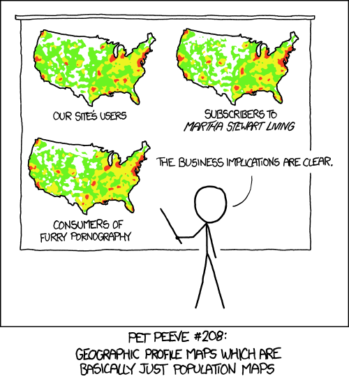
Because at it's heart, this analysis has already been critiqued by Randall Munroe:
Crime occurs where people - perpetrators and victims - are already concentrated. As such, any explanation of when/where/why has to account for population.
Population
The best level of detail available on population is the U.S. Census block. In a city as big as San Francisco, there are thousands of these, each with a very credible population count. They're not as spatially consistent as hexbins, but they're accurate:Elevation
Elevation variation also contributes to the city's distinct character:Crime
And the frequency of crime seems to reflect a bit of both population and elevation:
Labels:
cartodb,
cartography,
census,
colinearity,
crime,
gis,
github,
Maps,
Open Data,
population,
spatial analysis
Piano/Source
Sunday, August 18, 2013
I remember the moment I realized I needed to learn how to play the piano.
[Psssst. Keep reading; this is still about maps!]
During my second semester at Berklee, I found myself with a bunch of fellow art-nerds, sitting in an apartment watching a video [VHS whaaaaa!] about a dance piece collaboration between Garth Fagan and Wynton Marsalis called "Griot New York". Wynton rolls into a rehearsal toting his horn in a gig bag and rolling a full-size yamaha keyboard behind him. As the voice-over goes into dance/music duality overanalysis mode, I see that Wynton is playing the trumpet with his right hand and laying down chord progressions on the keys with his left hand.
Sure, I'd heard about Dizzy Gillespie, John Coltrane, Charlie Haden et al. doing their composing on piano. I'd gotten all sorts of pressure to put down my horn and practice the keys regularly as a way of understanding the harmonic roots of the music I wanted to play. But this was live proof - in the form of one of the greatest virtuosos of a generation - that a melody instrument could only take you so far in both performance and composition before you needed Western music's chosen tool for getting at the harmony underneath.
My not-so-subtle point is that the same goes for programming in GIS. Bill Dollins and Adena Schutzberg wrote more eloquently than I ever will about the need for GIS practitioners to learn to code. But I just realized I've been down this road before. I played trumpet for years before buckling down (under degree requirements, really) and setting my fingers to piano keys. And I worked from ArcView and ArcMap for years before realizing that I needed proficiency in python and javascript.
The piano is a compiled language, to be sure - several steps abstracted from the wonder that is our perception of tone and harmony. But it fits the question I've heard time and time again from GIS analysts, and seen in blog-nonsense form hither and yon:
Do I really need to learn python/piano?
Yes. Your advancement as a scientist/artist will not be possible without it.
Let me close with another question brought on by this crude metaphor: If the piano is Fortran, does music have a kernel? :)
Tiled Basemaps Survey 2013 - Results!
Tuesday, August 6, 2013
![]() |
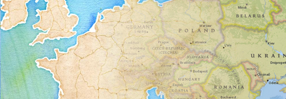
| From Stamen, OSM Contributors and National Geographic |
The results are in!
123 helpful participants submitted their thoughts on their favorite basemap services, and without further ado I present some of the results:
Which tiled basemap is most cartographically appealing to you?
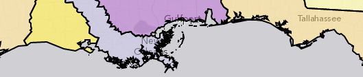
Google, National Geographic (served via ESRI), and Mapbox are the winners here, with support for Stamen's options as well. "Other" in this case included OSU's Crinkled Watercolor and OpenCycleMap. Between the Stamen, OSM-Mapnik and Mapbox selections here, tiles based on OpenStreetmap data were ahead of the others. But this is a popularity contest based on looks. Moving on to substance . . .
Which tiled basemap do you use most frequently in your projects?
Google wins on ubiquity. Almost half of the respondent pool uses Google's tiles first; though given the widespread adoption of the API this is not a great surprise. More interesting is that about half of these Google users find a different basemap to be more attractive. Which brings us to . . .
What factors drive the choice of basemap for your projects?
Respondents could choose more than one here, but it's clear that not many balked at the technical challenge or vendor lock-in concerns. Mostly it seems like choices were driven by a balance between aesthetics and quality/detail, with cost and licensing hovering in the back of respondents' minds.
What do you like best about your "cartographic favorite"?
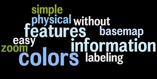
Unpacking these results is best done with a series of [gasp!] word clouds for the top three choices. You might call it a word storm . . .
National Geographic:
Mapbox:
Google:
Interpret these as you will - subjective assessments have a way of bleeding from one choice to another. For instance, it looks like everyone likes the "colors".
Whoa there . . .
This is not a scientific survey. And despite my best efforts to reach out to all the communities involved, it's probably not even terribly representative. But it's interesting to inspect the choices made by this particular group of mappers, and fantastic that so many were willing to share their thoughts. Check out the unvarnished results here - mostly interesting to see the full explanations of what folks like about their preferred aesthetic.
As always, drop me a line if you have any questions or concerns about these results. Thanks to all who participated!
Labels:
apple,
cartography,
design,
ESRI,
google,
google maps,
map,
MapBox,
National Geographic,
nokia,
OpenStreetmap,
stamen,
symbology,
web design,
web map
Open Cadastral Data: a Github Test Case
Wednesday, July 24, 2013
A bolt of GIS-Manna from Heaven
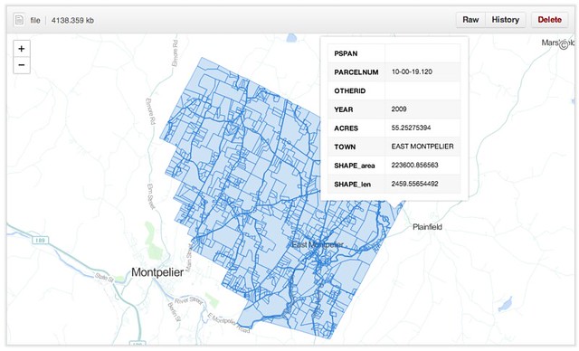
A dedicated and talented GIS developer at the VT Agency of Natural Resources just finished compiling the most-comprehensive cadastral dataset to which our small state has ever had access. Coincidentally he sent out the announcement while I was annoying a few githubbers about their new geodata capabilities. What luck: a test case.The dataset - as a shapefile - clocks in at 250MB, representing 289,000 parcel polygons in 191 towns. [The 46 VT towns not included tend to have populations under 200 and a blithe commitment to dusty paper records.] It turns out that this is over the 100MB limit imposed on individual files, so I pulled the dataset, split it by town and converted the outputs to geojson, then pushed them to a repository I just set up. The largest of these is juuuuust over the maximum file size to be renderable in Github's snazzy new Mapbox-based interactive maps, but most of the town parcel maps pop up just fine.
The Implications
Okay, great - another slippy map somewhere on the web. Who cares? These folks, actually:- A landowner who wants to look up the parcel numbers of her abutting properties without visiting the steam pipe distribution venue in the basement of her local town hall.
- A town GIS manager who has a hard drive overflowing with parcel shapefiles, converted CAD drawings and map requests from lawyers.
- Probably a lot of lawyers. Don't get me started.
- The overworked data gurus at the Vermont Center for Geographic Information (VCGI), who - while they're probably the only agency that can handle it - are really reluctant to take on management of a statewide, rolling, versioned database.
What Github provides in this test case, for free:
- Fast hosting of modestly-large geospatial data
- Relatively-simple version control of said data
- Edit access to anyone with a github account and a GIS platform (FOSS or Arc'ed)
- An embeddable client view for the public for files up to 10MB
- A robust API for client views bigger than that (for example)
- A muthaflippin' download button (well, "save page as")
For those of us who have been ranting about geoportals in recent months, this pretty much covers the bases. For free. Github is walking the #opendata walk.
What's Next . . .
There are a whole bunch of caveats here. Biggest is the file size issue (though I've seen Bill Dollins and Sophia Parafina starting to work around that in the past few days), since 10MB is a fine limit for municipalities in the second-smallest state, but Manhattan is a teensy bit bigger. Another hitch is data quality; this dataset is top-of-the-line, but like any other it's missing SPAN numbers, dates and acreages here and there. The vendors will tell you that quality can't be beefed up in a free collaborative environment, without data value-add. I don't know if they're right or wrong.
But I'd love to see a town GIS manager throw a pull request and get this ball rolling. Who's up for it?
The data hub is waiting right here
Update: 7/25/13
I've heard a bunch of awesome questions about the practicalities of using Github this way, so while I am by no means a power user I recorded a quick demo video.
The data hub is waiting right here
Update: 7/25/13
I've heard a bunch of awesome questions about the practicalities of using Github this way, so while I am by no means a power user I recorded a quick demo video.
Maps in a Responsive Page
Sunday, July 21, 2013
Heaven help me - I've been building a responsive infographic.
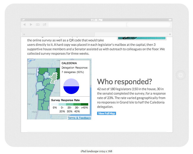
Specifically, I used Bootstrap to flesh out a not-really-infinite-scroll site that summarizes the findings of a survey - done by some #opengov types on social media use in the Vermont legislature. Getting the infographic confession aside, my point in mentioning it is that I wanted to include a map of responses by county, and that posed a dilemma.
I went with a responsive layout for the page because I know that 50% or more of the traffic will be from mobile clicks - the kind of viewing experience that makes a tricked-out slippy map either frustrating or useless. So I'd need something more flexible than my usual portfolio. Fortunately, a few months ago responsive-design-zealot Brad Frost had talked about using a combination of static and dynamic maps for the same purpose depending on available screen real estate. I thought it was cool but at the time had no use for it. Enter this recipe:
Ingredients:
1.) An API that provides both static and dynamic endpoints: Check. Mapbox FTW.
2.) A Responsive layout: Check. Bootstrap is out-of-the-box.
3.) A snippet of javascript to load the map according to screen size: Check. Repurposed here.
I knocked together a dynamic map using Tilemill and mapbox.js - this let me do some cool linking of SVG hover states and popup information windows. As a bonus I could disable pan and zoom to make it more like an interactive image and fit better into the overall page context. [Yes, haters, you're right - I should have done this with D3. Gimme a break; I'll get to it.] I then grabbed the map's PNG equivalent from the Mapbox Static API and plugged it into the code as the "static" option.
In Mr. Frost's original his "embed" option for larger screens is the standard google maps embed string. I wanted more features than were available with a standard mapbox embed, so I built the site separately with mapbox.js and "iframed" it in. This is just as much of an ugly hack as it seems, but it works.
The result is a map that renders big and fully-interactive on tablets and larger:
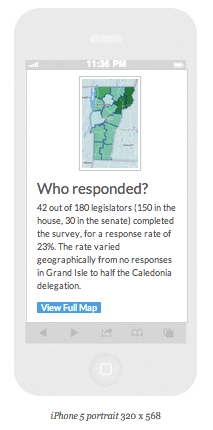
But shows a teaser image and a link to see more on a small screen:
This is obviously not a perfect solution, but it fits the purpose here. And it's also extendable - consider if you had to generate dozens of pages like this - you could do it just by programmatically changing the lat/lon or index value of both the static and the embed maps. Also worth noting is that this strategy works with both Mapbox and Google APIs.
As we move into a web that's even more solidly mobile-centric, we'll need to keep adapting maps with the resources we have available. It's actually a lot of fun trying to keep up.
Click here to see it in action
Labels:
bootstrap,
infographic,
map,
MapBox,
responsive design
Tiled Basemaps: the Survey
Monday, July 8, 2013
The time has come once again for a taking of the geopulse! In years past I've asked broad questions about platform-level technology use, but this year I'm getting more specific:
Yes, I realize that the very concept of tiles is about to go the way of the Avenue script, but the present moment is still flush with amazing cartography served up in square chunks. For this survey I've chosen a selection of "Streetmap" styles from the major players, since imagery is another can of worms entirely.
I've built a comparison app here (with thanks to Dair Grant for the idea). Check it out and vote for your favorite.
Note: It's not possible to get a perfect comparison, since some maps tiles are locked to a particular API (what up, Apple), and others were too hard to parse into a single web map (Was a quadkey scheme really necessary, Bing?). Feel free to add these in if they serve as your go-to basemaps anyway.
Thanks for participating, and check back here for results in a few weeks!
Labels:
apple,
bing,
cartography,
design,
ESRI,
google,
google maps,
map,
MapBox,
Mapnik,
microsoft,
National Geographic,
nokia,
OpenStreetmap,
stamen,
vector tiles,
web design,
web map
5 Examples of an Inflection Point for Maps on the Web
Monday, June 3, 2013
Some recent thoughts by Brandon Rosage reminded me that webcartographics (I should trademark that one) are the midst of a change. Since the dawn of Mapserver, we've been building maps into our websites in a segregated fashion, often treating the map as little more than an <iframe> keyed to a CMS. This works well enough in a short blog or location description, but there are more engaging stories to tell with cartography, and better ways to deal with UX complexity than just adding more markers.
Fortunately some great developers are steadily building tighter integration between geography and web design. My favorite recent examples of this follow:
1. Chasing the Boston Bombers
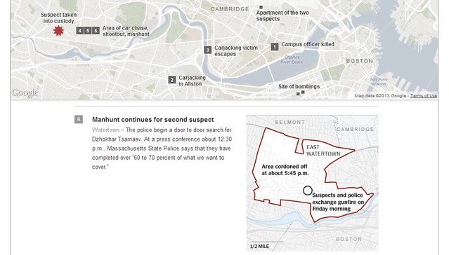
A maps-in-the-background piece on the Boston bombings from the New York Times Graphics Department uses a Google static map as a location-based table of contents to a scrollable storyline highlighted with more maps and photos.2. The Royal Navy in WWI
From Vizzuality, a moving record of Allied ship traffic in WWI was derived from their work crowdsourcing the transcription of old ships logs. This is more of a show than an interactive piece, which works perfectly to illustrate the flurry of activity around major geopolitical events.
3. The Adventure of the Bruce-Partington Plans
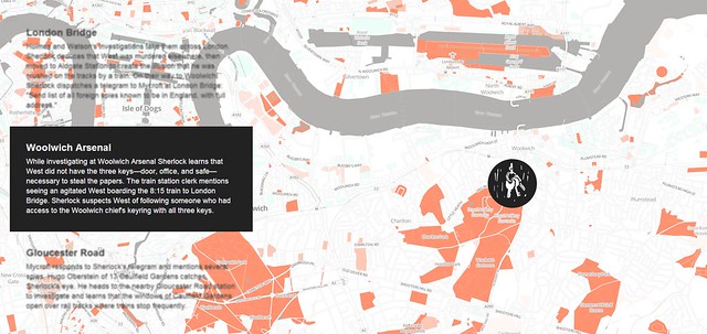
Young Hahn's Mapbox-based adaptation of a Sherlock Holmes storyline changes the click-and-drag paradigm of the web map by tying map navigation exlusively to a scrolling text storyline. Unlike the NYTimes piece above, the map does move - but only as the narrative progresses. Bonus points that it's responsive, making this an equally-rich read on mobile.4. Crowdmap's New Layout
Crowdmap has some great potential here, though it's still being pulled in several directions by varying stakeholders. The previous version was a codeless window into Ushahidi's functionality, and that was great for easy access to a map-within-a-CMS. But with the current iteration they've tried to bring the focus to a map driven by its content, rather than content accessed via a map.5. Hurricane Sandy Coastal Impacts
Another entry in the the journalism category, this tour-de-force from Derek Watkins treats the coastal axis (North-to-South) as a narrative, attaching aerial photos seamlessly to a thematic map built with the D3 javascript library. Perhaps the coolest part of this one is what it implies - D3 is one of the best emerging tools for breaking maps out of "Plugin" status and letting them interact seamlessly with the architecture of web design. This is looking more and more like a window into the future of maps on the web.
Labels:
cartodb,
cartography,
crowdmap,
CSS,
d3,
design,
google maps,
journalism,
MapBox,
Maps,
ushahidi,
web design,
web map
We Are Still Talking About These Things: Dispatches from the Dawn of Crowdsourcing
Thursday, May 23, 2013
I was just having a conversation with some colleagues about the nuts and bolts of participatory mapping with some local farmers. We were all:
"Man, it totally depends on if you have internet at the site. If you do, just pull up Google Maps or CartoDB and have them digitize right into the iPad. If not it's a huge hassle; you'd have to annotate a PDF and georeference it later."
"Yeah, but either way the stylus is key. Non-technicians always want to use a pen and paper."This talk of getting a skeumorphic data-entry device in the hands of the common folk reminded me of something from the past. This, specifically:
Even taking as a fact of life that community GIS will always require some mediation by the more technically skilled, Al-Kodmany's Chicago neighbourhood projects are not a little bit extreme. In fact, by the time he describes the community members being given 'coloring the map' participation exercises as a way to actually participate, there is a rather patronizing air about the project. 'Participants were broken into small groups and were given a map and felt-tipped markers,' he writes. Felt so as not to inadvertently poke out their own eyeballs, no doubt.
This from Christopher Miller, writing in 2006 about how participatory GIS (nee "GIS/2") was being hamstrung by academic condescension, cultural barriers and the failure of imagination that is traditional GIS ("GIS/1"). Man, 2006 sounds like a long time ago from here, but we're still spinning our wheels in some ways on this stuff.
Based on Andy Woodruff's Boston-oriented project, last year I built an app to get locals defining the boundaries of neighborhoods in the city of Burlington. When I showed up to the first hearings on city redistricting to present the results, their credibility was questioned by some who hadn't heard of the project, even though it had been announced in every local news outlet as well as digital channels. These were people who showed up to meetings, because that was how you participated. Not learning my lesson, I adapted Azavea's Districtbuilder app for the redistricting process and made it public, hoping "participatory technology" would open a traditionally-closed political world. It turns out that the technology wasn't really the problem.
In his snark-laden, brilliant 2006 paper, Miller goes on to describe this neat little app called Scipionus, built in the aftermath of Hurricane Katrina on the back of a newly-opened Google Maps API. Here's the thing: it let anyone with a web connection report their location and status on a Google Map! Fast-forward three years and Ushahidi comes along. Fast-forward another three years and Google Maps gets collaborative, Crowdmap is everywhere and Twitter becomes a news source. Fast-forward to last month and the most reliable information on a civil war is from a participatory map, and Ushahidi can take in reports from every technology short of smoke signals.
We still don't have good retorts to Miller's challenges. We still haven't made GIS accessible to the public, and I'm not really sure that's a valid goal. More importantly, we seem to be driving deeper into the gulch between Internet-Worshippers and Tech-Hostile Curmudgeons that Miller warned us about. Whether we're community-building, solving disputes or reporting the news, we've got to do a better job building bridges between the public and our maps.
In many cases, "Paticipation" is still a felt-tipped marker jabbed into the eyeball.
Labels:
#SMEM,
cartography,
crisis mapping,
crowdsourcing,
democracy,
desktop gis,
gis,
google,
google maps,
map,
web map
Taking Tilemill 2 for a Spin
Sunday, May 19, 2013
When I took my first GIS class, I was told that 5% of my time would be spent making maps, while 90% of it would be spent corralling data into usable format and 5% would be spent beating an unresponsive plotter with a cardboard tube. This balance has definitely changed as interoperability has gone from prayer to practice, but I've continued to be frustrated by the time I feel gets lost to a missing shapefile extension or a falsely-defined projection.
For all the fun afforded us by Mapbox's original Tilemill map design platform, it's always been sort of a GIS-y hassle to wrangle data into it. Mind you this is slight, glancing criticism - it's NOTHING compared to getting your geodata to work in Illustrator or any actual GIS platform. But I always found myself wishing I could spend less time racking my brain for where I put that awesome building footprint layer, or trying in vain to find the right ORDER BY syntax for a PostGIS datasource.
Perhaps you've heard, but Mapbox sort of solved my whiny problems. Tilemill 2 is in unsupported alpha, but it's already fulfilling my dream of data-agnostic cartography. The basic idea is that the world - as derived from OpenStreetmap - is some pretty centralizable basedata, so why not just tap the source and style it however you like? Instead of pulling extracts or copies or subsets, Tilemill 2 just gives you the whole damn world, all 330GB-and-counting of it, via super-fast vector tiles (great explanation here). You get to style those tiles with the CartoCSS language, and at that point they're ready for your audience.
It is A LOT of fun to have the world at your fingertips:
For the moment there's no export or serving option, and it'll be interesting to see what Mapbox does with this tool in its already-robust custom mapping lineup. It's also worth noting that planet.osm is not ALL TEH DATAZ - we'll always need a way to use local or personal geodata. But this is a great leap for an already-impressive platform.
It's liberating to be able to focus on cartography with the building blocks already in place.
Props to Gretchen Peterson for some great color ideas as I fiddle with this.
Labels:
CartoCSS,
cartography,
MapBox,
OpenStreetmap,
tilemill,
vector tiles
Geoflow: A Hasty Review
Friday, April 19, 2013
Remember those Microsoft guys?
Yeah, me neither. They're not really geo-involved in any loud way. Their contribution to GIS has consisted of a few excel plugins and a dedicated deference to the ArcGIS platform. They made a halfhearted attempt to enter the web mapping space with Bing maps, but it's safe to say the developer community hasn't expressed much interest:
Despite my last Win8 Metro map project working flawlessly using @leafletjs, I decided to give @bingmaps SDK a try. Don't do that mistake.
— Marcel Å ulek (@veproza) April 19, 2013
But there are some geo-progressive (How many times am I allowed to use it as a prefix?) corners of the Windows empire, notable in the hiring of OpenStreetmap founder Steve Coast, and in a generous licensing of high-resolution imagery for OSM mappers. Add to that a new tool for Excel called Geoflow, which launched to some fanfare Last week as we all looked up from our maps with a collective "Microsoft? Really?"
I've been fiddling with it a bit since and I'm glad to have given it a try. It can probably be best described as the CartoDB/Fusion Tables of the desktop, and while that may sound like a backhanded insult, I think it will be extremely useful to the large and dedicated population of Excel users. This is not GIS. This is geovisualization, and it's not half bad.
The premise is simple - put your spreadsheet records on a map - and it executes with little difficulty. The user just needs a column with placenames (or coordinates), and the rest of the columns become thematic options in a 3D map without having to leave excel. The defaults are novel and in some cases visually appealing - which is fortunate because there's not a lot of tweaking you can do (Until Microsoft exposes a Visual Basic UI. Heaven help us.). The orthographic perspective is nice and the application did a better job of figuring out my data structure than excel usually does.
A quick roundup:
- Only available on Office 2013 for now.
- It's the antithesis of open-source but they get a temporary pass because excel is ubiquitous. I look forward to the LibreOffice Calc plugin.
- The Nokia-based geocoding is solid, with only one misfire to null island.
- The map UI isn't intuitive, but I'm not exactly sure if there is such a thing as intuitive 3D navigation. Maybe this is one for the Leap Motion developers.
- Not portable. Unless there's some feature in the Office365 version that I'm missing, this is Geoflow's biggest shortcoming. The one nod to the desire to show your map somewhere other than in your cubicle is the "Copy Screen" button. Which I already had on my keyboard.
- The tour function is clunky, roped to a jerky graphics engine that tries to load every zoom level of tiles even after you've arrived at your stop. This happens every time, suggesting there's no tile caching at all.
- There's a nice selection of default map themes from Bing Maps, but they have trouble in the orthographic environment. Labels and imagery are slow to load, and text keeps its north orientation even if you want the Hobo-Dyer projection.
Overall: not bad, Microsoft. I like novelty, and they've somehow managed to combine some of the better elements of Google Earth with a spreadsheet and make it look compelling. I wouldn't say it's buggy, just in need of some UX rethinking. Ultimately it's good for all of us when a new map technology emerges from unexpected quarters.
Labels:
3D,
cartodb,
cartography,
design,
desktop gis,
excel,
fusion tables,
google earth,
google maps,
map,
microsoft,
symbology
Toward an Ideal Geoportal
Thursday, April 18, 2013
A Geoportal Identity Crisis
A city wants to open its geodata for public use. An NGO wants to spark a transparency initiative. A regional planning commission wants to stop emailing zipped shapefiles when pestered. They want to deliver two contrasting products - raw data and parsed themes - to as many as a dozen different audiences: policymakers, technical service providers, the press, professional curmudgeons, etc.In the past decade, the solution to this nearly-impossible balancing act has been to build a Geoportal, and we've seen some pretty memorable misfires. Most of the trouble can be chalked up to the good intentions of the technicians who produce the data and the tools to distribute it; accustomed to a desktop GIS environment for exploration and analysis, they have built and re-built "GIS on the Web" (Chris Herwig documented his travels around a broad selection of them). They've done this under the assumption that users will be filtering, buffering, selecting by location and overlaying, and as it happens that's not really true. This approach fails all sectors of the public.
For many months now, Brian Timoney has been championing sanity in the wasteland of geoportals. He expertly trolls the mapjunk and the faustian UX, but he's also offered an analytics-based selection of "Best practices" for getting geodata to the public. Beyond how users actually interact with online maps, he's drawn attention to the subtle distinction between "open data" and "useable open data". But he is still something of a voice in the wilderness, as we all nod vigorously in agreement and go back to downloading file geodatabases from the USGS. We work with the system we have, because it's hard to envision the details of the alternative.
A Template
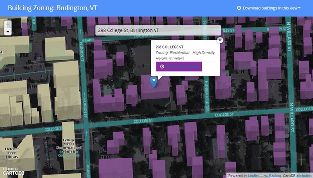
I've been trying to envision such an alternative, spurred on by some adventurous clients. Specifically, I wanted to see if it was possible to crack open a public dataset in a way that was compelling to technicians as well as to the lay public - something that would adhere to emerging best practices as well as to my own bias toward open architecture for open data. Timoney himself has already taken a stab at this, but we have different styles. So I cobbled together a template geoportal, wrapped around a standard multipurpose bit of public data: building records.Give it a spin here.
I assumed two audiences: 1.) citizens who want their own zoning information and permit history fast, and 2.) analysts who want to grab bulk chunks of building footprint geodata for urban planning, disaster response or just noodling cartography. The former group can search for their address, see their building in context, and get the basic info before heading off to print their fact sheet. One minute or less.
The GIS specialists of the world can hit the download link and vacuum in all the features within the current view extent, in the interoperable format flavor that suits them (+TopoJSON for the bleeding-edge types).
This is just a page for a single dataset, but I think it meets the needs of both audiences and doesn't suck to look at or navigate. A few of the other features I wanted to include:
- Lightweight and Javascript-based - less than 1MB before the tiles show up.
- Shareable URLS - the root URL is subject specific, and the location hash allows users to pass around a focused view of a neighborhood or house.
- Traditional search (in the hanging dialog box) is prominent without obscuring the map, since I'm of the opinion that a map is better as a page canvas than as a tiny sidebar window.
- Very few visible bells and whistles - This is built to some narrow workflows with no mission creep and no toolbars. A bunch of info is socked away in a modal popup for the intrepid.
- Cartography - I'm done with auto-pixelated graphics and bad default symbology; this is 2013 and we should all be using Mapnik for the web.
- Open-source undercarriage - this is a combo of Bootstrap, Leaflet, CartoDB and Mapbox.
- A note on CartoDB and Mapbox - their server code is legit open-source (meaning I could just run it my own damn self), but I've used their hosted services here since it's just - ack - easier to let them handle the services and flexibility thereof. And still cheaper than the competition.
Here's the code on github. The index.html is commented liberally, so you should be able to tell where to swap things in and out. Scaling this approach to an entire suite of geodata could be as easy as forking the repo for every dataset you want to present to the public. Single-theme maps will see the most use in the long run, so keep it simple.
The To-Do List
This app needs typeahead in the search box to really deliver options. Andrew Hill at Vizzuality shows how easy this is when pulling from a CartoDB address column, but I'm still trying to bolt it onto the partially-abstracted leaflet geosearch module with my meager javascript skills. I will gleefully accept pull requests. Additionally, you may note that each building's "Fact Sheet" points to the same place. The city of Burlington is doing great things with its data, but we don't have building URLs keyed to parcel IDs or addresses yet :)
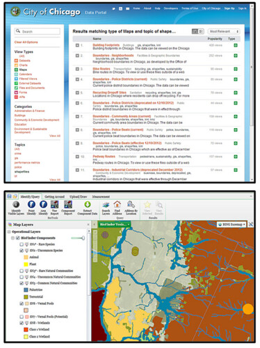
The bigger question is one of data discovery; if we're going to limit geoportals to one theme at a time, how do users get where they want to go? I hate being directed to a silverlight-slinging "Map Gallery" when I'm looking for info, but I'm not sure what the alternative is for top-level geodata search. Is it Chicago's spare text-based search? Is it the 300-button web GIS that requires training to use? Is it good SEO?
We know something about how users behave once they find the map they want, but how do we get them there in the first place?
![]() |
| Listocracy from Chicago, GIS-in-a-browser from VT Nat. Resources |
TopoJSON and Messed-Up Topology
Tuesday, February 12, 2013
The awesomeness of Mike Bostock's TopoJSON format for geodata is not disputable. It drops file sizes by up to 90% and opens the door to seamless feature simplification. And Josh Livni's shpescape.com makes it accessible to everyone in a web conversion UI. But in the GIS world topology is a fearful thing - it blows up your geoprocessing when incorrect, and "fixing" the errors of features that partially share messy borders can take hours. So I wish the conversion of a messy feature set from .shp or GeoJSON to TopoJSON would magically erase the gaps and overlaps of topological suckage. Would that I could click my heels and make it so, along with a smoked porter appearing on my desk.
The above example shows some postal codes at the U.S./Canada border; in 1816 some surveyor-deficient New Yorkers accidentally built a fort 3/4 of a mile into Canada, before realizing their mistake and abandoning it. If the current residents of zipcode 12979 decided they wanted to take that site back, the resulting overlap would be about what you see here, with a U.S. postal code overlapping a Canadian one. This being TopoJSON, the U.S. feature shares a D3 "path" with its New York neighbor. But its Northern border is now unique to that feature, no longer coinciding with the southern path of the Canadian feature it invaded.
This doesn't really pose any showstopping problems in this use case, but it certainly could if the symbology were at all complicated or the label placement were important. My point here is that clean geometry still matters when using TopoJSON; errors don't go away when you make the conversion.
Fortunately it looks like more cleaning products are in the works . . .
Subscribe to:
Posts (Atom)