Pages

Showing posts with label Maps. Show all posts

Redistricting: A Question and a Query

Wednesday, January 15, 2014
Alert: Both policy AND technology will be discussed below. Bring both your brains. You've been warned.
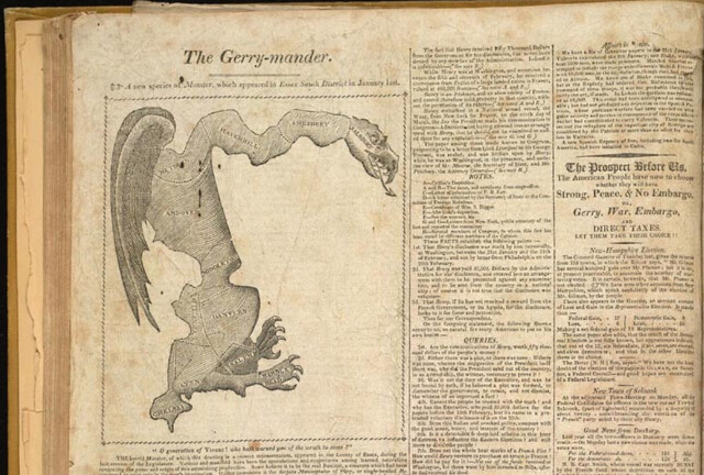
Gotta love the classics

The Question

My city is on the tail end of the country's redistricting cycle. Somehow while Texas was marginalizing Latinos and Dennis Kucinich was getting scribbled out of his constituency, we here in Burlington were waffling over how to deal with triparty politics and the implications of our changing neighborhoods.

I was unrealistic early on about how much of a role technology could play in the process. A survey of neighborhood geographic identity and a do-it-yourself redistricting app were helpful but not game-changing. After years of wrangling, the parties mostly just hashed it out in committee (though the final plan is derived from one made with our DistrictBuilder app), and now in about 6 weeks the voters will approve or reject it.

Which brings me to the question: What would the proposed plan change things for the average BTV citizen? It's a pretty easy one to answer in the aggregate - all the information is out there: new boundaries, old boundaries, population distribution, polling locations. But these bits are spread out across various sites and articles. What if there was a way to just ask the question: How will this change things for me?

Under the umbrella of CodeForBTV - the local CodeforAmerica brigade - I put together the basic answering tool. Built for phones (via Bootstrap), the app lets the user plug in their address and get back a list of redistricting plan implications:


The Query

The question of individual impact can be answered with a simple spatial query: return some pieces of information based on the polygons that intersect the user's location. This pointed to some basic building blocks:

  • The city redistricting plan - both the old wards and the new ones lumped into one geojson file
  • A robust search engine - I went with the Google Maps API because of the amazing viewport-biased geocoding and the built-in typeahead, but given more time I would use Leaflet and a state-hosted geocoder plus typeahead.js
  • Spatial query capability - fortunately CartoDB offers all the magic of PostGIS at a URL endpoint, with great styling available as well. 
The user-selected address gets converted to lat/lon, then sent to the CartoDB API in an ST_Intersects() query. It returns a map overlay of the old and new district boundaries at the site, and a set of answers to some FAQs about redistricting.

It's a simple app, relying on some robust APIs. I hope it's useful in getting my neighbors oriented to the landscape of the proposed redistricting. At the very least it'll save people some time peering at a large paper map in city hall, and at best it'll head off 40,000 individual "how will this affect me" emails directed at the city councilors and GIS manager.

I also hope it'll be of use to anyone else who wants to present geographic change over time at a user-selected location. Get the code on github.
Read more ...

Crime Doesn't {{Insert Variable}}

Tuesday, September 17, 2013

tl;dr

There's no citywide relationship between crime rate and elevation in San Francisco. It's because there are other factors at work - like property value, income, tourism, etc. - in between the two. But there are a few discrete spots around the downtown area where it is at least partially accurate to say "Crime doesn't climb" - check out the last map on this page.


Crime Doesn't What?

Dammit, I love hexbins. I love their flow complexity, I love their visual appeal, I defend them where necessary, and I use them wherever I can. However, sometimes hexbins don't tell the whole story.

Last week a couple of talented Bay Area developers put some of San Francisco's new open data to use, testing the old adage that "Crime Doesn't Climb" in the city. They compiled SFPD crime statistics in elevation-based strata and found - indeed - that the lion's share of SanFranCrime occurs closest to sea level. Recognizing a bit of simplicity in this argument, they went a step further and adjusted the numbers to account for the fact that there is simply more space - more crime-canvas, if you will - at lower elevations. The results were the same: lots of crime low, not much up high.

The web reacted with characteristic nuance and reason:


While there's irony and sarcasm at work here, I think it would probably be a shame if even a handful of people now contented themselves with the certainty that criminals are lazy, or if some misguided readers resolved only to pass through SoMa in an armored car.

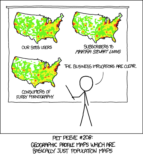
Because at it's heart, this analysis has already been critiqued by Randall Munroe:


Crime occurs where people - perpetrators and victims - are already concentrated. As such, any explanation of when/where/why has to account for population.

Population

The best level of detail available on population is the U.S. Census block. In a city as big as San Francisco, there are thousands of these, each with a very credible population count. They're not as spatially consistent as hexbins, but they're accurate:


Elevation

Elevation variation also contributes to the city's distinct character:


Crime

And the frequency of crime seems to reflect a bit of both population and elevation:


Read more ...

5 Examples of an Inflection Point for Maps on the Web

Monday, June 3, 2013
Some recent thoughts by Brandon Rosage reminded me that webcartographics (I should trademark that one) are the midst of a change. Since the dawn of Mapserver, we've been building maps into our websites in a segregated fashion, often treating the map as little more than an <iframe> keyed to a CMS. This works well enough in a short blog or location description, but there are more engaging stories to tell with cartography, and better ways to deal with UX complexity than just adding more markers.

Fortunately some great developers are steadily building tighter integration between geography and web design. My favorite recent examples of this follow:

1. Chasing the Boston Bombers

A maps-in-the-background piece on the Boston bombings from the New York Times Graphics Department uses a Google static map as a location-based table of contents to a scrollable storyline highlighted with more maps and photos.

2. The Royal Navy in WWI

From Vizzuality, a moving record of Allied ship traffic in WWI was derived from their work crowdsourcing the transcription of old ships logs. This is more of a show than an interactive piece, which works perfectly to illustrate the flurry of activity around major geopolitical events.

3. The Adventure of the Bruce-Partington Plans

Young Hahn's Mapbox-based adaptation of a Sherlock Holmes storyline changes the click-and-drag paradigm of the web map by tying map navigation exlusively to a scrolling text storyline. Unlike the NYTimes piece above, the map does move - but only as the narrative progresses. Bonus points that it's responsive, making this an equally-rich read on mobile.

4. Crowdmap's New Layout

Crowdmap has some great potential here, though it's still being pulled in several directions by varying stakeholders. The previous version was a codeless window into Ushahidi's functionality, and that was great for easy access to a map-within-a-CMS. But with the current iteration they've tried to bring the focus to a map driven by its content, rather than content accessed via a map.

5. Hurricane Sandy Coastal Impacts

Another entry in the the journalism category, this tour-de-force from Derek Watkins treats the coastal axis (North-to-South) as a narrative, attaching aerial photos seamlessly to a thematic map built with the D3 javascript library. Perhaps the coolest part of this one is what it implies - D3 is one of the best emerging tools for breaking maps out of "Plugin" status and letting them interact seamlessly with the architecture of web design. This is looking more and more like a window into the future of maps on the web.


Read more ...

HTML5 and the Limits of Imagination

Tuesday, December 11, 2012
I just (days later than everyone else) came across this awesome Google Maps application built by Darren Wiens using the buckled-on graphics capabilities of paper.js. It strikes me as a perfect example of good imagination at work on complex geographic problems. Specifically, this is a mixture of pure javascript, HTML5 browser-boosting and advanced trip routing, all to make a cool visualization of where traffic bottlenecks will arise.

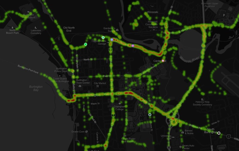
The application calls on paper.js to generate an endless series of random point-to-point trips within the map view, then passes them to Google's routing API and renders the result visually as a trip on the local road network. Over a short time, the traces of the trips build up into a density map of highest traffic:


So as is my wont, I grabbed the code (Thanks again to Mr. Wiens) and adapted it to my home territory of Burlington, VT, with a bit of map styling for contrast (modern browser required):


I intend to spend a lot more time figuring out the ways that new graphics modules can interact with the maps I build, but as always I'm limited by my own imagination. It seems like the technology is increasingly unlimited in capability.

Read more ...

The Buffalo in the Room Part 1: Fade In

Wednesday, September 12, 2012
Since the ancient days - well, since late 1993 or so - production cartographers have been been stuck in an awkward technical limbo between GIS and art. Two platforms were required to get a map from vector geoprocessing to publication-quality graphics: Mostly ESRI's ArcGIS for the former and mostly Adobe's Creative Suite for the latter. Sure the two tried to overlap each other as time went on ("Seven hours to export a 900dpi TIFF and I can still see the pixels? Thanks ArcMap!"), but the basic math was tough to overcome: with finite memory on a workstation, ArcGIS focuses its resources on geoprocessing at the expense of the graphic outputs, and vice-versa.

This was the way of it when I started mapping. And the classic example of "You can't do that in GIS" is the buffalo tint popularized and used to wicked effect by National Geographic Maps. Basically it's a targeted feature fade, meant to draw attention to a focal point or to one side of a divide. And pretty hot too.

And it's not really possible in ArcMap. Here, let's try doing the inverse of a fade, which is easier to envision. This is more of a halo, and it's theoretically possible to do this by adding line layer after line layer, each offset and transparent-ed a bit more than the last:

Buffalo Halo a la ArcMap
Not too shabby, I suppose. A fade out from a clear focal feature. Maybe a bit heavy-handed, but it gets the message across. Too bad it took 30 minutes of clicking into five successive sub-menus on each of ten layers to get it done. And since ArcMap isn't a graphic engine, there's no anti-aliasing, and pixels are visible in every feature. This is not a production-quality graphic.

Let's try that again with Tilemill. I know I know, it's not a GIS engine, but it's a lot closer to one than Adobe Illustrator is, try as they might. Tilemill has full support for operations like selecting and styling by attributes as well as basic geoprocessing if the data is tied to a source like PostGIS, Google's data API or CartoDB's SQL API. Also it's free and open-source (I love that such news is ancillary to my point here. Woot!). As I've mentioned before, Tilemill brings the efficiency of CSS code to the map styling process, and it pushes everything through the sophisticated Mapnik graphic driver to look damn pretty for web or print.

Code will save us, right? Here, check it out:

Buffalo Halo a la Tilemill
This is a more subtle effect, with no striping artifacts, and all the linework is anti-aliased for smoothness. Bonus points for also providing an interactive output where the halo scales dynamically.

So what kind of Carto CSS went into that? Oh, just more than three hundred lines of recursively offset style code. Oy. It's true that it's portable (feel free to plug the code into your own project), but it's not ideal. Definitely not for fast projects under a deadline.

This is where compositing comes in. Last month, the indefatigable Mapnik team added support for the graphical magic that underpins programs like illustrator. This is part of a long-running effort by cartographic designers at Stamen and Development Seed to get out from under the Iron Adobe boot. (or the supple GIMP moccasin, I suppose). With compositing, all sorts of things become a lot easier to do in Tilemill, for instance what we've been trying above is now about 30 lines of CartoCSS, and much richer:

Buffalo Halo with Mapnik Compositing Mojo in Tilemill
The possibilities are sort of mind-boggling, and I invite all the actual graphic designers of the world to figure them out (The composite parameter alone in CartoCSS has 35 options). In the meantime I'll continue to look for ways to enhance my mapping toolkit; the next post will focus on reversing the direction of this effect, like in the NatGeo example linked above.

Free-Range Buffalo Halo, Thriving in its Natural Environment.
Thanks to Dane Springmeyer for pointing out the time-saving parameters on this one.

Read more ...

Results of the Geospatial Technology Users' Poll 2012

Friday, July 20, 2012
Update 7/23/12:  The poll is now reopened and live results are appearing at a new post. The figures and discussion below should be considered preliminary

Thanks to all those who hit yesterday's poll of technologies at work in the geospatial field. I've got some interesting results below.

First a note on experimental design: This crap is not scientific. First I tweeted, facebook-posted and Google+'d, so I got in contact with the core community of geogeeks with whom I regularly interact. Then I sent it out via the Vermont GIS listserv, the ESRI user conference hashtag and the O'Reilly open-source conference hashtag, hoping for balance. There is surely a geographic skew toward the U.S. Northeast, but I'm pleased with the general distribution of respondents. n = 117, which seems pretty good to me. Hit me on Twitter or on the GeoSprocket contact page if you'd like a copy of the raw survey results.

Here's a look at the participants using the generalized locations of reported companies/institutions (lots were left blank, so who knows):


The results of question 1:

Note: Some of the technologies that went into the "Other" column include FME, MicroStation, ENVI/IDL, GIS Cloud, AutoDesk, Maptitude, Idrisi, Mapserver and Geocortex. Sorry to have ignored those, but it's a big ecosystem out there.

And the results of question 2:
Ayup, ESRI Desktop is the big winner in this circle. But a surprising number of Google Maps folks there too. Also intriguing is the even split among the open-source toolset types, contrasting with the topheavy ESRI lean toward desktop.

Here is primary toolset use by overarching category:


Things get interesting when we parse out some conditional results:
  • 40% of users whose primary tool is an ESRI product have also used an open-source geo platform in the past year.
  • But a whopping 80% of users whose primary tool is open-source (desktop, web or DB) have also used an ESRI product in the past year.
  • Same with Google - 80% of respondents who primarily use Google Maps have also used an ESRI product in the past year.
  • That favor is largely returned - 75% of primary-ESRI users have used Google Maps.
  • OpenStreetmap and GeoCommons had plenty of casual users, but very few used them/built them as their primary tool (1% each).
      There's a venn diagram to be had in there somewhere, but I'm not up to it.

Without leaping to conclusions, I would say that it's still an ESRI world. Even the folks whose day-to-day revolves around open-source or Google tools still fire up an Arc license every now and then. The converse is not equivalent; fewer than half of ArcJockeys use any of the open-source tools, though they are partial to Google Maps.

There are a lot of potential reasons for that, but it seems safe to say that open-source geo is still developers' territory, and Google mapmaking tools are more comfortable ground for ESRI's users. I recall that specific path when I was making my own way from ArcGIS to GDAL and Javascript.

There's a lot to read here; what are your thoughts? Anything surprising?


Read more ...

Browser Cartography: Some Safehouses for ESRI Refugees

Wednesday, May 30, 2012
"Island" by Konstantin Kafer

A Primer for Getting Started With Open-Source Web Maps


Now that you know why I care about telling compelling stories with widely-distributed maps, let's look at a few of the many tools that are out there to help the process. I confess to narrow experience here; I use MapBox and CartoDB for the majority of my projects, and there are plenty of alternatives to those. But as a starting point I think that these open-source web map design platforms are perfect - they minimize the amount of code required, they use the best graphic rendering engine in the field, and they are extremely cheap (or free) to use, even in an enterprise or high-traffic environment. I'm avoiding ESRI's "ArcWhatever Online for Server" options because of a.) the high price tag, and b.) the actual user-facing sites are only as robust as the javascript or flash developer who builds them. My preferred options give you a lot more to work with out of the box, for free.

I am not going to walk you step-by-step through the process below - I'll point you to resources that will - but rather I mean to sketch the structure that can get your map applications up and running. If you're stumbling and need some help, drop me a line through the GeoSprocket contact page or on Twitter

Step 1: Data


Data in this context can mean a lot of different things. The tools we're using aren't picky, so this includes:

  • Shapefiles (but this will need to be in a compressed folder)
  • Spreadsheets (CSV, XLS, DBF, you name it)
  • KML or KMZ
  • GPX or in many cases raw text from various GPS units

Desktop GIS isn't dead. Those who say so aren't paying attention. You still need some form of spatial data manipulator to analyze and prepare your source information, and if you can do that with pure GDAL hacking at the command line of a virtual machine, you have no need for my advice. Yes, "Desktop Platform" includes ArcMap, but if you want to make a clean break I recommend Quantum GIS for robust, open-source geoprocessing potential.


Step 2: Choose a Platform and Get a Hosting Account

Your data should live on the web somewhere - where, exactly?
  • Option 1: MapBox - Most advantageous for its speed and complete cartographic design potential. However, once you've rendered your map into tiles (in step 3), there's not much you can do to change them on the fly. Use this option if you have a specific vision of symbology in mind to present to your users, if you have a lot of information to present interactively (i.e. text/charts/images that pop up when a feature is clicked), and also if the underlying data will be accurate for more than a few weeks. Sign up here for the free starter account.
  • Option 2: CartoDB - This is a user-friendly, cloud-based adaptation of the popular PostGIS database architecture. It can run a bit slower than MapBox (since it's rendering on the go), and the cartography options are more limited. However, the provided SQL API means that you can sort, filter and process your data basically in the browser. Go with this option if your application will have a lot of user-generated queries (i.e. "how many points are within 50 miles of this one?"), or if you regularly update the data being mapped. Sign up here for the free starter account (notice the pattern of freeness).


Step 3: Mapping Your Data


At this point using either option, you should now have maps that are ready to be launched.

Step 4: Serving Your Map to the World


Step 4a: Embedding - By far the easiest way to get a URL that you can distribute to your audience. Both Mapbox and Cartodb have fantastically-easy embed interfaces for plugging maps into your blog or website content management system, and in each case they essentially host a full-page map website for you as well. Examples:


Racial Breakdown of Census Blocks in Burlington, VT Using Mapbox


Participatory Farm Mapping in Vermont with CartoDB


Step 4b: The World of Pages, Javascript and Beyond - This creeps a bit further beyond the scope of what I hope to cover here, but this is the ultimate destination for most of my map applications. There is simply greater flexibility in a website or mobile application that you can manage yourself, though it requires some knowledge of HTML, CSS and Javascript.

I say "some" knowledge - I didn't know the first thing about code when I got into this world, but it was amazing how easy it was to adapt a little bit. The resources available in the open-source software community are spectacular; the help and guidance offered to me by experienced developers out of sheer goodwill has been uniformly superior to the high-priced support of proprietary vendors (Trimble and ESRI, I'm looking at you). I am no developer, but with community help I've been able to explore and utilize some of the most exciting tools available to cartographers in our time. And things are only getting better from here . . .

Here are a smattering of places to start for customizing a page of your own:

  • Mapbox Templates - these require a bit of github knowledge, but otherwise they are as close to plug-and-play map sites as you'll find. 
  • CartoDB Examples - Plenty of code available for re-purposing and adapting. In many cases this just involves changing a line or two to point to your own data.
  • Codecademy - Might as well learn how to do this stuff for real . . .


Read more ...

Republican Fundraising 2012 - the Early Days

Thursday, August 25, 2011
They're coming! Holy crap, they're coming!

It's always instructive to see the spatial dimensions of politics. Development Seed in D.C. just set up this snappy way of viewing individual donations to candidates so far this election cycle [it's already a cycle? Jeez, slow down, Hoss.]:


The regional clustering of some candidates - Romney owns the coasts, the midwest is split - is a fairly good representation of how our society fractures and gathers, even on the conservative side of things alone.

Mostly surprising is the number of times Ron Paul's name shows up. Dude just won't quit. Or make a coherent argument for a tight monetary policy.
Read more ...