Pages

Showing posts with label gis. Show all posts

Crime Doesn't {{Insert Variable}}

Tuesday, September 17, 2013

tl;dr

There's no citywide relationship between crime rate and elevation in San Francisco. It's because there are other factors at work - like property value, income, tourism, etc. - in between the two. But there are a few discrete spots around the downtown area where it is at least partially accurate to say "Crime doesn't climb" - check out the last map on this page.


Crime Doesn't What?

Dammit, I love hexbins. I love their flow complexity, I love their visual appeal, I defend them where necessary, and I use them wherever I can. However, sometimes hexbins don't tell the whole story.

Last week a couple of talented Bay Area developers put some of San Francisco's new open data to use, testing the old adage that "Crime Doesn't Climb" in the city. They compiled SFPD crime statistics in elevation-based strata and found - indeed - that the lion's share of SanFranCrime occurs closest to sea level. Recognizing a bit of simplicity in this argument, they went a step further and adjusted the numbers to account for the fact that there is simply more space - more crime-canvas, if you will - at lower elevations. The results were the same: lots of crime low, not much up high.

The web reacted with characteristic nuance and reason:


While there's irony and sarcasm at work here, I think it would probably be a shame if even a handful of people now contented themselves with the certainty that criminals are lazy, or if some misguided readers resolved only to pass through SoMa in an armored car.

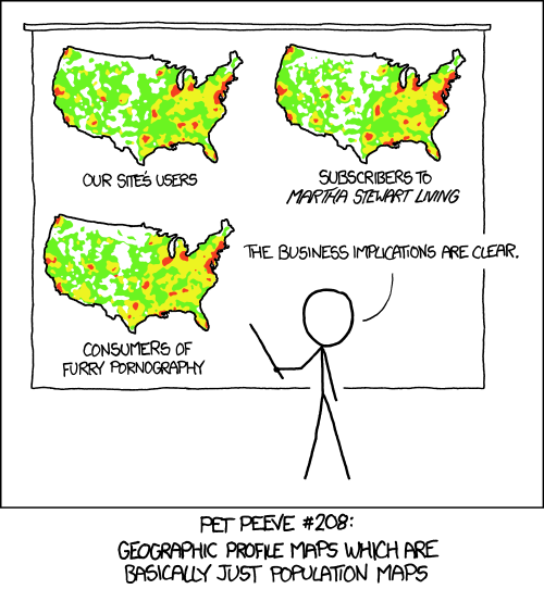
Because at it's heart, this analysis has already been critiqued by Randall Munroe:


Crime occurs where people - perpetrators and victims - are already concentrated. As such, any explanation of when/where/why has to account for population.

Population

The best level of detail available on population is the U.S. Census block. In a city as big as San Francisco, there are thousands of these, each with a very credible population count. They're not as spatially consistent as hexbins, but they're accurate:


Elevation

Elevation variation also contributes to the city's distinct character:


Crime

And the frequency of crime seems to reflect a bit of both population and elevation:


Read more ...

Piano/Source

Sunday, August 18, 2013


I remember the moment I realized I needed to learn how to play the piano.

[Psssst. Keep reading; this is still about maps!]

During my second semester at Berklee, I found myself with a bunch of fellow art-nerds, sitting in an apartment watching a video [VHS whaaaaa!] about a dance piece collaboration between Garth Fagan and Wynton Marsalis called "Griot New York". Wynton rolls into a rehearsal toting his horn in a gig bag and rolling a full-size yamaha keyboard behind him. As the voice-over goes into dance/music duality overanalysis mode, I see that Wynton is playing the trumpet with his right hand and laying down chord progressions on the keys with his left hand.

Sure, I'd heard about Dizzy Gillespie, John Coltrane, Charlie Haden et al. doing their composing on piano. I'd gotten all sorts of pressure to put down my horn and practice the keys regularly as a way of understanding the harmonic roots of the music I wanted to play. But this was live proof - in the form of one of the greatest virtuosos of a generation - that a melody instrument could only take you so far in both performance and composition before you needed Western music's chosen tool for getting at the harmony underneath.

My not-so-subtle point is that the same goes for programming in GIS. Bill Dollins and Adena Schutzberg wrote more eloquently than I ever will about the need for GIS practitioners to learn to code. But I just realized I've been down this road before. I played trumpet for years before buckling down (under degree requirements, really) and setting my fingers to piano keys. And I worked from ArcView and ArcMap for years before realizing that I needed proficiency in python and javascript.

The piano is a compiled language, to be sure - several steps abstracted from the wonder that is our perception of tone and harmony. But it fits the question I've heard time and time again from GIS analysts, and seen in blog-nonsense form hither and yon:

Do I really need to learn python/piano?

Yes. Your advancement as a scientist/artist will not be possible without it.

Let me close with another question brought on by this crude metaphor: If the piano is Fortran, does music have a kernel? :)

Read more ...

Open Cadastral Data: a Github Test Case

Wednesday, July 24, 2013

A bolt of GIS-Manna from Heaven

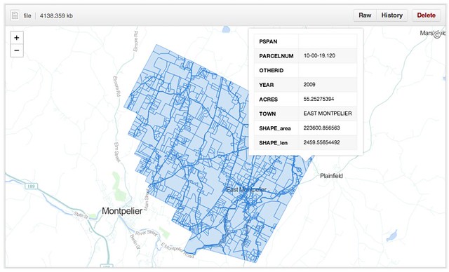
A dedicated and talented GIS developer at the VT Agency of Natural Resources just finished compiling the most-comprehensive cadastral dataset to which our small state has ever had access. Coincidentally he sent out the announcement while I was annoying a few githubbers about their new geodata capabilities. What luck: a test case.

The dataset - as a shapefile - clocks in at 250MB, representing 289,000 parcel polygons in 191 towns. [The 46 VT towns not included tend to have populations under 200 and a blithe commitment to dusty paper records.] It turns out that this is over the 100MB limit imposed on individual files, so I pulled the dataset, split it by town and converted the outputs to geojson, then pushed them to a repository I just set up. The largest of these is juuuuust over the maximum file size to be renderable in Github's snazzy new Mapbox-based interactive maps, but most of the town parcel maps pop up just fine.

The Implications

Okay, great - another slippy map somewhere on the web. Who cares? These folks, actually:
  • A landowner who wants to look up the parcel numbers of her abutting properties without visiting the steam pipe distribution venue in the basement of her local town hall.
  • A town GIS manager who has a hard drive overflowing with parcel shapefiles, converted CAD drawings and map requests from lawyers.
  • Probably a lot of lawyers. Don't get me started.    
  • The overworked data gurus at the Vermont Center for Geographic Information (VCGI), who - while they're probably the only agency that can handle it - are really reluctant to take on management of a statewide, rolling, versioned database.

What Github provides in this test case, for free:
  • Fast hosting of modestly-large geospatial data
  • Relatively-simple version control of said data
  • Edit access to anyone with a github account and a GIS platform (FOSS or Arc'ed)
  • An embeddable client view for the public for files up to 10MB
  • A robust API for client views bigger than that (for example)
  • A muthaflippin' download button (well, "save page as")
For those of us who have been ranting about geoportals in recent months, this pretty much covers the bases. For free. Github is walking the #opendata walk.


What's Next . . .

There are a whole bunch of caveats here. Biggest is the file size issue (though I've seen Bill Dollins and Sophia Parafina starting to work around that in the past few days), since 10MB is a fine limit for municipalities in the second-smallest state, but Manhattan is a teensy bit bigger. Another hitch is data quality; this dataset is top-of-the-line, but like any other it's missing SPAN numbers, dates and acreages here and there. The vendors will tell you that quality can't be beefed up in a free collaborative environment, without data value-add. I don't know if they're right or wrong.

But I'd love to see a town GIS manager throw a pull request and get this ball rolling. Who's up for it?

The data hub is waiting right here


Update: 7/25/13
I've heard a bunch of awesome questions about the practicalities of using Github this way, so while I am by no means a power user I recorded a quick demo video.
Read more ...

We Are Still Talking About These Things: Dispatches from the Dawn of Crowdsourcing

Thursday, May 23, 2013


I was just having a conversation with some colleagues about the nuts and bolts of participatory mapping with some local farmers. We were all:
"Man, it totally depends on if you have internet at the site. If you do, just pull up Google Maps or CartoDB and have them digitize right into the iPad. If not it's a huge hassle; you'd have to annotate a PDF and georeference it later."
"Yeah, but either way the stylus is key. Non-technicians always want to use a pen and paper."
This talk of getting a skeumorphic data-entry device in the hands of the common folk reminded me of something from the past. This, specifically:
Even taking as a fact of life that community GIS will always require some mediation by the more technically skilled, Al-Kodmany's Chicago neighbourhood projects are not a little bit extreme. In fact, by the time he describes the community members being given 'coloring the map' participation exercises as a way to actually participate, there is a rather patronizing air about the project. 'Participants were broken into small groups and were given a map and felt-tipped markers,' he writes. Felt so as not to inadvertently poke out their own eyeballs, no doubt.
This from Christopher Miller, writing in 2006 about how participatory GIS (nee "GIS/2") was being hamstrung by academic condescension, cultural barriers and the failure of imagination that is traditional GIS ("GIS/1"). Man, 2006 sounds like a long time ago from here, but we're still spinning our wheels in some ways on this stuff.


Based on Andy Woodruff's Boston-oriented project, last year I built an app to get locals defining the boundaries of neighborhoods in the city of Burlington. When I showed up to the first hearings on city redistricting to present the results, their credibility was questioned by some who hadn't heard of the project, even though it had been announced in every local news outlet as well as digital channels. These were people who showed up to meetings, because that was how you participated. Not learning my lesson, I adapted Azavea's Districtbuilder app for the redistricting process and made it public, hoping "participatory technology" would open a traditionally-closed political world. It turns out that the technology wasn't really the problem.


In his snark-laden, brilliant 2006 paper, Miller goes on to describe this neat little app called Scipionus, built in the aftermath of Hurricane Katrina on the back of a newly-opened Google Maps API. Here's the thing: it let anyone with a web connection report their location and status on a Google Map! Fast-forward three years and Ushahidi comes along. Fast-forward another three years and Google Maps gets collaborative, Crowdmap is everywhere and Twitter becomes a news source. Fast-forward to last month and the most reliable information on a civil war is from a participatory map, and Ushahidi can take in reports from every technology short of smoke signals.

We still don't have good retorts to Miller's challenges. We still haven't made GIS accessible to the public, and I'm not really sure that's a valid goal. More importantly, we seem to be driving deeper into the gulch between Internet-Worshippers and Tech-Hostile Curmudgeons that Miller warned us about. Whether we're community-building, solving disputes or reporting the news, we've got to do a better job building bridges between the public and our maps.

In many cases, "Paticipation" is still a felt-tipped marker jabbed into the eyeball.

Read more ...

Toward an Ideal Geoportal

Thursday, April 18, 2013

A Geoportal Identity Crisis

A city wants to open its geodata for public use. An NGO wants to spark a transparency initiative. A regional planning commission wants to stop emailing zipped shapefiles when pestered. They want to deliver two contrasting products - raw data and parsed themes - to as many as a dozen different audiences: policymakers, technical service providers, the press, professional curmudgeons, etc.

In the past decade, the solution to this nearly-impossible balancing act has been to build a Geoportal, and we've seen some pretty memorable misfires. Most of the trouble can be chalked up to the good intentions of the technicians who produce the data and the tools to distribute it; accustomed to a desktop GIS environment for exploration and analysis, they have built and re-built "GIS on the Web" (Chris Herwig documented his travels around a broad selection of them). They've done this under the assumption that users will be filtering, buffering, selecting by location and overlaying, and as it happens that's not really true. This approach fails all sectors of the public.

For many months now, Brian Timoney has been championing sanity in the wasteland of geoportals. He expertly trolls the mapjunk and the faustian UX, but he's also offered an analytics-based selection of "Best practices" for getting geodata to the public. Beyond how users actually interact with online maps, he's drawn attention to the subtle distinction between "open data" and "useable open data". But he is still something of a voice in the wilderness, as we all nod vigorously in agreement and go back to downloading file geodatabases from the USGS. We work with the system we have, because it's hard to envision the details of the alternative.

A Template

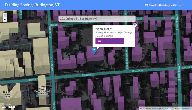
I've been trying to envision such an alternative, spurred on by some adventurous clients. Specifically, I wanted to see if it was possible to crack open a public dataset in a way that was compelling to technicians as well as to the lay public - something that would adhere to emerging best practices as well as to my own bias toward open architecture for open data. Timoney himself has already taken a stab at this, but we have different styles. So I cobbled together a template geoportal, wrapped around a standard multipurpose bit of public data: building records.

Give it a spin here.

I assumed two audiences: 1.) citizens who want their own zoning information and permit history fast, and 2.) analysts who want to grab bulk chunks of building footprint geodata for urban planning, disaster response or just noodling cartography. The former group can search for their address, see their building in context, and get the basic info before heading off to print their fact sheet. One minute or less.


The GIS specialists of the world can hit the download link and vacuum in all the features within the current view extent, in the interoperable format flavor that suits them (+TopoJSON for the bleeding-edge types).


This is just a page for a single dataset, but I think it meets the needs of both audiences and doesn't suck to look at or navigate. A few of the other features I wanted to include:
  • Lightweight and Javascript-based - less than 1MB before the tiles show up.
  • Shareable URLS - the root URL is subject specific, and the location hash allows users to pass around a focused view of a neighborhood or house.
  • Traditional search (in the hanging dialog box) is prominent without obscuring the map, since I'm of the opinion that a map is better as a page canvas than as a tiny sidebar window.
  • Very few visible bells and whistles - This is built to some narrow workflows with no mission creep and no toolbars. A bunch of info is socked away in a modal popup for the intrepid.
  • Cartography - I'm done with auto-pixelated graphics and bad default symbology; this is 2013 and we should all be using Mapnik for the web.
  • Open-source undercarriage - this is a combo of Bootstrap, Leaflet, CartoDB and Mapbox.
  • A note on CartoDB and Mapbox - their server code is legit open-source (meaning I could just run it my own damn self), but I've used their hosted services here since it's just - ack - easier to let them handle the services and flexibility thereof. And still cheaper than the competition. 
It's true that much of my requirements were about what to omit, but it is truly a difficult task to limit the scope of an application that is being driven to omni-functionality by stakeholders. Resistance is part of the process.

Here's the code on github. The index.html is commented liberally, so you should be able to tell where to swap things in and out. Scaling this approach to an entire suite of geodata could be as easy as forking the repo for every dataset you want to present to the public. Single-theme maps will see the most use in the long run, so keep it simple.

The To-Do List

This app needs typeahead in the search box to really deliver options. Andrew Hill at Vizzuality shows how easy this is when pulling from a CartoDB address column, but I'm still trying to bolt it onto the partially-abstracted leaflet geosearch module with my meager javascript skills. I will gleefully accept pull requests. Additionally, you may note that each building's "Fact Sheet" points to the same place. The city of Burlington is doing great things with its data, but we don't have building URLs keyed to parcel IDs or addresses yet :)

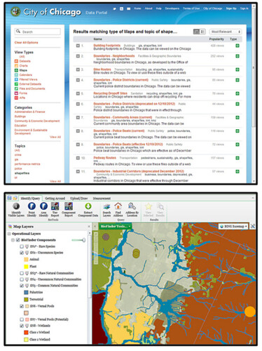
The bigger question is one of data discovery; if we're going to limit geoportals to one theme at a time, how do users get where they want to go? I hate being directed to a silverlight-slinging "Map Gallery" when I'm looking for info, but I'm not sure what the alternative is for top-level geodata search. Is it Chicago's spare text-based search? Is it the 300-button web GIS that requires training to use? Is it good SEO?

We know something about how users behave once they find the map they want, but how do we get them there in the first place?

Listocracy from Chicago, GIS-in-a-browser from VT Nat. Resources
Many thanks to Jay Appleton from the city of Burlington for being the single-handed support structure of open data here, including emailing the occasional zipped shapefile :)


Read more ...

TopoJSON and Messed-Up Topology

Tuesday, February 12, 2013


The awesomeness of Mike Bostock's TopoJSON format for geodata is not disputable. It drops file sizes by up to 90% and opens the door to seamless feature simplification. And Josh Livni's shpescape.com makes it accessible to everyone in a web conversion UI. But in the GIS world topology is a fearful thing - it blows up your geoprocessing when incorrect, and "fixing" the errors of features that partially share messy borders can take hours. So I wish the conversion of a messy feature set from .shp or GeoJSON to TopoJSON would magically erase the gaps and overlaps of topological suckage. Would that I could click my heels and make it so, along with a smoked porter appearing on my desk. 

The above example shows some postal codes at the U.S./Canada border; in 1816 some surveyor-deficient New Yorkers accidentally built a fort 3/4 of a mile into Canada, before realizing their mistake and abandoning it. If the current residents of zipcode 12979 decided they wanted to take that site back, the resulting overlap would be about what you see here, with a U.S. postal code overlapping a Canadian one. This being TopoJSON, the U.S. feature shares a D3 "path" with its New York neighbor. But its Northern border is now unique to that feature, no longer coinciding with the southern path of the Canadian feature it invaded. 

This doesn't really pose any showstopping problems in this use case, but it certainly could if the symbology were at all complicated or the label placement were important. My point here is that clean geometry still matters when using TopoJSON; errors don't go away when you make the conversion.

Fortunately it looks like more cleaning products are in the works . . .


Read more ...

Navigation on Planks

Wednesday, February 6, 2013
We're not there yet . . . (Skier dude by Saman Bemel Benrud)
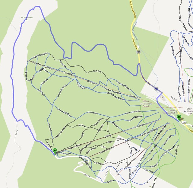
The news yesterday was that Google has added the trails of 38 ski resorts in the US and Canada to its Maps database. Here in Vermont, my stashes are safe from further encroachment, since the only two Green Mountain resorts on the list are perennial tourist-bait favorites Okemo and Stowe. That said, this is a cool move by Google in its desire to permeate our mobile world. I'm used to leaving my phone behind while I ski, but this sort of information would be useful to have at my fingertips if I were in unfamiliar terrain at a new resort. It could also be useful in tandem with the ski-run-tracking apps that are proliferating these days.

However, one item is missing from the new functionality: ski navigation. You can't request the shortest (or gnarliest) route from the top of the Sensation Quad to the bottom of the Alpine Double. These new lines - while color-coded according to difficulty - are just background images in Google's otherwise-rich network of information. The navigation engine suggests that the shortest route down the Liftline at Stowe is to pop off my cables and trudge down the Toll Road or the Long Trail.

The longest way around
I can see why Google would be nervous about offering directions in this context - There are two problems that are unique to alpine skiing as a navigation paradigm:

Obey the Rope.

Trail conditions (especially in the East) change more rapidly than road conditions. However, they don't change more rapidly than traffic conditions, and Google's got that covered in near-realtime in major metro areas. 
Solution: GTFS for ski resorts - While it's not immediately realistic to ask every resort to come up with a trails API, it's possible to work out a common format for trail reports (Y'know, those things you look at in the morning to see where it's not bulletproof) much like Google does for public transit. It would be an afternoon task for a data ninja at Mountain View to figure out a way of scraping and parsing that information on a daily basis.

Gravity's a . . . Precondition.


Leaving nordic and backcountry skiing aside, ski navigation would require consideration of elevation change. No uphill turns allowed. 
Solution: Spatial Analysis -  This is one of those bread-and-butter geoprocessing problems that GIS undergrads are given: calculate a flow accumulation surface, add turn attributes to the trail data accordingly. This is actually kind of a fun one.

Lots of folks are never going to look at a mobile device while skiing, maybe myself included. But for the ones who do, it'd be pretty danged cool to have navigation assistance built into the vertical territory that Google is now adding to its already-thorough map system. Just a few hitches to overcome, and I think they're up to it :)

"If only there were some way I could technify this experience . . ."

Read more ...

Secession & Racism: a Spatial Analysis

Thursday, November 15, 2012

Can a state's tendency toward racism determine it's willingness to secede from Barack Obama's America?

Maybe.

There's the short answer. The longer one follows, and please note the many qualifiers before you fire up the Troll-o-Matic 9000.

Post-Election Racism

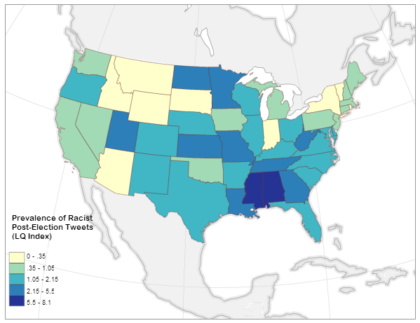
It turns out that there was a lot of racist language being bandied about on twitter after the election. And a small group of brilliant individuals elected to post their hate speech with geolocation attached. The good folks at Floating Sheep were there to catch it all and they boiled it down to a normalized index of the prevalence of racist tweets about the election by state:


A very small number of people in Alabama and Mississippi don't come out of this analysis looking very good. But the point here is that among social media users, Alabamans and Mississippians are slightly more likely than others to vent about the election using hate speech.

Post-Election Support for Secession

At the same time, citizens of some (initially Southern) states initiated online petitions calling for peaceful separation from the United States, AKA secession. These petitions have quickly spread to every state in the union, but the number of signatures varies wildly. As of this writing, Texas has over 100,000 signatures on its petition, while Vermont has 869 [and some colorful arguments have been made about keeping these specific two in separate countries].

Obviously you can't compare these two numbers on the same plane. To get a picture of the real support for secession in each state, I normalized the number of signatures by the state population in 2011 per census estimates:


Balanced by 25 million people, Texas is actually not quite as hot for a second republic as the petition might suggest. The northern rockies on the the other hand are desperate to escape, with a much as ONE AND A HALF PERCENT of the states' populations showing up on a secession petition (yes, this is a tiny percentage). The only states with no stomach for independence are pretty close to the map that John Kerry won in 2004 (with the odd inclusion of Virginia). This is fascinating on its own, but let's dig deeper . . .


Why do you really want to secede? I mean, really why?

All well and good, I thought, but what sort of motivations drive someone to sign onto an idea that half a million Americans died over not so long ago? There are as many explanations as pundits to make them up: culture, climate, economics, and one that comes up every now and then: racism.

So much coded language was thrown around during the election cycle that "Welfare" translated as "Greedy Black People" and "States' Rights" translated to "White Power" to some who were inclined to hear it. In such an environment it's not inconceivable that some citizens would rather leave the U.S.A. than dwell another four years under a president whose legitimacy was so exhaustively questioned.

Relationships like that are extremely difficult to tease out. There are potentially hundreds of factors driving an individual's decision to sign a petition like this, and the president's ethnicity may be only the smallest one - if it's present in the calculation at all. Colinearity is the term the statisticians like to throw around: you think you've got a significant relationship between two variables, but it's really a parallel factor that you forgot to measure.

Therefore, a non-exhaustive list of caveats before I get to any results:
  • Fewer than 400 geolocated tweets included both racist language and a reference to the election. This is a tiny number compared to the overall election-related traffic, and Floating Sheep has made this clear in their analysis. The author of that post judiciously used the term "Thin nail to hang on" in reference to my use of his dataset. That said, there was also a significant amount of non-geolocated twitter traffic using hate speech in the days after the election, so these are representative of a larger tone if not of a geographic location.
  • Signatories to these secession petitions are not all residents of the state in question. About 3/4 of the Texas petition participants appear to be Texans, while only about 1/4 of Oklahoma signatories are locals. Without a good way to sort out locals-only, I just included the total number on each petition and in doing so introduced more error. 
  • The analysis method I use below doesn't eliminate colinearity. It just suggests where it might be strong and where it might be weak. It's possible that racists in Georgia really love pandas, and it's actually the broader panda-loving population there that wants to secede so that the federal government can't seize any Georgian pandas.
  • Similarly, this analysis helps with - but does not eliminate - the modifiable areal unit problem.
  • Alaska and Hawaii have secession petitions too, but their non-contiguity with the lower 50 skews the results.
  • This is only scratching the surface. If there's a grad student out there with funding and no project, I invite them to burn time improving the input data.
  • More as they occur to me . . .
With these qualifiers in mind, let's look at the straight-up linear relationship between racist tweeting and secession-petition-signing. The big question I'm asking here is "Can a state's tendency toward racism determine it's willingness to secede from Barack Obama's America?" And I'm not answering that question; I'm answering a highly-qualified version of it based on the data I have available. Plus it's kind of a nutty question.

And at the national level, the answer to the question is no:
This "relationship" at the national level is not significant at any useful confidence interval, and it sports only the tiniest of trends (P = 0.36, R-squared = 0.017).

Before I lose the rest of you, let me say this: The answer to the above question could still be "maybe".

There's a statistical tactic available called Geographically-weighted regression (GWR); it's best described as a diagnostic tool to figure out how relationships like this can vary over distance. Instead of measuring the relationship between racism and secession at the national scale, we can look at it regionally to tease out places where it might be valid:

This map shows where it's possible that the prevalence of racist post-election tweets can predict the local support for secession. 
Cutting through the fog of colinearity, we're left with four states that exhibit the signs of correlation between racism and secession: Kentucky, Tennessee, Georgia and Florida. Anecdotally this isn't nuts; the very real secessionist movements in Northern New England express an odd motivating mix of social liberalism and Rand-ian libertarianism. On the other hand the Southern states actually did secede once, and whether you give it a Marxist reading or not, the resulting war was about the intertwining of race and governance. The banner-bearers of southern secession before this petition fracas included not a few white supremacist groups.

Many on the political left are trigger-happy with the use of racism as an explanation for any opposition to the president. The above analysis shows that this may be the case in some places. However, it must be pointed out that it also shows there is no strong link between racism and secession (using proxy terms here) in many "red states", including Texas and Mississippi. Other factors not analyzed here are most likely driving the petitions in those states. This is not to say there's no racist twitter activity in Texas, just that it's not really correlated with support for secession.

Here's the qualified conclusion born of all this flying data:

In a few southern states it is possible that the drive to secede from the United States is being informed by racism on some level. 

This is surely news to no one, but I thought it would be useful to look at the statistical underpinnings of it. Make of this what you will.


    Read more ...

    The Buffalo in the Room Part 2: Fade Out

    Sunday, September 16, 2012
    In the last post we looked at the many difficult paths that can take us to the summit of cartographic nirvana known as the "Buffalo Tint", as rocked by National Geographic Maps and others

    As I noted, this effect has traditionally been impossible to pull off in a GIS platform like ArcMap or QGIS. Tilemill initially got us a little bit closer by giving us full control over styling possibilities with CartoCSS code.

    But now, as of Tilemill 0.10.0, compositing functions make this kind of effect a snap. Let's look at making a full Buffalo Fade, still using South Sudan as an example. Specifically, we're going to make a fade mask in Tilemill that can be laid over some Mapbox base layers in a web map.


    Step 1: Preprocessing a Mask

    This step - preprocessing in a GIS platform - is optional, it just depends on where you want the fade to begin. The purpose of preprocessing is to create a fixed feature mask;

    • QGIS: Run a buffer on your focal feature, larger than the convex hull of the feature for good measure. Then run a difference process between the buffer and the focal feature. 


    Either way you're aiming for a feature mask that looks like this:


    Step 2: Into Tilemill


    Then import that feature mask into Tilemill and style it with what might be the most efficient piece of code I've ever cobbled together, compositing the feature mask to fade inward from its border:


    [Alternately, in this case you can do it by just compositing every country that isn't South Sudan and eliminate the buffer processing above. Here's the CartoCSS to do that]

    That's it. Export to MBTiles format and drop it on top of a base map of your choice. You're off to the races:


    There are still a few bugs when using this for dynamic tiles, notably some tile-edge artifacts that break up the smoothness. But overall I'm looking forward to messing around with these new compositing capabilities


    Read more ...

    The Buffalo in the Room Part 1: Fade In

    Wednesday, September 12, 2012
    Since the ancient days - well, since late 1993 or so - production cartographers have been been stuck in an awkward technical limbo between GIS and art. Two platforms were required to get a map from vector geoprocessing to publication-quality graphics: Mostly ESRI's ArcGIS for the former and mostly Adobe's Creative Suite for the latter. Sure the two tried to overlap each other as time went on ("Seven hours to export a 900dpi TIFF and I can still see the pixels? Thanks ArcMap!"), but the basic math was tough to overcome: with finite memory on a workstation, ArcGIS focuses its resources on geoprocessing at the expense of the graphic outputs, and vice-versa.

    This was the way of it when I started mapping. And the classic example of "You can't do that in GIS" is the buffalo tint popularized and used to wicked effect by National Geographic Maps. Basically it's a targeted feature fade, meant to draw attention to a focal point or to one side of a divide. And pretty hot too.

    And it's not really possible in ArcMap. Here, let's try doing the inverse of a fade, which is easier to envision. This is more of a halo, and it's theoretically possible to do this by adding line layer after line layer, each offset and transparent-ed a bit more than the last:

    Buffalo Halo a la ArcMap
    Not too shabby, I suppose. A fade out from a clear focal feature. Maybe a bit heavy-handed, but it gets the message across. Too bad it took 30 minutes of clicking into five successive sub-menus on each of ten layers to get it done. And since ArcMap isn't a graphic engine, there's no anti-aliasing, and pixels are visible in every feature. This is not a production-quality graphic.

    Let's try that again with Tilemill. I know I know, it's not a GIS engine, but it's a lot closer to one than Adobe Illustrator is, try as they might. Tilemill has full support for operations like selecting and styling by attributes as well as basic geoprocessing if the data is tied to a source like PostGIS, Google's data API or CartoDB's SQL API. Also it's free and open-source (I love that such news is ancillary to my point here. Woot!). As I've mentioned before, Tilemill brings the efficiency of CSS code to the map styling process, and it pushes everything through the sophisticated Mapnik graphic driver to look damn pretty for web or print.

    Code will save us, right? Here, check it out:

    Buffalo Halo a la Tilemill
    This is a more subtle effect, with no striping artifacts, and all the linework is anti-aliased for smoothness. Bonus points for also providing an interactive output where the halo scales dynamically.

    So what kind of Carto CSS went into that? Oh, just more than three hundred lines of recursively offset style code. Oy. It's true that it's portable (feel free to plug the code into your own project), but it's not ideal. Definitely not for fast projects under a deadline.

    This is where compositing comes in. Last month, the indefatigable Mapnik team added support for the graphical magic that underpins programs like illustrator. This is part of a long-running effort by cartographic designers at Stamen and Development Seed to get out from under the Iron Adobe boot. (or the supple GIMP moccasin, I suppose). With compositing, all sorts of things become a lot easier to do in Tilemill, for instance what we've been trying above is now about 30 lines of CartoCSS, and much richer:

    Buffalo Halo with Mapnik Compositing Mojo in Tilemill
    The possibilities are sort of mind-boggling, and I invite all the actual graphic designers of the world to figure them out (The composite parameter alone in CartoCSS has 35 options). In the meantime I'll continue to look for ways to enhance my mapping toolkit; the next post will focus on reversing the direction of this effect, like in the NatGeo example linked above.

    Free-Range Buffalo Halo, Thriving in its Natural Environment.
    Thanks to Dane Springmeyer for pointing out the time-saving parameters on this one.

    Read more ...

    The Official Takeover

    Wednesday, August 29, 2012
    High Seas by AJ Ashton. Pirate by Lego, clearly.
    ESRI has made some interesting moves in the web mapping space in the past year. I don't blame them for being desperate to get a grappling hook up on a ship dominated by a combination of Google Maps and an open-source polyglot, but at this point the attitude is starting to border on dickish:

    • Step 1: ESRI rumbles toward a unified way of getting licenseholders' data online, while pulling a group of early innovators - GeoIQ - onboard to help. Admirable.
    • Step 2: ESRI adopts the term "Web Map" along with "Story Map" and a few other items that they clearly stole. No worries; a bit of rebranding and we're all one big-happy-web-mappy family, ESRI, Google, FOSS4G and your grandmother with her Bing API side project.
    • Step 3: ESRI kicks everyone else off the boat they just boarded. Now only ESRI makes "official" web maps, and clients should be wary of cut-rate imitators. Specifically a "Web Service" is only an ESRI REST service, and a "Web Map" is "[Like an] .mxd file, but for the web." 
    Okay, this is an oversimplification - particularly that step 3 doesn't come from ESRI directly, but from a well-intentioned partner. Well-intentioned because the author clearly wants the "Average GIS professional" to have access to the brave new world of the cartointerwebs and that path is not currently an easy one. But this attitude doesn't arrive in a vacuum; ESRI has cultivated it in the hope that no one will notice they didn't innovate the web mapping space. Web developers did and still do. Folks from tiny open-source shops all the way up to search giants.

    Fair play to the big guy with the marketing budget, you say. But here's why I want the developers that built this ship to retain control of it: THEY'RE BETTER AT IT. The user experience is uniformly superior in non-ESRI web maps, the implementation costs are lower and the data is faster. Though this will change and ESRI will catch up if new hires like Sean Gorman have anything to say about it.

    But for now I would love to see a bit of humility and willingness to listen on the part of the GIS giant, instead of taking the ship by storm and kicking off everyone who knows how to steer it.
    Read more ...

    Data-Driven Symbology in Carto

    Tuesday, August 7, 2012

    The term "disruption" makes me want to stick a hot poker in my eyes, and then post a tilt-shifted instagram pic of that poker laying on a table next to a lychee mojito.

    However, "disruption" is an accurate description of the state of cartography over the past two years or so. The traditional realm of the GIS analyst has been invaded and turned upside-down by an army of new cartographers who come from a software development background. These visigoths have brought odd notions like efficiency, economy and - heaven help us - design to the mapping field, but wow do they have a different process for making maps.

    This dichotomy between GIS-er and carto-developer is visible in the CartoCSS language. Stemming from a project called Cascadenik, CartoCSS is a collection of stylesheet code that allows a mapper to assign symbology to geodata and render it with Mapnik - by far the best image rendering engine available for cartography. This code distinctly resembles the assemblage of rule sets, blocks and properties that any web developer would use to style a web page (hint: the target user base):

     #wind {    marker-width:5;    marker-fill:#DADDE2;    marker-line-color:#fff;    marker-fill-opacity: 0.6;   }  

    The highest-profile deployment of CartoCSS is in the excellent Tilemill mapping platform from the folks at Development Seed. The code drives every style choice you make in Tilemill, then it compiles everything to Mapnik and delivers you exceptional graphics, both static and web-ready. This is great news for developers, who are already comfortable with code in their workflows. Not so much for the GIS analysts (like me) who have been Arc-trained for years on how to push buttons and move sliders in the quest for a good map. Also, CartoCSS has had limited functionality for thematic mapping - a common complaint is that you can't do multivariate symbology (graduated colors and symbols, say) without awkwardly-nested code cascades.

    Until now, that is. A key development has been taking place behind the scenes, one style parameter at a time -- data-driven symbology has arrived in CartoCSS as of Tilemill version 0.10.0. Let's take a look at what this means:

    Figure 1 - Marker Size
    Previously, you needed to specify a hard number as a value for almost every style parameter. Translated, that means the point data (representing weather stations) in figure 1A was coded like this:

     #wind { marker-width:10; }  

    To make graduated symbol sizes, you previously had to put in a plague of conditional statements over many lines, each pointing to a different value for marker width. Now you can just pull those numbers from attribute data; in figure 1B, the points are graduated based on average wind speed, with the values coming from the attribute field labeled "mph":

     #wind { marker-width:[mph]; }  

    You can even manipulate the attribute-derived values directly in CartoCSS with basic math. In figure 1B, I've multiplied everything by 2 for an exaggerated effect. Things get interesting when you try styling on multiple variables - one on symbol width (wind speed) and one on symbol height (station elevation) in figure 2B:

    Figure 2 - Multivariate Symbology

    Label placement has long been the lone data-driven feature in CartoCSS. This code renders the weather station labels in figure 3A:

     #wind { text-name:"[STATION NAME]"; }  

    Now you can orient labels directly from a column, for instance to make them point in the average wind direction in figure 3B below (fun but cartographically criminal). Makers of typographic maps should pop a celebratory beer over this one; a little bit of geoprocessing and your work is automated now. [Update: I'm told the real purpose of this is to orient interesting text characters like Arrows (-->). It's all fair game.]

     #wind { text-orientation:[direction]; }  

    Figure 3 - Label Rotation

    Building heights for "Pseudo-3D" effects can also now be pulled from attribute data. Figure 4A shows building outlines, 4B shows all buildings rendered with a height of 8pts, and 4C shows them rendered at actual height in meters with a vertical exaggeration of 2. Woot.
    Figure 4 - Dynamic Building Heights

    The possibilities are not limitless here. It takes a fair amount of chopping away at the Mapnik source code to enable each of these data-driven parameters, so the list of available ones is still pretty short. Nor does this make CartoCSS the absolutely-ideal entry platform for a GIS analyst looking to get into "Map Development". However, this represents a forward leap in ease of use for mappers of all stripes, and I look forward to seeing what the community can do with this functionality.


    Read more ...

    Results of the Geo Toolkit Poll 2012

    Monday, July 23, 2012
    Many thanks to everyone who participated in this survey of the geospatial industry. I tried to get a platform-agnostic look at the tools that are most-frequently used in our community, and after 250 responses I think we have a useful glimpse of the scene.

    My reason for running this survey: I'm tired of speculating. As a multi-platform user I don't know where I stand with my clients and competitors, let alone in this sprawling industry, and I've heard lots of similar curiosity from colleagues. I call this an independent survey in that no vendor funded it (nobody funded it, actually) and it isn't for marketing use. This is a community poll, nothing more. Onward . . .

    Methods

    This is worth a cursory glance, since the results are inevitably colored by the collection routine. I relied almost entirely on social media to get the word out, specifically:
    • Numerous twitter solicitations to my ~500 followers, retweeted to a combined audience of over 11,000 utilizing hashtags for both the ESRI User Conference and OSCon - probably annoying the crap out of everyone in the process
    • Google+ and Facebook posts
    • Listserv posts to ESRI, OSGeo, OSM and Google user groups
    • Posts on the three largest geospatial groups on LinkedIn
    Given the warren-like distribution network, I do not know how many people saw this poll. Thus the sample size is 250 out of an unknown population, and no big-picture conclusions should be drawn. Also let it be known that the balance - even if measured properly - changes from month-to-month.

    Results


    Question 1: Which of the following geospatial technologies have you used on at least one project in the past year? [Note - I Included pre-purchase GeoCommons on its own out of morbid curiosity; I otherwise would have included it with FOSS4G Web Tools]

    Some of the technologies that went into the "Other" column include FME, MicroStation, ENVI/IDL, GIS Cloud, AutoDesk, Maptitude, Idrisi, ERDAS, MapProxy, R-Spatial, Garmin Basecamp, Oracle XE, Ushahidi and Geocortex. Sorry to have ignored those, but it's a big ecosystem out there.


    Question 2: Which of the above technologies did you use most frequently in the past year?


    Platform Gregariousness: Do you cross over from your primary platform? e.g. ESRI is your main platform but you've also used Google Maps/Earth at least once in the past year. [A venn diagram would be cooler but the chart API was inscrutable]


    Use by Business Sector:


    Use by Country: (Click here for fullscreen glory - we're all cartographers here)


    There's a lot to see in these distributions - an ESRI lean among U.S. respondents, a FOSS4G lean among Europeans. Also interesting to see how the sectors use these tools. See anything of note? Anything obviously-spurious? Do tell - I think there's a good discussion to be had here.

    I'll say it again: this was not a scientific, controlled survey. It's a snapshot or an anectodal collection; take your pick. But it is nonetheless interesting to see what this group of mappers uses to get the job done. Thanks again to you all for pitching in, and maybe we'll try an expanded version next year.

    If you're interested in the raw, messy results (stripped of unique identifiers of course), hit this link for an XLS download, and happy parsing!


    Read more ...

    GeoTools 2012 Poll - Round 2

    Monday, July 23, 2012
    Expanding the search around the Geo Community:

    Read more ...

    Results of the Geospatial Technology Users' Poll 2012

    Friday, July 20, 2012
    Update 7/23/12:  The poll is now reopened and live results are appearing at a new post. The figures and discussion below should be considered preliminary

    Thanks to all those who hit yesterday's poll of technologies at work in the geospatial field. I've got some interesting results below.

    First a note on experimental design: This crap is not scientific. First I tweeted, facebook-posted and Google+'d, so I got in contact with the core community of geogeeks with whom I regularly interact. Then I sent it out via the Vermont GIS listserv, the ESRI user conference hashtag and the O'Reilly open-source conference hashtag, hoping for balance. There is surely a geographic skew toward the U.S. Northeast, but I'm pleased with the general distribution of respondents. n = 117, which seems pretty good to me. Hit me on Twitter or on the GeoSprocket contact page if you'd like a copy of the raw survey results.

    Here's a look at the participants using the generalized locations of reported companies/institutions (lots were left blank, so who knows):


    The results of question 1:

    Note: Some of the technologies that went into the "Other" column include FME, MicroStation, ENVI/IDL, GIS Cloud, AutoDesk, Maptitude, Idrisi, Mapserver and Geocortex. Sorry to have ignored those, but it's a big ecosystem out there.

    And the results of question 2:
    Ayup, ESRI Desktop is the big winner in this circle. But a surprising number of Google Maps folks there too. Also intriguing is the even split among the open-source toolset types, contrasting with the topheavy ESRI lean toward desktop.

    Here is primary toolset use by overarching category:


    Things get interesting when we parse out some conditional results:
    • 40% of users whose primary tool is an ESRI product have also used an open-source geo platform in the past year.
    • But a whopping 80% of users whose primary tool is open-source (desktop, web or DB) have also used an ESRI product in the past year.
    • Same with Google - 80% of respondents who primarily use Google Maps have also used an ESRI product in the past year.
    • That favor is largely returned - 75% of primary-ESRI users have used Google Maps.
    • OpenStreetmap and GeoCommons had plenty of casual users, but very few used them/built them as their primary tool (1% each).
          There's a venn diagram to be had in there somewhere, but I'm not up to it.

    Without leaping to conclusions, I would say that it's still an ESRI world. Even the folks whose day-to-day revolves around open-source or Google tools still fire up an Arc license every now and then. The converse is not equivalent; fewer than half of ArcJockeys use any of the open-source tools, though they are partial to Google Maps.

    There are a lot of potential reasons for that, but it seems safe to say that open-source geo is still developers' territory, and Google mapmaking tools are more comfortable ground for ESRI's users. I recall that specific path when I was making my own way from ArcGIS to GDAL and Javascript.

    There's a lot to read here; what are your thoughts? Anything surprising?


    Read more ...