Pages

Showing posts with label CartoCSS. Show all posts

On Reverse-Engineering a Map Stack

Saturday, January 11, 2014


I'm going to come right out and say this:

You should probably just use Mapbox.

How I came to that conclusion is a bit of a longer story.

The Scene

As a cartographer, I am an unabashed fan of Mapbox. I've been using Tilemill for years, and I love the fully-realized design of the Mapbox Streets basemaps. Even before Google Maps brought the paywall hammer down I was already migrating my clients' projects to the open-source ecosystem based out of a D.C. garage. Controlling so much of the stack in an open-source environment meant less risk to my clients, and in most cases it came out a lot cheaper. The choice was pretty easy, actually. 

Looking around this section of the market I don't believe that Mapbox and Google Maps have anyone to compete with but each other (mobile is another story). They are the only two companies currently offering a rigorous javascript API tightly integrated with attractive map services built for the web. (Debate this in the comments, ESRI, Nokia, and Bing users) There are plenty of a la carte options out there - Stamen's wonderful map tiles, the sheer power of the OpenLayers API - but as a lazy developer I've come to really like working with an integrated, open stack. Mapbox is my current choice, though many use cases all but require Google's services.

The Challenge

An open-source stack doesn't mean a free stack, and Mapbox's map tile charges can rack up quickly if you're not paying attention. Exhibit A: I offered Brandon Martin-Anderson one of my Mapbox tilesets to use as a reference for his Census Dotmap. Several viral weeks later I was looking at overages the size of my annual budget.

An open-source stack may not always be free, but in theory it can be copied and hosted by others. I've done this quite a bit on the javascript API side, mixing and matching tile providers with various client libraries. However, the costs that had begun to concern me were on the basemap end. So I set out to do what Mapbox flat-out encourages you to do with its wide-open codebase:

I would make and serve my own damn basemap. How hard could it be?

The Tools


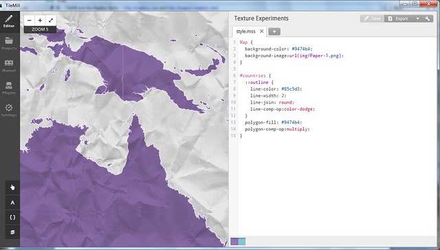
I started with the open-source Tilemill template OSM-Bright, noting that there are some good examples of it in use out there. I grabbed the current OSM data, piped it into my local PostGIS database (note the hazards of adding many extracts) and spent some time turning it into "Geosprocket-Bright" in Tilemill:
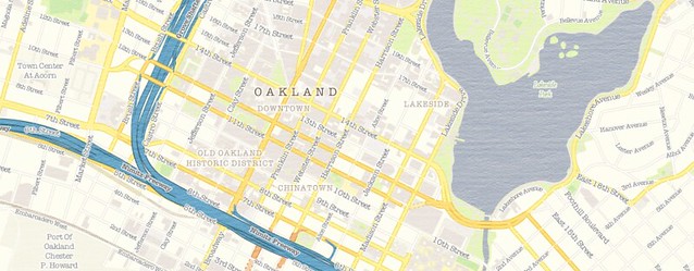

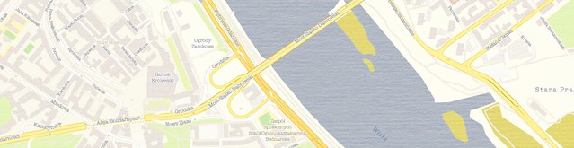
Next came the heavy lifting. I exported a slew of regions to .mbtiles format; I would have loved to build a map of the entire world down to street zoom level, but I thought I'd start more realistically with a global map down to zoom level 9, then a handful of cities down to zoom level 17. I planned to put them on an Amazon S3 instance and tap them directly from the client library, doing an end-run around Mapbox hosting. Sounds pretty smooth, right?

Let's keep track of the time investment, shall we?

  • 4 hours to export everything from Tilemill
  • 6 hours to chop the .mbtiles into 1.6 million PNGs
  • 3 hours to consolidate them all into a single directory structure (because I was too dumb to do that in the last step)
  • 56 hours to push the tiles to an S3 bucket on a 20mbps connection
Obviously these are CPU hours, not billable hours - but it was still more than two days between when my map style was ready and when I could actually hook the map up to a browser.


The Verdict

This is a narrow case where I needed to roll my own tiles and serve them. My map included texture and custom fonts, which is beyond the reach of Mapbox Streets. The total filesize of my exports - even as .mbtiles - was 15GB; that translates to the Premium Mapbox hosting plan, and a whopping $6,000 flat fee per year. That's for five cities - the tiniest fraction of a world of tiles. It's not quite Google Maps Enterprise money, but damn. By contrast, it cost me nine bucks to get all of my map tiles into an S3 bucket, where I'll get billed something like half a cent per 1,000 map views.

But this process will be moot pretty soon anyway; the promise of Tilemill 2 is that you only need to bring your cartography to the table - Mapbox will do the rest of the work to get your style to the browser with vector tiles. They've only done this for a few testers while they're hashing out the details, but odds are there will be a public version in the first half of 2014. 

In keeping with other examples of open-source underpinning software-as-a-service, Mapbox has a sound business model. Despite the huge amount of intellectual capital they've open-sourced, it is still easier and - when time spent is considered - VASTLY cheaper to just use their hosted map services. I suspect they've been totally aware of this even as they release service-liberating tools like Tilemill, OSM-Bright and mbutil. The scale and efficiency of Mapbox make their hosted maps too good to avoid.

I hope my experience here has been instructive to others.

The Product

I did get a map out of my experiment, and it's free to use. If you happen to be mapping in Warsaw, Sochi, Santo Domingo, LA or the Bay Area, I hope it proves useful. Just use this XYZ tile scheme in your client implementation:

http://s3.amazonaws.com/geosprocket/tiles/{z}/{x}/{y}.png

As per the usual OSM license, be sure to include "© OpenStreetMap contributors". Happy Mapping!

Read more ...

Seamless Textures for Tilemill

Thursday, October 24, 2013
As evidenced by AJ Ashton's announcement this week, Tilemill keeps getting cooler. With vector tiles and Tilemill 2 on the horizon it seems like anything will be cartographically possible, but I've been having fun while we wait.

Tilemill allows you to fill a polygon or feature with an image instead of a plain color, which makes for some cool pattern and feel options:


However, you need to be careful not to run afoul of the tiling system that repeats any such image in gridded 512px intervals. You can get some funky edges if you're not paying attention. The solution to this is to use a seamless image - i.e. an image where every edge matches up with its opposite. There are quite a few options out there for seamless backgrounds, but not very many that are both square and 512px on a side. So I followed the lead of the talented artists at Stamen and reluctantly opened photoshop to make some seamless texture images of my own for Tilemill.

There are 12 of them, and you can grab them here, licensed CC-by-SA. 

I'm personally inclined to overuse things like this once I've made them available (I used them last weekend at StoryHack, actually), so it's going to take some time before I find the right subtle level. I'll let you know when I get there.

Have fun! And I'd love to see any examples of these in the wild once you put them to use . . .


Read more ...

Taking Tilemill 2 for a Spin

Sunday, May 19, 2013

When I took my first GIS class, I was told that 5% of my time would be spent making maps, while 90% of it would be spent corralling data into usable format and 5% would be spent beating an unresponsive plotter with a cardboard tube. This balance has definitely changed as interoperability has gone from prayer to practice, but I've continued to be frustrated by the time I feel gets lost to a missing shapefile extension or a falsely-defined projection.

For all the fun afforded us by Mapbox's original Tilemill map design platform, it's always been sort of a GIS-y hassle to wrangle data into it. Mind you this is slight, glancing criticism - it's NOTHING compared to getting your geodata to work in Illustrator or any actual GIS platform. But I always found myself wishing I could spend less time racking my brain for where I put that awesome building footprint layer, or trying in vain to find the right ORDER BY syntax for a PostGIS datasource.

Perhaps you've heard, but Mapbox sort of solved my whiny problems. Tilemill 2 is in unsupported alpha, but it's already fulfilling my dream of data-agnostic cartography. The basic idea is that the world - as derived from OpenStreetmap - is some pretty centralizable basedata, so why not just tap the source and style it however you like? Instead of pulling extracts or copies or subsets, Tilemill 2 just gives you the whole damn world, all 330GB-and-counting of it, via super-fast vector tiles (great explanation here). You get to style those tiles with the CartoCSS language, and at that point they're ready for your audience.

It is A LOT of fun to have the world at your fingertips:


For the moment there's no export or serving option, and it'll be interesting to see what Mapbox does with this tool in its already-robust custom mapping lineup. It's also worth noting that planet.osm is not ALL TEH DATAZ - we'll always need a way to use local or personal geodata. But this is a great leap for an already-impressive platform.

It's liberating to be able to focus on cartography with the building blocks already in place.


Props to Gretchen Peterson for some great color ideas as I fiddle with this.


Read more ...

Context For Cheap - The Map Reference Overlay

Wednesday, January 23, 2013
I used to hate building reference layers in my maps. Labeling placenames was painful, but nothing compared to the chest-hair-waxing misery of scaling transportation symbology by road class. No out-of-the-box defaults were ever cartographically pleasing, and hours were incinerated in the fires of annotation placement. [Sorry, QGIS and Illustrator - you're just as much to blame here as the Redlands upstart.]

But that's basically all in the past. Not long after I slogged my way into web interactive maps, the crew at Mapbox released the finest preconfigured basemap I've ever seen, "Mapbox Streets". They quickly followed with a dozen attractive starter styles and an impressive customization pallette.

Mapbox Streets

The idea of the pre-baked map was nothing new - Google, ESRI, GeoIQ and others had entered the web map age with variations on the Reference-Canvas idea: "You provide the overlay data and the story to tell, we'll provide the geographic context." And this works really well for monodimensional Point of Interest (POI) data, as demonstrated by the Google pushpins that these days rain from the sky to skewer every interesting set of coordinates on the planet. Pins and icons don't get in the way of labels and reference features.

The siren call of the martini glass . . .

But what about polygons and the world of the choropleth? Not that it stopped anyone from trying, but polygons on top of a reference canvas either obscure the features beneath or require too much transparency to make a thematic point. I bombed out on early attempts to work with this essential truth:

NYC Metro, covered in bubble bath

The solution to this problem is under our noses. I first noticed this technique when John Keefe and Steven Melendez at the WNYC Data Desk posted a Mapbox-based interactive looking at NYC's proposed wards; the streets were curiously visible above the color-coded ward polygons.

They had introduced me to the reference overlay.

Leveraging the customization options of Mapbox streets, they had
  • Winnowed out the layers representing land and water from their basemap, leaving just roads, land use and text,
  • Set these to a modestly transparent level (maybe 30-40%),
  • Using the compositing of the Mapbox API, laid this semi-transparent layer on top of the thematic polygon layer, inverting the standard reference canvas model
After I recovered the pieces of my brain that had exploded out my ears (maybe I'm easily impressed), I set to applying this tactic to my own maps. I also realized that this could be expanded to allow for a sort of map sandwich, with land and water below, thematic data next and reference data on top:


And it's not just a Mapbox thing:
Hell, if you can do better than AJ Ashton and company, build your own mostly-transparent reference overlay and cache it in a tile server for future projects.

Subtle Context on the Census Dotmap

While I realize this is all old hat in the GIS world (yes, of course you place your labels above your polygons dude), it's usefulness in web mapping can't be overstated. The reference overlay saves us serious time, solves the "mashup" problem, and lets us focus on our data and what it has to say.

Update, Wednesday Night:
After conversations with some of the Stamen and former-GeoIQ folks, I figured it'd be worth comparing what happens when three different teams build reference overlays from the same (OpenStreetmap) data. Check it out here.


Read more ...

Maximalist Mapping

Monday, November 12, 2012
I am a journeyman cartographer, and I often find that my training didn't prepare me for the possibilities available today. It's all well and good to know the right ratios and color schemes, but how am I supposed to learn the right way to incorporate the nuttery that is Mapnik? How do I use compositing operations and CartoCSS in my maps without making them look like the worst visual excesses of web design?

By spitballing.

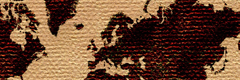
I'm throwing data, textures and cartographic conventions at the wall and seeing what sticks. Some combinations work better than others, and I'm finding that maximalism isn't all bad. There are elegant ways of arranging a thousand features in a map, and hopefully I'll stumble on them someday. In the meantime, here are some studies.


More of these fiddlings can be found here, with CartoCSS parameters attached in most cases. It's also worth noting that I used Tilemill for these, employing datasets from Natural Earth 1.4 and patterns from ForHumanUse. Most are open-source, all are free.

These are static images, and the test I'm now finding most difficult is how to make arresting visuals meaningful when dynamism is required. Many have failed, including me.


Read more ...

The Buffalo in the Room Part 2: Fade Out

Sunday, September 16, 2012
In the last post we looked at the many difficult paths that can take us to the summit of cartographic nirvana known as the "Buffalo Tint", as rocked by National Geographic Maps and others

As I noted, this effect has traditionally been impossible to pull off in a GIS platform like ArcMap or QGIS. Tilemill initially got us a little bit closer by giving us full control over styling possibilities with CartoCSS code.

But now, as of Tilemill 0.10.0, compositing functions make this kind of effect a snap. Let's look at making a full Buffalo Fade, still using South Sudan as an example. Specifically, we're going to make a fade mask in Tilemill that can be laid over some Mapbox base layers in a web map.


Step 1: Preprocessing a Mask

This step - preprocessing in a GIS platform - is optional, it just depends on where you want the fade to begin. The purpose of preprocessing is to create a fixed feature mask;

  • QGIS: Run a buffer on your focal feature, larger than the convex hull of the feature for good measure. Then run a difference process between the buffer and the focal feature. 


Either way you're aiming for a feature mask that looks like this:


Step 2: Into Tilemill


Then import that feature mask into Tilemill and style it with what might be the most efficient piece of code I've ever cobbled together, compositing the feature mask to fade inward from its border:


[Alternately, in this case you can do it by just compositing every country that isn't South Sudan and eliminate the buffer processing above. Here's the CartoCSS to do that]

That's it. Export to MBTiles format and drop it on top of a base map of your choice. You're off to the races:


There are still a few bugs when using this for dynamic tiles, notably some tile-edge artifacts that break up the smoothness. But overall I'm looking forward to messing around with these new compositing capabilities


Read more ...

The Buffalo in the Room Part 1: Fade In

Wednesday, September 12, 2012
Since the ancient days - well, since late 1993 or so - production cartographers have been been stuck in an awkward technical limbo between GIS and art. Two platforms were required to get a map from vector geoprocessing to publication-quality graphics: Mostly ESRI's ArcGIS for the former and mostly Adobe's Creative Suite for the latter. Sure the two tried to overlap each other as time went on ("Seven hours to export a 900dpi TIFF and I can still see the pixels? Thanks ArcMap!"), but the basic math was tough to overcome: with finite memory on a workstation, ArcGIS focuses its resources on geoprocessing at the expense of the graphic outputs, and vice-versa.

This was the way of it when I started mapping. And the classic example of "You can't do that in GIS" is the buffalo tint popularized and used to wicked effect by National Geographic Maps. Basically it's a targeted feature fade, meant to draw attention to a focal point or to one side of a divide. And pretty hot too.

And it's not really possible in ArcMap. Here, let's try doing the inverse of a fade, which is easier to envision. This is more of a halo, and it's theoretically possible to do this by adding line layer after line layer, each offset and transparent-ed a bit more than the last:

Buffalo Halo a la ArcMap
Not too shabby, I suppose. A fade out from a clear focal feature. Maybe a bit heavy-handed, but it gets the message across. Too bad it took 30 minutes of clicking into five successive sub-menus on each of ten layers to get it done. And since ArcMap isn't a graphic engine, there's no anti-aliasing, and pixels are visible in every feature. This is not a production-quality graphic.

Let's try that again with Tilemill. I know I know, it's not a GIS engine, but it's a lot closer to one than Adobe Illustrator is, try as they might. Tilemill has full support for operations like selecting and styling by attributes as well as basic geoprocessing if the data is tied to a source like PostGIS, Google's data API or CartoDB's SQL API. Also it's free and open-source (I love that such news is ancillary to my point here. Woot!). As I've mentioned before, Tilemill brings the efficiency of CSS code to the map styling process, and it pushes everything through the sophisticated Mapnik graphic driver to look damn pretty for web or print.

Code will save us, right? Here, check it out:

Buffalo Halo a la Tilemill
This is a more subtle effect, with no striping artifacts, and all the linework is anti-aliased for smoothness. Bonus points for also providing an interactive output where the halo scales dynamically.

So what kind of Carto CSS went into that? Oh, just more than three hundred lines of recursively offset style code. Oy. It's true that it's portable (feel free to plug the code into your own project), but it's not ideal. Definitely not for fast projects under a deadline.

This is where compositing comes in. Last month, the indefatigable Mapnik team added support for the graphical magic that underpins programs like illustrator. This is part of a long-running effort by cartographic designers at Stamen and Development Seed to get out from under the Iron Adobe boot. (or the supple GIMP moccasin, I suppose). With compositing, all sorts of things become a lot easier to do in Tilemill, for instance what we've been trying above is now about 30 lines of CartoCSS, and much richer:

Buffalo Halo with Mapnik Compositing Mojo in Tilemill
The possibilities are sort of mind-boggling, and I invite all the actual graphic designers of the world to figure them out (The composite parameter alone in CartoCSS has 35 options). In the meantime I'll continue to look for ways to enhance my mapping toolkit; the next post will focus on reversing the direction of this effect, like in the NatGeo example linked above.

Free-Range Buffalo Halo, Thriving in its Natural Environment.
Thanks to Dane Springmeyer for pointing out the time-saving parameters on this one.

Read more ...

Map Texture Studies

Tuesday, September 11, 2012
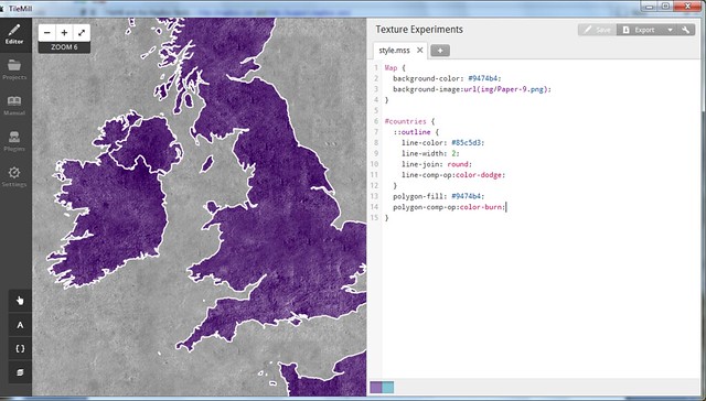
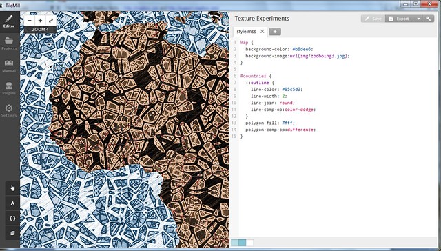
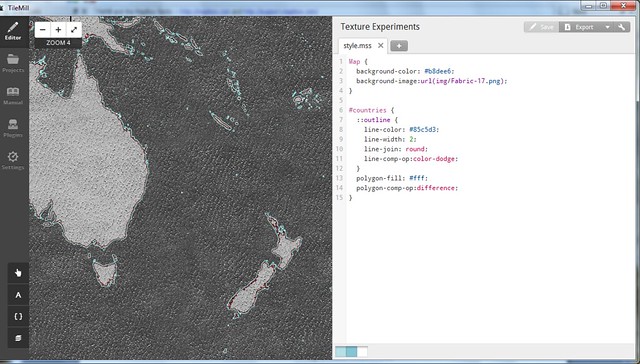
Given enough time to play with them, I'm coming to adore the new Mapnik image compositing features available in Tilemill. I'll cover some methods in more detail in the next few days, but for now here's a look at a series of map background textures, composited through geographic features. The vignettes below are displayed with their attendant carto parameters for your re-creative enjoyment. Click here to see the full set.


Many thanks to AJ Ashton for fiddling assistance and to Dane Springmeyer (+Artem & the Mapnik crew) for hacking the new features. [Mostly] seamless texture tiles generously provided by Dave McNally and Patrick Hoesly.

More compositing to follow . . .

Read more ...

Data-Driven Symbology in Carto

Tuesday, August 7, 2012

The term "disruption" makes me want to stick a hot poker in my eyes, and then post a tilt-shifted instagram pic of that poker laying on a table next to a lychee mojito.

However, "disruption" is an accurate description of the state of cartography over the past two years or so. The traditional realm of the GIS analyst has been invaded and turned upside-down by an army of new cartographers who come from a software development background. These visigoths have brought odd notions like efficiency, economy and - heaven help us - design to the mapping field, but wow do they have a different process for making maps.

This dichotomy between GIS-er and carto-developer is visible in the CartoCSS language. Stemming from a project called Cascadenik, CartoCSS is a collection of stylesheet code that allows a mapper to assign symbology to geodata and render it with Mapnik - by far the best image rendering engine available for cartography. This code distinctly resembles the assemblage of rule sets, blocks and properties that any web developer would use to style a web page (hint: the target user base):

 #wind {    marker-width:5;    marker-fill:#DADDE2;    marker-line-color:#fff;    marker-fill-opacity: 0.6;   }  

The highest-profile deployment of CartoCSS is in the excellent Tilemill mapping platform from the folks at Development Seed. The code drives every style choice you make in Tilemill, then it compiles everything to Mapnik and delivers you exceptional graphics, both static and web-ready. This is great news for developers, who are already comfortable with code in their workflows. Not so much for the GIS analysts (like me) who have been Arc-trained for years on how to push buttons and move sliders in the quest for a good map. Also, CartoCSS has had limited functionality for thematic mapping - a common complaint is that you can't do multivariate symbology (graduated colors and symbols, say) without awkwardly-nested code cascades.

Until now, that is. A key development has been taking place behind the scenes, one style parameter at a time -- data-driven symbology has arrived in CartoCSS as of Tilemill version 0.10.0. Let's take a look at what this means:

Figure 1 - Marker Size
Previously, you needed to specify a hard number as a value for almost every style parameter. Translated, that means the point data (representing weather stations) in figure 1A was coded like this:

 #wind { marker-width:10; }  

To make graduated symbol sizes, you previously had to put in a plague of conditional statements over many lines, each pointing to a different value for marker width. Now you can just pull those numbers from attribute data; in figure 1B, the points are graduated based on average wind speed, with the values coming from the attribute field labeled "mph":

 #wind { marker-width:[mph]; }  

You can even manipulate the attribute-derived values directly in CartoCSS with basic math. In figure 1B, I've multiplied everything by 2 for an exaggerated effect. Things get interesting when you try styling on multiple variables - one on symbol width (wind speed) and one on symbol height (station elevation) in figure 2B:

Figure 2 - Multivariate Symbology

Label placement has long been the lone data-driven feature in CartoCSS. This code renders the weather station labels in figure 3A:

 #wind { text-name:"[STATION NAME]"; }  

Now you can orient labels directly from a column, for instance to make them point in the average wind direction in figure 3B below (fun but cartographically criminal). Makers of typographic maps should pop a celebratory beer over this one; a little bit of geoprocessing and your work is automated now. [Update: I'm told the real purpose of this is to orient interesting text characters like Arrows (-->). It's all fair game.]

 #wind { text-orientation:[direction]; }  

Figure 3 - Label Rotation

Building heights for "Pseudo-3D" effects can also now be pulled from attribute data. Figure 4A shows building outlines, 4B shows all buildings rendered with a height of 8pts, and 4C shows them rendered at actual height in meters with a vertical exaggeration of 2. Woot.
Figure 4 - Dynamic Building Heights

The possibilities are not limitless here. It takes a fair amount of chopping away at the Mapnik source code to enable each of these data-driven parameters, so the list of available ones is still pretty short. Nor does this make CartoCSS the absolutely-ideal entry platform for a GIS analyst looking to get into "Map Development". However, this represents a forward leap in ease of use for mappers of all stripes, and I look forward to seeing what the community can do with this functionality.


Read more ...