I used to hate building reference layers in my maps. Labeling placenames was painful, but nothing compared to the chest-hair-waxing misery of scaling transportation symbology by road class. No out-of-the-box defaults were ever cartographically pleasing, and hours were incinerated in the fires of annotation placement. [Sorry, QGIS and Illustrator - you're just as much to blame here as the Redlands upstart.]
But that's basically all in the past. Not long after I slogged my way into web interactive maps, the crew at Mapbox released the finest preconfigured basemap I've ever seen, "Mapbox Streets". They quickly followed with a dozen attractive starter styles and an impressive customization pallette.
The idea of the pre-baked map was nothing new - Google, ESRI, GeoIQ and others had entered the web map age with variations on the Reference-Canvas idea: "You provide the overlay data and the story to tell, we'll provide the geographic context." And this works really well for monodimensional Point of Interest (POI) data, as demonstrated by the Google pushpins that these days rain from the sky to skewer every interesting set of coordinates on the planet. Pins and icons don't get in the way of labels and reference features.
But what about polygons and the world of the choropleth? Not that it stopped anyone from trying, but polygons on top of a reference canvas either obscure the features beneath or require too much transparency to make a thematic point. I bombed out on early attempts to work with this essential truth:
The solution to this problem is under our noses. I first noticed this technique when John Keefe and Steven Melendez at the WNYC Data Desk posted a Mapbox-based interactive looking at NYC's proposed wards; the streets were curiously visible above the color-coded ward polygons.
They had introduced me to the reference overlay.
Leveraging the customization options of Mapbox streets, they had
And it's not just a Mapbox thing:
While I realize this is all old hat in the GIS world (yes, of course you place your labels above your polygons dude), it's usefulness in web mapping can't be overstated. The reference overlay saves us serious time, solves the "mashup" problem, and lets us focus on our data and what it has to say.
Update, Wednesday Night:
After conversations with some of the Stamen and former-GeoIQ folks, I figured it'd be worth comparing what happens when three different teams build reference overlays from the same (OpenStreetmap) data. Check it out here.
But that's basically all in the past. Not long after I slogged my way into web interactive maps, the crew at Mapbox released the finest preconfigured basemap I've ever seen, "Mapbox Streets". They quickly followed with a dozen attractive starter styles and an impressive customization pallette.
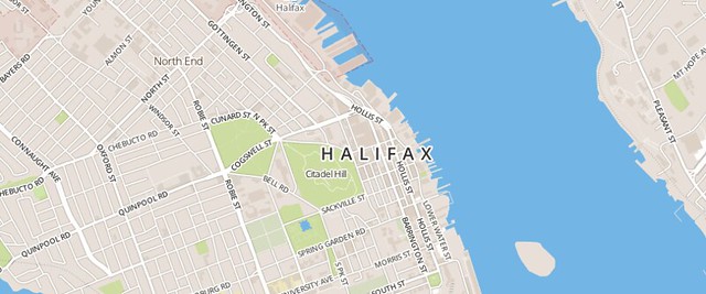 |
| Mapbox Streets |
The idea of the pre-baked map was nothing new - Google, ESRI, GeoIQ and others had entered the web map age with variations on the Reference-Canvas idea: "You provide the overlay data and the story to tell, we'll provide the geographic context." And this works really well for monodimensional Point of Interest (POI) data, as demonstrated by the Google pushpins that these days rain from the sky to skewer every interesting set of coordinates on the planet. Pins and icons don't get in the way of labels and reference features.
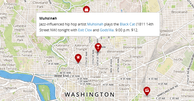 |
| The siren call of the martini glass . . . |
But what about polygons and the world of the choropleth? Not that it stopped anyone from trying, but polygons on top of a reference canvas either obscure the features beneath or require too much transparency to make a thematic point. I bombed out on early attempts to work with this essential truth:
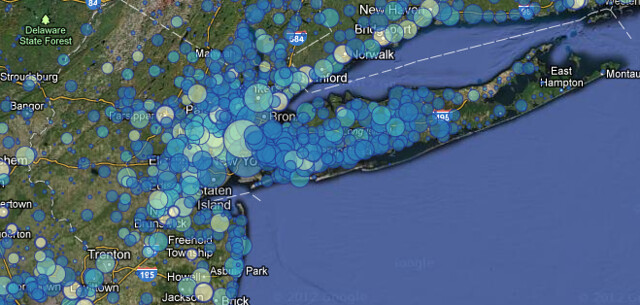 |
| NYC Metro, covered in bubble bath |
The solution to this problem is under our noses. I first noticed this technique when John Keefe and Steven Melendez at the WNYC Data Desk posted a Mapbox-based interactive looking at NYC's proposed wards; the streets were curiously visible above the color-coded ward polygons.
They had introduced me to the reference overlay.
Leveraging the customization options of Mapbox streets, they had
- Winnowed out the layers representing land and water from their basemap, leaving just roads, land use and text,
- Set these to a modestly transparent level (maybe 30-40%),
- Using the compositing of the Mapbox API, laid this semi-transparent layer on top of the thematic polygon layer, inverting the standard reference canvas model
After I recovered the pieces of my brain that had exploded out my ears (maybe I'm easily impressed), I set to applying this tactic to my own maps. I also realized that this could be expanded to allow for a sort of map sandwich, with land and water below, thematic data next and reference data on top:
And it's not just a Mapbox thing:
- Josh Livni makes it work with Google Maps,
- It's possible to interleave thematic tiles from another service like CartoDB when using the Leaflet library.
- In fact, with all the interoperable javascript libraries, you can use a Mapbox Streets reference overlay in the Google Maps API, like Brandon Martin-Anderson did with his census dotmap.
- Stamen Design has awesome toner tiles that are available in various styles of overlay on all the major map APIs.
- ESRI's ArcGIS Online has some modest reference overlay options as well, though the styles are out of the usual ArcMap playbook, and like Google you're locked into their API.
- The National Park Service just rolled their entire map infrastructure into a series of wafer-thin theme layers, built in Tilemill and served on Mapbox.
- The whole concept of a la carte reference map components in web mapping is older than 2012 - the GeoIQ team (now folded into ESRI) built "Acetate" - a system for layering terrain, roads, labels and more within the GeoIQ API. So I'm late to the party.
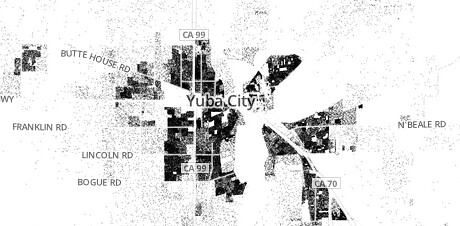 |
| Subtle Context on the Census Dotmap |
While I realize this is all old hat in the GIS world (yes, of course you place your labels above your polygons dude), it's usefulness in web mapping can't be overstated. The reference overlay saves us serious time, solves the "mashup" problem, and lets us focus on our data and what it has to say.
Update, Wednesday Night:
After conversations with some of the Stamen and former-GeoIQ folks, I figured it'd be worth comparing what happens when three different teams build reference overlays from the same (OpenStreetmap) data. Check it out here.


