Pages

Showing posts with label responsive design. Show all posts

Redistricting: A Question and a Query

Wednesday, January 15, 2014
Alert: Both policy AND technology will be discussed below. Bring both your brains. You've been warned.
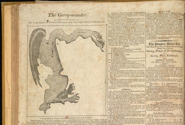
Gotta love the classics

The Question

My city is on the tail end of the country's redistricting cycle. Somehow while Texas was marginalizing Latinos and Dennis Kucinich was getting scribbled out of his constituency, we here in Burlington were waffling over how to deal with triparty politics and the implications of our changing neighborhoods.

I was unrealistic early on about how much of a role technology could play in the process. A survey of neighborhood geographic identity and a do-it-yourself redistricting app were helpful but not game-changing. After years of wrangling, the parties mostly just hashed it out in committee (though the final plan is derived from one made with our DistrictBuilder app), and now in about 6 weeks the voters will approve or reject it.

Which brings me to the question: What would the proposed plan change things for the average BTV citizen? It's a pretty easy one to answer in the aggregate - all the information is out there: new boundaries, old boundaries, population distribution, polling locations. But these bits are spread out across various sites and articles. What if there was a way to just ask the question: How will this change things for me?

Under the umbrella of CodeForBTV - the local CodeforAmerica brigade - I put together the basic answering tool. Built for phones (via Bootstrap), the app lets the user plug in their address and get back a list of redistricting plan implications:


The Query

The question of individual impact can be answered with a simple spatial query: return some pieces of information based on the polygons that intersect the user's location. This pointed to some basic building blocks:

  • The city redistricting plan - both the old wards and the new ones lumped into one geojson file
  • A robust search engine - I went with the Google Maps API because of the amazing viewport-biased geocoding and the built-in typeahead, but given more time I would use Leaflet and a state-hosted geocoder plus typeahead.js
  • Spatial query capability - fortunately CartoDB offers all the magic of PostGIS at a URL endpoint, with great styling available as well. 
The user-selected address gets converted to lat/lon, then sent to the CartoDB API in an ST_Intersects() query. It returns a map overlay of the old and new district boundaries at the site, and a set of answers to some FAQs about redistricting.

It's a simple app, relying on some robust APIs. I hope it's useful in getting my neighbors oriented to the landscape of the proposed redistricting. At the very least it'll save people some time peering at a large paper map in city hall, and at best it'll head off 40,000 individual "how will this affect me" emails directed at the city councilors and GIS manager.

I also hope it'll be of use to anyone else who wants to present geographic change over time at a user-selected location. Get the code on github.
Read more ...

How to build a Mobile-First Map Form

Friday, November 8, 2013

Find me, small screen.

I've spent a lot of time thinking about the incredibly rich experiences we're getting these days from a digital map paradigm basically invented by Google in 2005.

A rich experience everywhere but on mobile devices, that is.

The dichotomy is pretty intense - on our larger screens, we have data visualizations of artful grandeur. We have amazing cartography in tiles and vectors, and we have smooth analytical tools. We're even approaching "GIS on the Web" that doesn't suck.

But then you turn on your phone and the best applications use oblique-angle maps the same way they did in Car SatNavs a decade ago.

I don't have an answer to this problem, I just mean to say I've been thinking about it. And it turns out that a bunch of the technologies I use regularly can be pretty easily combined to offer some possible fixes for how a user experiences maps on mobile. I'll walk you through them while trying to tackle a basic application: a location-based survey.

1.) Bootstrap

I get it. I overuse Bootstrap for the architecture of my sites. But in the latest release (3.0) they went "Mobile First", so it makes many of my other tasks easy by providing the responsive classes out of the box:


2.) Google Forms

I still think of Google Forms as an underutilized gem for easy data collection: pipe data from a form to a spreadsheet with an API; one barely needs to try anymore :) However, tying a custom Bootstrap page to a specific google form requires a few things available in the source code of the input form's page:
  • Form identifiers:
  • Field-specific IDs:
  • A Redirection iframe:


3.) Mapbox.js

Most of the necessary functions here are actually native to Leaflet, but I like the look of the Mapbox implementation, and they provide "Retina Tiles" that scale better for mobile. The basic tasks for the map in this application are:
  • Figure out user location without asking
  • Let the user fix the inevitably-incorrect positioning
This works with a quick call to a free IP registry, centering the map on the result:


Then the user can drag the map around under the crosshair to where they actually are - this is a tactic I borrowed from OpenPlans after I got a reminder:


4.) CartoDB

Using a new tool they've made available to sync tables, there's almost no code involved in this step. All I needed to do was go to "File-->Publish" in the form target spreadsheet, then copy the .csv URL into the "New Table" creation dialog in CartoDB. Then a bit of easy styling created a custom-mapped results page:


The page itself is pretty simple, and you can grab it as a gist here. It'd be pretty easy to fork it and replace the form parameters with one of your own. As always, please share if you use it; I'd love to see where others take this.

The Caveats and Alternatives:

  • Geolocation by IP is pretty awful, unless you happen to be Google (but in that case you're currently being sued for the method by which you collected your registry). The service I used put me in the correct city on my laptop, the correct state on my tablet, but according to my phone I'm in Buffalo. There are better ways to get location, but they require user permission, which is a UX hurdle I didn't want to jump for this.
  • I subscribe to the gospel of responsive design because I'm lazy. It would probably be smoother to build this as a native Android/iOS app, but no way would it be this easy.
  • Since location is being passed to the table from the initial map, there's no geocoding and you could theoretically just tap the Google Drive API to put points on a results map. But again: EASY. CartoDB is that :)

#Facepalm

In the first run I forgot the mobile-specific meta tag. I was reminded :) Thanks, Vladimir!


Read more ...

Maps in a Responsive Page

Sunday, July 21, 2013


Heaven help me - I've been building a responsive infographic.

Specifically, I used Bootstrap to flesh out a not-really-infinite-scroll site that summarizes the findings of a survey - done by some #opengov types on social media use in the Vermont legislature. Getting the infographic confession aside, my point in mentioning it is that I wanted to include a map of responses by county, and that posed a dilemma.

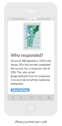
I went with a responsive layout for the page because I know that 50% or more of the traffic will be from mobile clicks - the kind of viewing experience that makes a tricked-out slippy map either frustrating or useless. So I'd need something more flexible than my usual portfolio. Fortunately, a few months ago responsive-design-zealot Brad Frost had talked about using a combination of static and dynamic maps for the same purpose depending on available screen real estate. I thought it was cool but at the time had no use for it. Enter this recipe:

Ingredients:
1.) An API that provides both static and dynamic endpoints: Check. Mapbox FTW.
2.) A Responsive layout: Check. Bootstrap is out-of-the-box.
3.) A snippet of javascript to load the map according to screen size: Check. Repurposed here.

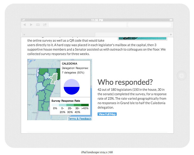
I knocked together a dynamic map using Tilemill and mapbox.js - this let me do some cool linking of SVG hover states and popup information windows. As a bonus I could disable pan and zoom to make it more like an interactive image and fit better into the overall page context. [Yes, haters, you're right - I should have done this with D3. Gimme a break; I'll get to it.] I then grabbed the map's PNG equivalent from the Mapbox Static API and plugged it into the code as the "static" option.

In Mr. Frost's original his "embed" option for larger screens is the standard google maps embed string. I wanted more features than were available with a standard mapbox embed, so I built the site separately with mapbox.js and "iframed" it in. This is just as much of an ugly hack as it seems, but it works.

The result is a map that renders big and fully-interactive on tablets and larger:


But shows a teaser image and a link to see more on a small screen:


This is obviously not a perfect solution, but it fits the purpose here. And it's also extendable - consider if you had to generate dozens of pages like this - you could do it just by programmatically changing the lat/lon or index value of both the static and the embed maps. Also worth noting is that this strategy works with both Mapbox and Google APIs.

As we move into a web that's even more solidly mobile-centric, we'll need to keep adapting maps with the resources we have available. It's actually a lot of fun trying to keep up.

Click here to see it in action

Read more ...