Pages

Showing posts with label PostGIS. Show all posts

Redistricting: A Question and a Query

Wednesday, January 15, 2014
Alert: Both policy AND technology will be discussed below. Bring both your brains. You've been warned.
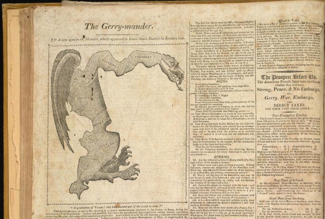
Gotta love the classics

The Question

My city is on the tail end of the country's redistricting cycle. Somehow while Texas was marginalizing Latinos and Dennis Kucinich was getting scribbled out of his constituency, we here in Burlington were waffling over how to deal with triparty politics and the implications of our changing neighborhoods.

I was unrealistic early on about how much of a role technology could play in the process. A survey of neighborhood geographic identity and a do-it-yourself redistricting app were helpful but not game-changing. After years of wrangling, the parties mostly just hashed it out in committee (though the final plan is derived from one made with our DistrictBuilder app), and now in about 6 weeks the voters will approve or reject it.

Which brings me to the question: What would the proposed plan change things for the average BTV citizen? It's a pretty easy one to answer in the aggregate - all the information is out there: new boundaries, old boundaries, population distribution, polling locations. But these bits are spread out across various sites and articles. What if there was a way to just ask the question: How will this change things for me?

Under the umbrella of CodeForBTV - the local CodeforAmerica brigade - I put together the basic answering tool. Built for phones (via Bootstrap), the app lets the user plug in their address and get back a list of redistricting plan implications:


The Query

The question of individual impact can be answered with a simple spatial query: return some pieces of information based on the polygons that intersect the user's location. This pointed to some basic building blocks:

  • The city redistricting plan - both the old wards and the new ones lumped into one geojson file
  • A robust search engine - I went with the Google Maps API because of the amazing viewport-biased geocoding and the built-in typeahead, but given more time I would use Leaflet and a state-hosted geocoder plus typeahead.js
  • Spatial query capability - fortunately CartoDB offers all the magic of PostGIS at a URL endpoint, with great styling available as well. 
The user-selected address gets converted to lat/lon, then sent to the CartoDB API in an ST_Intersects() query. It returns a map overlay of the old and new district boundaries at the site, and a set of answers to some FAQs about redistricting.

It's a simple app, relying on some robust APIs. I hope it's useful in getting my neighbors oriented to the landscape of the proposed redistricting. At the very least it'll save people some time peering at a large paper map in city hall, and at best it'll head off 40,000 individual "how will this affect me" emails directed at the city councilors and GIS manager.

I also hope it'll be of use to anyone else who wants to present geographic change over time at a user-selected location. Get the code on github.
Read more ...

On Reverse-Engineering a Map Stack

Saturday, January 11, 2014


I'm going to come right out and say this:

You should probably just use Mapbox.

How I came to that conclusion is a bit of a longer story.

The Scene

As a cartographer, I am an unabashed fan of Mapbox. I've been using Tilemill for years, and I love the fully-realized design of the Mapbox Streets basemaps. Even before Google Maps brought the paywall hammer down I was already migrating my clients' projects to the open-source ecosystem based out of a D.C. garage. Controlling so much of the stack in an open-source environment meant less risk to my clients, and in most cases it came out a lot cheaper. The choice was pretty easy, actually. 

Looking around this section of the market I don't believe that Mapbox and Google Maps have anyone to compete with but each other (mobile is another story). They are the only two companies currently offering a rigorous javascript API tightly integrated with attractive map services built for the web. (Debate this in the comments, ESRI, Nokia, and Bing users) There are plenty of a la carte options out there - Stamen's wonderful map tiles, the sheer power of the OpenLayers API - but as a lazy developer I've come to really like working with an integrated, open stack. Mapbox is my current choice, though many use cases all but require Google's services.

The Challenge

An open-source stack doesn't mean a free stack, and Mapbox's map tile charges can rack up quickly if you're not paying attention. Exhibit A: I offered Brandon Martin-Anderson one of my Mapbox tilesets to use as a reference for his Census Dotmap. Several viral weeks later I was looking at overages the size of my annual budget.

An open-source stack may not always be free, but in theory it can be copied and hosted by others. I've done this quite a bit on the javascript API side, mixing and matching tile providers with various client libraries. However, the costs that had begun to concern me were on the basemap end. So I set out to do what Mapbox flat-out encourages you to do with its wide-open codebase:

I would make and serve my own damn basemap. How hard could it be?

The Tools


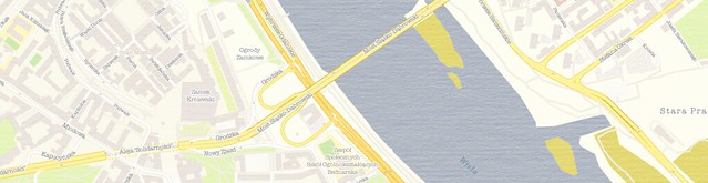
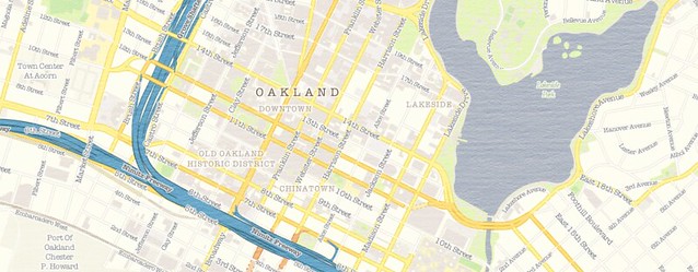
I started with the open-source Tilemill template OSM-Bright, noting that there are some good examples of it in use out there. I grabbed the current OSM data, piped it into my local PostGIS database (note the hazards of adding many extracts) and spent some time turning it into "Geosprocket-Bright" in Tilemill:


Next came the heavy lifting. I exported a slew of regions to .mbtiles format; I would have loved to build a map of the entire world down to street zoom level, but I thought I'd start more realistically with a global map down to zoom level 9, then a handful of cities down to zoom level 17. I planned to put them on an Amazon S3 instance and tap them directly from the client library, doing an end-run around Mapbox hosting. Sounds pretty smooth, right?

Let's keep track of the time investment, shall we?

  • 4 hours to export everything from Tilemill
  • 6 hours to chop the .mbtiles into 1.6 million PNGs
  • 3 hours to consolidate them all into a single directory structure (because I was too dumb to do that in the last step)
  • 56 hours to push the tiles to an S3 bucket on a 20mbps connection
Obviously these are CPU hours, not billable hours - but it was still more than two days between when my map style was ready and when I could actually hook the map up to a browser.


The Verdict

This is a narrow case where I needed to roll my own tiles and serve them. My map included texture and custom fonts, which is beyond the reach of Mapbox Streets. The total filesize of my exports - even as .mbtiles - was 15GB; that translates to the Premium Mapbox hosting plan, and a whopping $6,000 flat fee per year. That's for five cities - the tiniest fraction of a world of tiles. It's not quite Google Maps Enterprise money, but damn. By contrast, it cost me nine bucks to get all of my map tiles into an S3 bucket, where I'll get billed something like half a cent per 1,000 map views.

But this process will be moot pretty soon anyway; the promise of Tilemill 2 is that you only need to bring your cartography to the table - Mapbox will do the rest of the work to get your style to the browser with vector tiles. They've only done this for a few testers while they're hashing out the details, but odds are there will be a public version in the first half of 2014. 

In keeping with other examples of open-source underpinning software-as-a-service, Mapbox has a sound business model. Despite the huge amount of intellectual capital they've open-sourced, it is still easier and - when time spent is considered - VASTLY cheaper to just use their hosted map services. I suspect they've been totally aware of this even as they release service-liberating tools like Tilemill, OSM-Bright and mbutil. The scale and efficiency of Mapbox make their hosted maps too good to avoid.

I hope my experience here has been instructive to others.

The Product

I did get a map out of my experiment, and it's free to use. If you happen to be mapping in Warsaw, Sochi, Santo Domingo, LA or the Bay Area, I hope it proves useful. Just use this XYZ tile scheme in your client implementation:

http://s3.amazonaws.com/geosprocket/tiles/{z}/{x}/{y}.png

As per the usual OSM license, be sure to include "© OpenStreetMap contributors". Happy Mapping!

Read more ...

Toward an Ideal Geoportal

Thursday, April 18, 2013

A Geoportal Identity Crisis

A city wants to open its geodata for public use. An NGO wants to spark a transparency initiative. A regional planning commission wants to stop emailing zipped shapefiles when pestered. They want to deliver two contrasting products - raw data and parsed themes - to as many as a dozen different audiences: policymakers, technical service providers, the press, professional curmudgeons, etc.

In the past decade, the solution to this nearly-impossible balancing act has been to build a Geoportal, and we've seen some pretty memorable misfires. Most of the trouble can be chalked up to the good intentions of the technicians who produce the data and the tools to distribute it; accustomed to a desktop GIS environment for exploration and analysis, they have built and re-built "GIS on the Web" (Chris Herwig documented his travels around a broad selection of them). They've done this under the assumption that users will be filtering, buffering, selecting by location and overlaying, and as it happens that's not really true. This approach fails all sectors of the public.

For many months now, Brian Timoney has been championing sanity in the wasteland of geoportals. He expertly trolls the mapjunk and the faustian UX, but he's also offered an analytics-based selection of "Best practices" for getting geodata to the public. Beyond how users actually interact with online maps, he's drawn attention to the subtle distinction between "open data" and "useable open data". But he is still something of a voice in the wilderness, as we all nod vigorously in agreement and go back to downloading file geodatabases from the USGS. We work with the system we have, because it's hard to envision the details of the alternative.

A Template

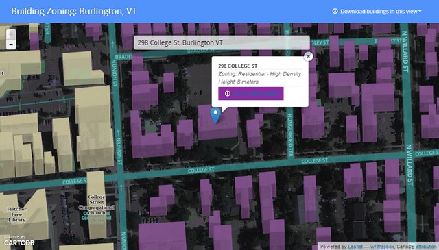
I've been trying to envision such an alternative, spurred on by some adventurous clients. Specifically, I wanted to see if it was possible to crack open a public dataset in a way that was compelling to technicians as well as to the lay public - something that would adhere to emerging best practices as well as to my own bias toward open architecture for open data. Timoney himself has already taken a stab at this, but we have different styles. So I cobbled together a template geoportal, wrapped around a standard multipurpose bit of public data: building records.

Give it a spin here.

I assumed two audiences: 1.) citizens who want their own zoning information and permit history fast, and 2.) analysts who want to grab bulk chunks of building footprint geodata for urban planning, disaster response or just noodling cartography. The former group can search for their address, see their building in context, and get the basic info before heading off to print their fact sheet. One minute or less.


The GIS specialists of the world can hit the download link and vacuum in all the features within the current view extent, in the interoperable format flavor that suits them (+TopoJSON for the bleeding-edge types).


This is just a page for a single dataset, but I think it meets the needs of both audiences and doesn't suck to look at or navigate. A few of the other features I wanted to include:
  • Lightweight and Javascript-based - less than 1MB before the tiles show up.
  • Shareable URLS - the root URL is subject specific, and the location hash allows users to pass around a focused view of a neighborhood or house.
  • Traditional search (in the hanging dialog box) is prominent without obscuring the map, since I'm of the opinion that a map is better as a page canvas than as a tiny sidebar window.
  • Very few visible bells and whistles - This is built to some narrow workflows with no mission creep and no toolbars. A bunch of info is socked away in a modal popup for the intrepid.
  • Cartography - I'm done with auto-pixelated graphics and bad default symbology; this is 2013 and we should all be using Mapnik for the web.
  • Open-source undercarriage - this is a combo of Bootstrap, Leaflet, CartoDB and Mapbox.
  • A note on CartoDB and Mapbox - their server code is legit open-source (meaning I could just run it my own damn self), but I've used their hosted services here since it's just - ack - easier to let them handle the services and flexibility thereof. And still cheaper than the competition. 
It's true that much of my requirements were about what to omit, but it is truly a difficult task to limit the scope of an application that is being driven to omni-functionality by stakeholders. Resistance is part of the process.

Here's the code on github. The index.html is commented liberally, so you should be able to tell where to swap things in and out. Scaling this approach to an entire suite of geodata could be as easy as forking the repo for every dataset you want to present to the public. Single-theme maps will see the most use in the long run, so keep it simple.

The To-Do List

This app needs typeahead in the search box to really deliver options. Andrew Hill at Vizzuality shows how easy this is when pulling from a CartoDB address column, but I'm still trying to bolt it onto the partially-abstracted leaflet geosearch module with my meager javascript skills. I will gleefully accept pull requests. Additionally, you may note that each building's "Fact Sheet" points to the same place. The city of Burlington is doing great things with its data, but we don't have building URLs keyed to parcel IDs or addresses yet :)

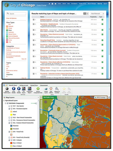
The bigger question is one of data discovery; if we're going to limit geoportals to one theme at a time, how do users get where they want to go? I hate being directed to a silverlight-slinging "Map Gallery" when I'm looking for info, but I'm not sure what the alternative is for top-level geodata search. Is it Chicago's spare text-based search? Is it the 300-button web GIS that requires training to use? Is it good SEO?

We know something about how users behave once they find the map they want, but how do we get them there in the first place?

Listocracy from Chicago, GIS-in-a-browser from VT Nat. Resources
Many thanks to Jay Appleton from the city of Burlington for being the single-handed support structure of open data here, including emailing the occasional zipped shapefile :)


Read more ...

The Buffalo in the Room Part 1: Fade In

Wednesday, September 12, 2012
Since the ancient days - well, since late 1993 or so - production cartographers have been been stuck in an awkward technical limbo between GIS and art. Two platforms were required to get a map from vector geoprocessing to publication-quality graphics: Mostly ESRI's ArcGIS for the former and mostly Adobe's Creative Suite for the latter. Sure the two tried to overlap each other as time went on ("Seven hours to export a 900dpi TIFF and I can still see the pixels? Thanks ArcMap!"), but the basic math was tough to overcome: with finite memory on a workstation, ArcGIS focuses its resources on geoprocessing at the expense of the graphic outputs, and vice-versa.

This was the way of it when I started mapping. And the classic example of "You can't do that in GIS" is the buffalo tint popularized and used to wicked effect by National Geographic Maps. Basically it's a targeted feature fade, meant to draw attention to a focal point or to one side of a divide. And pretty hot too.

And it's not really possible in ArcMap. Here, let's try doing the inverse of a fade, which is easier to envision. This is more of a halo, and it's theoretically possible to do this by adding line layer after line layer, each offset and transparent-ed a bit more than the last:

Buffalo Halo a la ArcMap
Not too shabby, I suppose. A fade out from a clear focal feature. Maybe a bit heavy-handed, but it gets the message across. Too bad it took 30 minutes of clicking into five successive sub-menus on each of ten layers to get it done. And since ArcMap isn't a graphic engine, there's no anti-aliasing, and pixels are visible in every feature. This is not a production-quality graphic.

Let's try that again with Tilemill. I know I know, it's not a GIS engine, but it's a lot closer to one than Adobe Illustrator is, try as they might. Tilemill has full support for operations like selecting and styling by attributes as well as basic geoprocessing if the data is tied to a source like PostGIS, Google's data API or CartoDB's SQL API. Also it's free and open-source (I love that such news is ancillary to my point here. Woot!). As I've mentioned before, Tilemill brings the efficiency of CSS code to the map styling process, and it pushes everything through the sophisticated Mapnik graphic driver to look damn pretty for web or print.

Code will save us, right? Here, check it out:

Buffalo Halo a la Tilemill
This is a more subtle effect, with no striping artifacts, and all the linework is anti-aliased for smoothness. Bonus points for also providing an interactive output where the halo scales dynamically.

So what kind of Carto CSS went into that? Oh, just more than three hundred lines of recursively offset style code. Oy. It's true that it's portable (feel free to plug the code into your own project), but it's not ideal. Definitely not for fast projects under a deadline.

This is where compositing comes in. Last month, the indefatigable Mapnik team added support for the graphical magic that underpins programs like illustrator. This is part of a long-running effort by cartographic designers at Stamen and Development Seed to get out from under the Iron Adobe boot. (or the supple GIMP moccasin, I suppose). With compositing, all sorts of things become a lot easier to do in Tilemill, for instance what we've been trying above is now about 30 lines of CartoCSS, and much richer:

Buffalo Halo with Mapnik Compositing Mojo in Tilemill
The possibilities are sort of mind-boggling, and I invite all the actual graphic designers of the world to figure them out (The composite parameter alone in CartoCSS has 35 options). In the meantime I'll continue to look for ways to enhance my mapping toolkit; the next post will focus on reversing the direction of this effect, like in the NatGeo example linked above.

Free-Range Buffalo Halo, Thriving in its Natural Environment.
Thanks to Dane Springmeyer for pointing out the time-saving parameters on this one.

Read more ...

Results of the Geo Toolkit Poll 2012

Monday, July 23, 2012
Many thanks to everyone who participated in this survey of the geospatial industry. I tried to get a platform-agnostic look at the tools that are most-frequently used in our community, and after 250 responses I think we have a useful glimpse of the scene.

My reason for running this survey: I'm tired of speculating. As a multi-platform user I don't know where I stand with my clients and competitors, let alone in this sprawling industry, and I've heard lots of similar curiosity from colleagues. I call this an independent survey in that no vendor funded it (nobody funded it, actually) and it isn't for marketing use. This is a community poll, nothing more. Onward . . .

Methods

This is worth a cursory glance, since the results are inevitably colored by the collection routine. I relied almost entirely on social media to get the word out, specifically:
  • Numerous twitter solicitations to my ~500 followers, retweeted to a combined audience of over 11,000 utilizing hashtags for both the ESRI User Conference and OSCon - probably annoying the crap out of everyone in the process
  • Google+ and Facebook posts
  • Listserv posts to ESRI, OSGeo, OSM and Google user groups
  • Posts on the three largest geospatial groups on LinkedIn
Given the warren-like distribution network, I do not know how many people saw this poll. Thus the sample size is 250 out of an unknown population, and no big-picture conclusions should be drawn. Also let it be known that the balance - even if measured properly - changes from month-to-month.

Results


Question 1: Which of the following geospatial technologies have you used on at least one project in the past year? [Note - I Included pre-purchase GeoCommons on its own out of morbid curiosity; I otherwise would have included it with FOSS4G Web Tools]

Some of the technologies that went into the "Other" column include FME, MicroStation, ENVI/IDL, GIS Cloud, AutoDesk, Maptitude, Idrisi, ERDAS, MapProxy, R-Spatial, Garmin Basecamp, Oracle XE, Ushahidi and Geocortex. Sorry to have ignored those, but it's a big ecosystem out there.


Question 2: Which of the above technologies did you use most frequently in the past year?


Platform Gregariousness: Do you cross over from your primary platform? e.g. ESRI is your main platform but you've also used Google Maps/Earth at least once in the past year. [A venn diagram would be cooler but the chart API was inscrutable]


Use by Business Sector:


Use by Country: (Click here for fullscreen glory - we're all cartographers here)


There's a lot to see in these distributions - an ESRI lean among U.S. respondents, a FOSS4G lean among Europeans. Also interesting to see how the sectors use these tools. See anything of note? Anything obviously-spurious? Do tell - I think there's a good discussion to be had here.

I'll say it again: this was not a scientific, controlled survey. It's a snapshot or an anectodal collection; take your pick. But it is nonetheless interesting to see what this group of mappers uses to get the job done. Thanks again to you all for pitching in, and maybe we'll try an expanded version next year.

If you're interested in the raw, messy results (stripped of unique identifiers of course), hit this link for an XLS download, and happy parsing!


Read more ...

GeoTools 2012 Poll - Round 2

Monday, July 23, 2012
Expanding the search around the Geo Community:

Read more ...

Open Source, Open Data, Open For Business.

Tuesday, July 10, 2012
GeoIQ and an Origin Tale


In 2009 I was a "GIS Technician". Heaven help me, I was auto-completing polygons on good days and schema locking on bad ones, at a well-meaning but projection-free engineering firm with 300 AutoDesk licenses and 5 ArcEditor seats. It was the worst of times.

Early on that year I took a week off to go to Las Vegas with my wife, who was presenting at the AAG conference there (she's the brains of the outfit). Benefiting from the super-low "Spouse" attendance fee (academic geographers take note), I wandered from one cool session to another, my brain stimulated in new and exciting ways. I watched in a standing-room only crowd as Jack Dangermond explained how mashups (remember those?) were going to solve Africa's problems, and I saw my first demonstrations of Object-Oriented Image Analysis and Hyperspectral wetlands detection. Cool enough, but there was something disheartening about the fact that 95% of the map crunching I saw was being done by ESRI products.

On a whim, I went to a panel session called "Open Source GIS". Probably for the damn novelty of it, but also maybe due to some lingering frustration from being license-bound while trying to do mapping work in my peace corps years. The little room was about 3/4 full and the panel consisted of some folks from USGS who used GRASS and PostGIS, and also an animated fellow named Andrew Turner from FortiusOne, who had a few things to say.

The Open Source GIS Panel at AAG 2009. Note the overdressed gentleman about to drop some science on us. (Photo courtesy of  Shriram  Ilavajhala)
It was no great conversion moment. The session covered some pretty wonky stuff from the perspective of a button-clicking non-coder, though the enthusiasm was palpable in the audience. The real "Glitch in the Matrix" hit when I talked with Andrew after the session. In an information stream that challenged the human limits of spoken words per minute, he told me it might be helpful if I downloaded Quantum GIS (1.3, yo.) and took a look at GeoCommons.com. Back at my computer, the world opened up to me; this was the starting event that would lead to the creation of Geosprocket a year later, and for that I am eternally grateful.

An early, misguided attempt to use GeoCommons in mapping global coffee production. Things have gotten better.
In that session and in subsequent interactions, Andrew conveyed two motivations for his work with FortiusOne-thence-GeoIQ.
  1. Open Source: OS software is just the tip of the iceberg. It fosters a culture of innovation and robustly supports the tools that people want most.
  2. Open Data: Geographic information should be a public good (Geo"Commons" - Get it?), and we can all benefit from driving maps into the public sphere.
These drivers were not unique to GeoIQ; they are dear to many in our community. Over time I have adopted these and included them in the core of Geosprocket's mission. As such it was something of a body blow this morning to read the news that GeoIQ had been purchased by ESRI. The pundits have already weighed in eloquently on this deal, and I can't add any new market analysis. I've even run out of snark. I can only mourn a bit to see GeoIQ forced to choose between open source and open data, for they have surely chosen the latter.

I have no doubt that ESRI's resources will supercharge GeoIQ's pursuit of open data. If Jack and co. have the wisdom to scrap ArcGIS Online and replace it with "ArcIQ" the world will be a better-informed place. But I'm going to miss the code contributions of some talented individuals. I raise a glass to them for getting me started in this business.


Read more ...