I am a journeyman cartographer, and I often find that my training didn't prepare me for the possibilities available today. It's all well and good to know the right ratios and color schemes, but how am I supposed to learn the right way to incorporate the nuttery that is Mapnik? How do I use compositing operations and CartoCSS in my maps without making them look like the worst visual excesses of web design?
By spitballing.
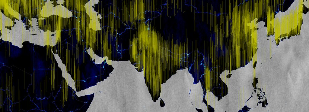
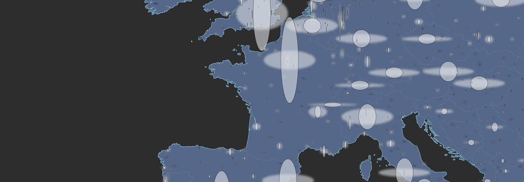
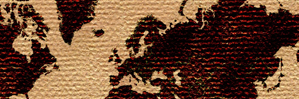
I'm throwing data, textures and cartographic conventions at the wall and seeing what sticks. Some combinations work better than others, and I'm finding that maximalism isn't all bad. There are elegant ways of arranging a thousand features in a map, and hopefully I'll stumble on them someday. In the meantime, here are some studies.


More of these fiddlings can be found here, with CartoCSS parameters attached in most cases. It's also worth noting that I used Tilemill for these, employing datasets from Natural Earth 1.4 and patterns from ForHumanUse. Most are open-source, all are free.
These are static images, and the test I'm now finding most difficult is how to make arresting visuals meaningful when dynamism is required. Many have failed, including me.
By spitballing.
I'm throwing data, textures and cartographic conventions at the wall and seeing what sticks. Some combinations work better than others, and I'm finding that maximalism isn't all bad. There are elegant ways of arranging a thousand features in a map, and hopefully I'll stumble on them someday. In the meantime, here are some studies.

More of these fiddlings can be found here, with CartoCSS parameters attached in most cases. It's also worth noting that I used Tilemill for these, employing datasets from Natural Earth 1.4 and patterns from ForHumanUse. Most are open-source, all are free.
These are static images, and the test I'm now finding most difficult is how to make arresting visuals meaningful when dynamism is required. Many have failed, including me.
